
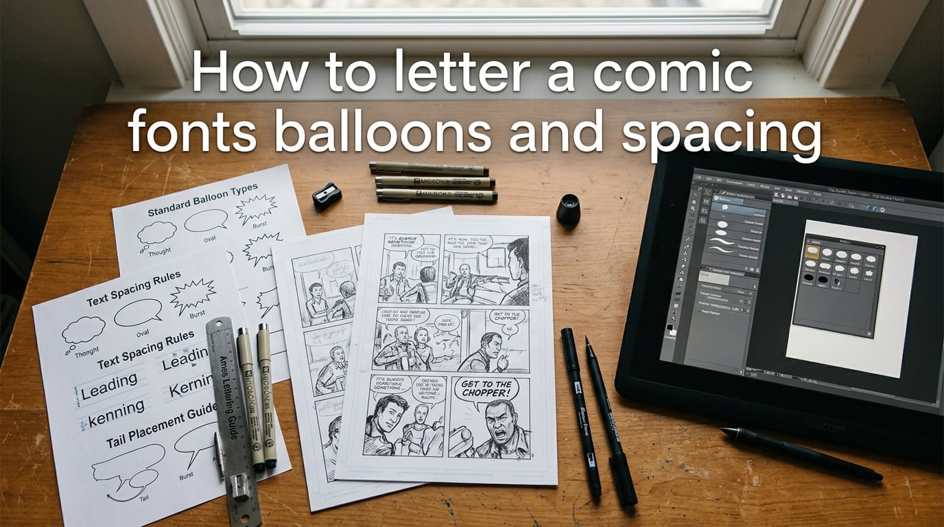
Comic lettering is the craft that makes readers hear dialogue inside their heads. Get it right, and nobody notices — the story flows. Get it wrong, and every balloon becomes a speed bump that pulls readers out of the page.
Whether you are lettering your first indie zine or tightening pages for a print run, three pillars hold up every lettering job: the font you choose, the balloons you draw, and the spacing you set between letters, lines, and panels. This guide walks through each one with concrete numbers, visual examples, and a printable checklist you can tape above your monitor.
I have lettered over 300 pages across indie comics and Webtoon vertical-scroll series. The rules below are the ones that separated clean, professional pages from the ones that came back from review covered in red ink.
Table of Contents
What Is Comic Lettering?
Comic lettering is the placement of dialogue, narration, and sound effects on a comic page using hand-drawn or digital lettering inside word balloons and caption boxes. It covers font selection, balloon shape, tail direction, and the white space between every letter and line. Lettering is not the same as typesetting — typesetting applies a uniform font to a block of text, while lettering adapts tone, size, and shape to match each moment in the story.
Good lettering disappears. The reader hears a whisper, a shout, or a thought without thinking about the font. Bad lettering — Comic Sans, misshapen balloons, cramped lines — is the fastest visual signal that a comic was not finished professionally.
Choosing a Dialogue Font
A dialogue font is the single typeface used for every speech balloon in an issue. Most professional comic letterers use fonts from two foundries: Blambot and Comicraft. The most common choices are CCWildWords (a clean, classic comic feel), Komika Hand (a slightly rougher, indie-friendly hand), and Anime Ace (wide letterforms suited to manga-style pages).
Key rules for font selection:
Pick one font for the entire issue. Do not switch fonts mid-issue unless the story demands it (a robot speaking in a different typeface, for example).
Size for print. Dialogue text should sit between 6 and 8 points at final print scale. Anything below 6 points becomes unreadable on a printed page.
Avoid Comic Sans. Despite the name, Comic Sans is not an industry standard. Its irregular letter spacing and childish weight make it the number one amateur tell in the eyes of editors and readers.
Use uppercase letterforms. Traditional comic lettering is all-caps. Mixed case works for caption boxes or modern indie styles, but uppercase remains the default for dialogue.
Check the x-height. The x-height — the height of a lowercase “x” — determines how large a font feels at any point size. Fonts with a tall x-height (like CCWildWords) read larger at 6pt than fonts with a short x-height.
Free starter fonts from Blambot (CCWildWords, Anime Ace) and open-source fonts (Komika Hand) let beginners start without spending anything. Paid foundry fonts from Comicraft offer broader weight and style families for creators who need italic, bold, and condensed variants in one package.
Word Balloon Shapes and What They Signal
A word balloon is a shaped container around dialogue text, and its outline tells the reader how the words sound before they read a single letter. Round balloons mean normal speech. Jagged balloons mean shouting. Scalloped or cloud-shaped balloons mean thoughts. The shape is the first cue a reader processes.
Here is a comparison of every standard balloon type, what it signals, and when to use it:
| Balloon Type | Shape | Tail Style | When to Use | Example |
|---|---|---|---|---|
| Speech Balloon | Round / oval | Single tapering tail toward speaker’s mouth | Normal dialogue — the default for most panels | “We need to go. Now.” |
| Shout / Burst Balloon | Jagged, star-shaped edges | Short, thick tail or no tail (fills the panel) | Yelling, explosions of emotion, anger, shock | “STOP!” |
| Thought Balloon | Cloud / scalloped outline with bubble trail | Chain of small circles leading to the thinker’s head | Internal monologue the reader “overhears” — classic comics style | “I don’t trust him…” |
| Caption Box | Rectangular, solid or outlined | No tail (narrator has no body) | Narration, location/time stamps, internal monologue (modern alternative to thought balloons) | “Tuesday. 3:14 AM.” |
| Whisper Balloon | Dashed or outline-only border, round shape | Thin, dashed tail | Whispering, secrecy, quiet dialogue | “Don’t turn around.” |
| Radio / Electric Balloon | Jagged or lightning-bolt edges, often with a connecting line to a device | Line to radio, phone, or speaker | Dialogue heard through a device — radio, phone, intercom, TV | “Base camp, do you copy?” |
| Wavy Balloon | Wobbly, uneven outline | Standard tail | Drunk, sick, dazed, or physically unstable speech | “I’m… I’m fine.” |
| Rough Balloon | Irregular, scratchy outline | Rough tail | Monster voice, growling, non-human speech | “GRAAAH.” |
The most common mistake beginners make is using a speech balloon for every line. If a character is thinking, use a thought balloon or a caption box. If they are shouting, use a burst. The shape does half the storytelling for you.
Balloon Tail Attribution: Pointing to the Speaker
A balloon tail is the pointer that connects a word balloon to the character speaking. Its job is simple: it must point clearly at the speaker’s mouth without ambiguity. The tail should cover roughly 50 to 60 percent of the distance between the balloon and the speaker’s face — long enough to be clear, short enough to avoid cluttering the panel.
Rules for clean tail attribution:
Point at the mouth, not the head. The tail aims at the speaker’s mouth because that is where speech originates visually.
Avoid crossing other characters. When two characters stand close together, bend the tail around the non-speaker rather than letting it pass through their body.
Off-panel speakers get a tail that exits the panel edge or a caption box labeled with the character’s name.
Never let two tails point at the same character. If both characters in a panel have balloons, each tail must point to its own speaker unambiguously.
When tails break these rules, readers lose track of who is speaking. In fast dialogue scenes with three or more characters, a single misplaced tail can derail an entire page.
Balloon Placement and Reading Order
Balloon placement follows the natural reading order of the page. In left-to-right languages, readers scan a panel in a Z pattern: top-left, top-right, bottom-left, bottom-right. Place the first line of dialogue in the top-left area of the panel and subsequent lines below and to the right.
Core placement rules:
Keep balloons near the top of the panel. Dialogue should sit in the upper third whenever possible, leaving the art visible below.
Never cover a character’s face. If the art does not leave enough headroom, shrink the balloon or move it to the gutter between panels.
Use negative space. Balloons read best against a clean background — sky, wall, shadow — not on top of detailed art.
Stack reading order, not visual symmetry. A balloon placed in the visually “correct” center of a panel is wrong if it breaks the left-to-right reading sequence.
For Webtoon and vertical-scroll formats, the rules shift slightly. Readers scroll down, so dialogue should flow top-to-bottom within each panel. Horizontal balloon clusters that work in print can confuse scroll readers. Keep balloons stacked vertically and leave breathing room between speech lines.
Spacing: Leading, Kerning, and Tracking
Spacing is the white space between letters, lines, and balloons — and it is the single most overlooked pillar of comic lettering. The topic keyword literally includes “spacing,” yet most tutorials treat it as an afterthought. Proper spacing determines whether text reads at a glance or forces the reader to squint.
Three measurements control all in-balloon spacing:
Leading (line spacing). Leading is the vertical distance between the baselines of two lines of text. The standard rule for comic lettering is to set leading at roughly 2x the font size. For a 7pt dialogue font, leading should sit around 14pt. Tighter leading (1.5x) works for short, punchy lines. Wider leading (2.5x) helps long caption blocks breathe.
Letter tracking. Tracking adjusts the uniform horizontal spacing between all letters in a line. Most comic dialogue fonts are designed with tracking built in, so you rarely need to change it. If letters feel cramped at smaller sizes, add 5-10 units of tracking in your type tool.
Kerning. Kerning is the adjustment of space between specific letter pairs (AV, To, We). Good dialogue fonts have kerning tables built in. If you spot a gap between a capital T and a lowercase o, manually kern that pair by reducing the space by 10-15 units.
Beyond the letterforms themselves, word spacing inside balloons matters. A general rule: the space between words should equal roughly the width of a lowercase “o” in the dialogue font. Too wide and the balloon looks hollow. Too narrow and the words blur together.
Balloon margins — the padding between the text block and the balloon outline — should sit at 1.5 to 2x the font size on all sides. A 7pt font needs roughly 10-14pt of internal padding. Skimpy margins make the text feel crammed; generous margins make the balloon feel empty.
If you are working in Clip Studio Paint, the balloon sub-tool handles most of this automatically — set your font size, and the tool builds the balloon with correct margins. In Illustrator or Photoshop, you will need to measure padding manually with guidelines.
Sound Effects (SFX) Lettering
Sound effects in comics are drawn art, not just a font. A SFX letter should be designed — its weight, color, texture, and integration with the background art all communicate how a sound feels, not just what it is.
Key principles for SFX lettering:
Size reflects loudness. A gunshot SFX might fill half the panel. A quiet drip might be 12pt tucked in a corner. Scale the effect to match the volume of the sound.
Color cues match the source. Red or orange for fire. Blue for water. Metallic grey for machinery. The color helps the reader connect the sound to its cause without extra narration.
Integrate with the art. SFX should interact with the illustration — a “CRASH” that overlaps a shattering window, or a “WHOOSH” that follows the arc of a punch. Floating, disconnected SFX look pasted on.
Hollow SFX for distant or muffled sounds. A hollow, outline-only letter style signals that the sound is coming from far away or through a wall.
Breath marks for effort. Small radiating lines around a character’s face or fist signal physical exertion — a punch, a lift, a sprint — without needing an SFX word at all.
Avoid setting SFX in the same font as dialogue. SFX should always feel hand-drawn or custom-designed. Using your dialogue font for a “BOOM” reads as lazy, not stylistic.
Captions vs. Dialogue: Four Types of Caption Boxes
A caption box is a rectangular container for text that is not spoken dialogue. Captions serve four distinct purposes, and each one has its own visual treatment:
Location and time stamps. “Gotham City. 11:47 PM.” These sit at the top of a panel, often in a smaller font or a colored background, and orient the reader in the story’s setting.
Internal monologue. The character’s unspoken thoughts. In modern comics, internal monologue captions are more common than thought balloons. They use the character’s voice and are often colored differently from narration to distinguish the speaker.
Spoken narration (off-panel). A character telling a story to someone else. These caption boxes use quotation marks and are styled differently from internal monologue.
Editorial / omniscient narration. A narrator outside the story. These are the classic “Meanwhile, across town…” boxes and are usually the most formal in tone and typesetting.
Modern indie and Webtoon creators are moving away from thought balloons toward internal monologue captions. Thought balloons with their bubble-trail tails feel dated to some readers, while caption boxes blend cleanly into vertical-scroll layouts.
Amateur Lettering Mistakes to Avoid
Editors and experienced readers spot amateur lettering in seconds. Here are the six most common tells — and the fix for each one:
Using Comic Sans or a non-comic font. Switch to a dedicated comic font from Blambot or Comicraft. Even a free Blambot font instantly raises the quality bar.
Inconsistent balloon shapes. Every speech balloon in an issue should use the same template — same oval ratio, same stroke weight, same tail angle. Draw one master balloon and duplicate it.
Wrong or missing tail attribution. Every speech balloon needs a tail pointing at the speaker’s mouth. If the speaker is off-panel, use a caption box with the character’s name.
Cramped spacing inside balloons. Text pressing against the balloon edge is the fastest visual tell of unfinished lettering. Add padding: at least 1.5x the font size on every side.
Covering character faces with balloons. Move the balloon to a clean area of the panel or into the gutter. Never cover a character’s eyes — eyes carry the emotion of the panel.
Butting balloons against panel borders. A balloon that touches or overlaps a panel border is called a “butting balloon” and is considered a layout error. Leave at least a small gap between every balloon edge and the panel frame.
One additional mistake worth calling out: tangent lines. A tangent occurs when a balloon edge just barely touches a line in the artwork — a character’s shoulder, a building edge, a speech tail. Tangents create visual tension and confuse the eye. Either pull the balloon away from the art or push it clearly over the art. Never just barely touch.
Pre-Flight Checklist Before Print or Export
Before you send pages to a printer or upload to a digital platform, run through this checklist. Skipping these steps is how good lettering falls apart at the final stage.
Font size at print scale. Zoom to 100% and verify that all dialogue text is at least 6pt. If any line falls below 6pt, increase the font size or reflow the text.
CMYK color check. Convert your file to CMYK and verify that caption backgrounds, SFX colors, and balloon fills still read clearly. Bright RGB blues and greens can flatten in CMYK.
Hairline border test. Print a test page and check that balloon outlines, caption borders, and SFX strokes are visible. Borders thinner than 0.5pt can disappear on some printers.
Proofread every balloon. Spelling errors in lettering cannot be fixed without re-lettering the page. Read every word out loud.
Tail direction check. Flip through every page and verify that every balloon tail points at the correct speaker. Look especially at panels with three or more characters.
Reading order scan. Read only the dialogue on each page, ignoring the art. If the dialogue flows naturally left-to-right, top-to-bottom, your reading order is clean.
Export format. For print, export as high-resolution PDF or TIFF at 300 DPI minimum. For Webtoon, export as JPEG or PNG at the platform’s recommended width (usually 800-1200px wide).
Pin this checklist next to your workstation. A two-minute pre-flight scan catches errors that would cost hours to fix after a print run.
Digital and Hand-Lettering Tools
The right tool depends on your workflow. Here is a quick breakdown of the most common options:
Clip Studio Paint — The industry standard for indie and manga lettering. Its balloon sub-tool, vector tail handles, and built-in font management make it the fastest path from rough art to finished lettering. Available on desktop and iPad.
Adobe Illustrator — Best for creators who want full typographic control. Anchor-point balloon drawing, advanced kerning tools, and vector output make it ideal for print-heavy workflows.
Adobe Photoshop — Works for lettering but is not optimized for it. Text layers and shape tools get the job done, but the workflow is slower than Clip Studio or Illustrator.
Inkscape (free) — The best free alternative for vector-based lettering. Its text and path tools handle balloons and tails, though the interface is less polished than paid options.
Ames Lettering Guide — A physical ruled guide for hand-lettering on paper. It sets consistent baselines and spacing without digital tools. Still used by hand-letterers and sketch-stage creators.
Most indie creators start with Clip Studio Paint or Inkscape. Both handle the full lettering workflow — font selection, balloon drawing, tail placement, spacing, and export — without needing additional software.
Frequently Asked Questions
What font do comics use for text?
Most professional comics use fonts from Blambot or Comicraft. CCWildWords, Komika Hand, and Anime Ace are the three most common dialogue fonts in the industry. They are designed for all-caps lettering at 6-8pt print scale, with built-in kerning and consistent x-heights.
What are the text bubbles in comics called?
The text containers in comics are called word balloons (or speech balloons) for dialogue, thought balloons for internal monologue, and caption boxes for narration. Each shape signals a different kind of speech — round for normal dialogue, jagged for shouting, scalloped for thoughts, and rectangular for captions.
How big should comic lettering be?
Comic dialogue text should be set between 6 and 8 points at final print scale. Anything smaller than 6pt becomes difficult to read on a printed page. For digital platforms like Webtoon, lettering can be slightly larger since screens are held closer to the face.
What is the difference between lettering and typesetting?
Lettering adapts the font, balloon shape, size, and spacing to match the tone of each moment in the story — a whisper gets a different balloon than a shout. Typesetting applies a uniform font and size to a block of text, like a book or magazine. Comic lettering is a craft; typesetting is a technical step.
How do I make word balloons?
In Clip Studio Paint, use the balloon sub-tool to draw an oval shape and add a tail. In Illustrator, draw an ellipse with the shape tool and add a tapered path for the tail. Set internal padding at 1.5 to 2x your font size so the text does not touch the balloon edge.
Should I letter on top of the art or leave space?
Leave space. Balloons should sit against clean backgrounds — sky, walls, shadows — not on top of detailed art. If the panel art does not leave enough room, move the balloon to the gutter between panels or reduce the dialogue to fit the available space.
Can I use Comic Sans for my comic?
You can, but you should not. Comic Sans is not an industry-standard comic font and is widely recognized as an amateur tell. Its irregular spacing and informal weight do not hold up at print scale. Switch to CCWildWords, Komika Hand, or any dedicated comic font from Blambot or Comicraft.
Can AI tools letter my comic?
AI tools can generate lettering layouts and balloon placement, but they struggle with tail attribution, tone-matched balloon selection, and SFX integration. Most working letterers treat AI as a rough layout assistant, not a replacement. Readers can spot fully AI-generated balloons, and the quality gap is still significant.
Conclusion
How to letter a comic comes down to three habits: choose a professional font and stick with it, use balloon shapes that match the tone of every line, and set spacing so the text reads at a glance without touching the balloon edges. Nail those three, and the rest — SFX, captions, tail attribution — builds on a solid foundation.
Start with a free font from Blambot, draw your balloons in Clip Studio Paint or Inkscape, and run the pre-flight checklist before every export. The craft rewards repetition: your tenth page will be cleaner than your first, and your hundredth will look professional.