
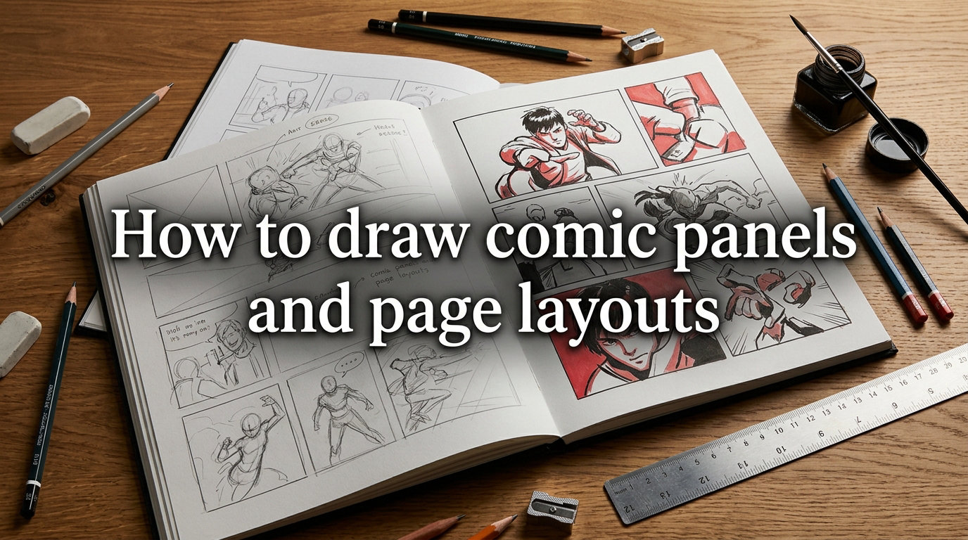
Learning how to draw comic panels and page layouts is one of the most important skills any aspiring comic artist can develop. A well-designed layout guides the reader’s eye, controls pacing, and transforms individual drawings into a cohesive visual story. Whether you’re working on manga, graphic novels, or webcomics, the principles of panel composition remain the same.
Many beginners focus heavily on drawing technique while overlooking layout entirely. This leads to pages that feel cluttered, confusing, or flat. The good news is that panel layout follows a set of learnable rules that you can apply immediately.
This guide covers everything from basic panel types and grid layouts to advanced techniques like overlapping panels and broken borders. You’ll learn the thumbnailing process used by professional artists, discover common mistakes that trip up beginners, and find digital tools that make the whole workflow easier. If you’ve ever stared at a blank page wondering where to start, this article is for you.
The principles here apply regardless of whether you draw by hand or digitally. What matters is understanding the visual language of comics. Once you internalize these concepts, laying out pages becomes second nature.
Table of Contents
What Are Comic Panels?
Comic panels are bordered frames on a page that each contain a single moment or scene. They work together sequentially to tell a visual story, functioning like individual shots in a film. Each panel captures a specific beat in the narrative.
Panels serve three essential purposes. First, they separate moments in time so the reader processes events in sequence. Second, they control how much visual information the reader receives at once. Third, they create rhythm and pacing through their size and arrangement on the page.
Without panels, a comic page becomes a chaotic jumble. Borders give structure and help readers understand the intended reading order. The space between panels, called the gutter, is equally important. It represents the passage of time or transition between scenes.
Essential Panel Types Every Artist Should Know
Different panel types serve different storytelling purposes. Understanding when to use each one separates competent layouts from exceptional ones. Here are the panel types you should master:
Establishing Shot
An establishing shot sets the scene by showing the broader environment. These panels are typically wide and placed at the beginning of a sequence. They tell the reader where and when the action takes place.
Close-Up Panel
Close-ups focus tightly on a character’s face, an object, or a specific detail. They create emotional intensity and draw attention to important story elements. Use close-ups during moments of high drama or to highlight critical details.
Medium Shot
Medium shots show characters from roughly the waist up. They’re versatile panels that work well for dialogue sequences and general action. Most comic pages rely heavily on medium shots for the bulk of the storytelling.
Splash Page
A splash page is a single panel that takes up an entire page. It delivers maximum impact and is reserved for pivotal story moments, dramatic reveals, or introductions. Use splash pages sparingly so they retain their power.
Inset Panel
An inset panel is a smaller panel placed inside a larger one. It draws the reader’s attention to a specific detail within a broader scene. This technique is common in mystery and thriller comics where details matter.
Diagonal Panel
Diagonal or angled panels break the visual monotony of rectangular frames. They create a sense of unease, action, or energy. Use them for fight scenes, disorienting moments, or to convey chaos.
Each panel type has its own storytelling strength. Mixing them effectively keeps your pages visually interesting while serving the narrative. Sticking to only one or two types makes pages feel repetitive and flat.
Understanding Gutters and Spacing
The gutter is the space between comic panels. This gap might seem minor, but it plays a crucial role in how readers perceive time and transitions. Understanding gutters is fundamental to learning how to draw comic panels effectively.
Wide gutters suggest a larger time gap or stronger separation between events. Narrow gutters create a sense of immediacy and rapid pacing. Zero gutter, where panels touch or overlap, indicates simultaneous events or continuous action.
Consider a sequence showing a character walking across a room. Three panels with wide gutters suggest slow, deliberate movement with pauses between steps. The same three panels with narrow gutters feel like quick, purposeful strides. The gutter width alone changes the emotional reading of identical artwork.
Consistent gutter width throughout a page creates a clean, professional look. Many artists use a standard gutter width of about one-eighth of an inch for print comics. Digital comics often use similar proportional spacing. When you deviate from your standard gutter width, do it with intention rather than by accident.
Panel borders themselves also matter. Thick borders create stronger separation and can feel more dramatic. Thin borders keep the focus on the art inside the panels. Some artists remove borders entirely for emotional or dreamlike sequences. A common technique is to use thick borders for the main story and thin or absent borders for flashbacks or memories.
Common Grid Layouts
Grid layouts provide the structural foundation for most comic pages. Three formats dominate comic art: the 4-panel grid, the 6-panel grid, and the 9-panel grid. Each has distinct advantages depending on your story’s needs.
4-Panel Grid
The 4-panel grid is simple and accessible. It works well for newspaper-style strips, lighthearted stories, and pages with minimal action. Each panel gets generous space, making it ideal for detailed art or strong visual moments. Many webcomics and daily strips use this format because it translates well across different screen sizes.
6-Panel Grid
The 6-panel grid is the workhorse of comic storytelling. Arranged as two rows of three panels, it offers a balanced mix of space and pacing. Most mainstream comics from Marvel and DC use variations of this grid for the majority of their pages. It’s an excellent default layout for beginners because it provides enough panels to tell a complete scene without feeling cramped.
Within a 6-panel grid, you can merge adjacent panels to create larger frames. Merging two panels in the top row creates a wide establishing shot, while keeping the bottom row as three separate panels. This flexibility makes the 6-panel grid adaptable to almost any storytelling need.
9-Panel Grid
The 9-panel grid divides the page into three rows of three equal panels. This format, popularized by artists like Dave Gibbons in Watchmen, creates a staccato rhythm that slows down time. It’s particularly effective for tense, dialogue-heavy sequences where every beat matters.
The 9-panel grid also works well for montages and parallel storylines. You can use individual panels to show simultaneous events happening in different locations. The equal sizing creates a democratic visual weight that treats each moment with equal importance.
You don’t have to stick rigidly to any grid. Most professional layouts combine grid elements with creative panel arrangements. The grid serves as your starting framework, which you then modify based on storytelling needs.
How to Draw Comic Panels Step by Step: The Thumbnailing Process
Thumbnailing is the rough sketching process where you plan your page layout before drawing anything detailed. Every professional comic artist uses this step, and skipping it is one of the biggest mistakes beginners make.
Start by sketching tiny versions of your page on scrap paper or in a sketchbook. Keep each thumbnail small, roughly the size of a postage stamp. This forces you to focus on composition rather than detail.
Here’s the thumbnailing process in practice:
Step 1: Read your script or story beats. Understand what needs to happen on this page before you draw anything.
Step 2: Determine the panel count. Decide how many panels the page needs based on pacing. Fast action needs more panels; dramatic moments need fewer, larger panels.
Step 3: Choose a grid foundation. Pick a 4, 6, or 9-panel grid as your base layout.
Step 4: Sketch the layout. Draw small rectangles representing each panel. Focus on the overall composition and flow.
Step 5: Mark focal points. Indicate which panels will contain the most important visual elements.
Step 6: Review the reading flow. Trace the path your eye takes across the page. If it stumbles, rearrange panels.
Step 7: Create multiple versions. Don’t settle for your first attempt. Sketch three to five variations of the same page to find the strongest layout.
Many artists on forums like r/comic_crits and r/ComicBookCollabs emphasize that thumbnails are the most valuable step in the entire process. One common sentiment is that panel layout actually improves when artists stop overthinking and just sketch freely during the thumbnail phase. Don’t worry about art quality at this stage. Thumbnails are purely about composition and flow.
Some artists prefer digital thumbnailing using Clip Studio Paint or even simple tools like Microsoft Paint. Others swear by pencil and paper for the tactile feedback. Both approaches work. The important thing is that you do the step rather than skip it.
Reading Flow and Visual Hierarchy
Reading flow is the path a reader’s eye follows across the page. In Western comics, readers move left to right and top to bottom. Manga reads right to left and top to bottom. Your panel arrangement must respect these conventions or risk confusing the audience.
Visual hierarchy determines which elements the reader notices first within each panel. Larger elements, high-contrast areas, and characters facing the reader naturally draw attention. Use these principles to guide the reader’s focus to the most important part of each scene.
The Z-pattern is the most common reading flow for Western comics. The eye starts at the top-left panel, moves across to the top-right, drops to the middle-left, continues to the middle-right, and finishes at the bottom panels. Arrange your story beats accordingly. The most impactful moment on a page typically lands in the bottom-right panel, as this is where the reader’s eye finishes before turning the page.
Manga and webtoons have different conventions. Manga reads right to left in mirrored Z-patterns, while vertical-scroll webtoons follow a single downward path. If you’re creating content for a specific format, study how published works in that format handle flow.
When you break the standard reading flow, do it intentionally. Angled panels, overlapping frames, or unusual arrangements should serve a specific storytelling purpose, like showing confusion or emphasizing a dramatic moment. Random flow disruptions simply frustrate readers and break immersion in your story.
Choosing Panel Sizes for Storytelling Impact
Panel size directly affects how the reader perceives a scene. Large panels give moments more weight and allow readers to linger. Small panels create urgency and push the narrative forward quickly. Size is one of the most powerful tools in your layout toolkit.
Varying panel sizes across a page creates visual rhythm. A page with identically sized panels feels monotonous and mechanical. Alternating between medium and small panels builds energy, while a single large panel among smaller ones creates a dramatic focal point. Think of panel size variation like the loud and soft dynamics in music.
Dialogue-heavy scenes typically work better with medium-sized panels that give enough room for speech balloons. Action sequences benefit from wider panels that show movement and direction. Emotional moments often call for tall, narrow panels that create a sense of intimacy or isolation. A character receiving bad news in a tall, thin panel feels trapped and alone in a way that a wide panel cannot convey.
Many forum users mention struggling with panel size intuition. A practical exercise is to study published comics you admire and trace their panel layouts on tracing paper. This reveals how professional artists use size variation to control pacing. After tracing ten or fifteen pages, you will start to feel the patterns instinctively.
A good rule of thumb is that the most emotionally important panel on each page should be the largest. If nothing particularly dramatic happens, keep panels roughly equal in size and let the art carry the storytelling instead.
Overlapping and Broken Panels for Dynamic Action
Overlapping panels occur when one panel extends over the border of another. This technique creates depth and visual interest, making the page feel more dynamic than a standard grid layout. The overlapping panel reads as being in front of or closer to the viewer than the panel it crosses.
Broken panels, where a character or object breaks through the panel border, are powerful tools for action sequences. A fist punching through a border or a character leaping from one panel into the next creates energy that standard bordered panels cannot match. This technique visually communicates that the action is too intense to be contained.
Use these techniques deliberately and sparingly. Overuse makes pages feel chaotic and hard to read. Reserve overlapping and broken panels for moments of high energy or dramatic impact. A page where every panel overlaps the next loses the effect entirely.
A character emerging from a panel border naturally draws the reader’s eye and signals importance. This technique is especially effective during fight scenes, transformations, or climactic story beats. It tells the reader that this moment matters more than what surrounds it.
Broken panels also work well for psychological moments. A character experiencing a mental break or an intrusive memory can literally break out of the panel structure. The visual metaphor reinforces the narrative without requiring dialogue or narration.
Common Beginner Mistakes to Avoid
Learning how to draw comic panels involves making mistakes, but some errors are avoidable with awareness. Here are the most common beginner pitfalls:
Skipping thumbnails. Jumping straight to detailed artwork without planning the layout leads to cramped, poorly composed pages. Always thumbnail first.
Using only one panel size. Pages with identical panels feel flat and boring. Vary your panel sizes to create visual rhythm and emphasize important moments.
Ignoring the reading flow. Panels that force the reader’s eye to jump around the page break immersion. Follow the Z-pattern for Western comics.
Making panels too small. Cramming too many panels onto a page overwhelms the reader. Give each moment enough space to breathe.
Neglecting gutters. Inconsistent gutter widths make pages look amateurish. Standardize your spacing for a professional appearance.
Overusing splash pages. Full-page panels lose their impact when used too frequently. Save them for truly pivotal moments.
Avoiding these common mistakes will immediately improve the quality of your comic layouts. As forum discussions consistently emphasize, studying existing comics by tracing and analyzing their layouts is one of the most effective learning strategies. Pick three to five pages from comics you love and trace just the panel borders. You will quickly see the patterns professional artists use.
Another mistake worth mentioning is failing to plan for speech balloons. Beginners often draw beautiful panels only to find there is no room for dialogue. Always leave space in your panel composition for text, or you will end up covering your artwork.
Digital Tools and Templates for Panel Layouts
Digital tools have made comic layout faster and more flexible. Several applications offer built-in panel layout features that streamline the process. The right tool can save you hours on each page.
Clip Studio Paint is the industry standard for digital comic creation. It includes a dedicated panel layout tool that lets you create, split, and modify panels with ease. The panel ruler feature automatically generates borders that you can adjust by dragging. Many professional manga artists use it as their primary tool, and it offers a one-time purchase option that appeals to independent creators.
Procreate on iPad offers a more freeform approach. While it lacks dedicated panel tools, artists create custom templates and use layer masks to define panel borders. It excels for artists who prefer a more painterly, sketch-based workflow. You can find panel template brushes and canvases from the Procreate community online.
Free templates are widely available online. Many artists share printable and digital panel layout templates for common grid formats. Websites and communities dedicated to comic creation offer downloadable templates for 4-panel, 6-panel, and 9-panel layouts in various aspect ratios. These are especially helpful for beginners who want to focus on storytelling without worrying about technical layout details.
Adobe Illustrator and InDesign work well for formal, highly structured layouts. They offer precise control over measurements and alignment, which suits artists who plan meticulously before drawing. However, they lack the drawing-focused features of Clip Studio Paint or Procreate.
Regardless of which tool you choose, the principles remain the same. Digital tools simply make experimentation faster and corrections easier. The best tool is whichever one you will actually use consistently.
Frequently Asked Questions
What is the 180 rule in comics?
The 180 rule in comics means maintaining a consistent spatial relationship between characters across panels. If a character faces right in one panel, they should continue facing right in subsequent panels unless there is a deliberate reason to change. Breaking this rule without purpose confuses the reader about character positions.
How do you layout comic panels?
To layout comic panels, start with small thumbnail sketches to plan your page flow. Choose a grid format as your foundation, such as a 4-panel, 6-panel, or 9-panel grid. Arrange panels to guide the reader’s eye left to right and top to bottom. Vary panel sizes to control pacing, with larger panels for important moments and smaller panels for quick beats. Always create multiple thumbnail variations before committing to a final layout.
What is the comic panel rule for a comic page?
The main rule is that panels should guide the reader through the story in the correct sequence without confusion. In Western comics, this means left to right and top to bottom. Panels should vary in size to create pacing, gutters should remain consistent, and the most important moments should receive larger or more prominent panels. The reading path should feel natural and intuitive.
What are common comic panel layouts?
The most common comic panel layouts are the 4-panel grid for simple stories, the 6-panel grid for mainstream comics offering balanced pacing, and the 9-panel grid for slow, deliberate sequences. Beyond these standard grids, artists use splash pages for dramatic impact, overlapping panels for dynamic action, and diagonal panels for scenes requiring tension or energy.
Conclusion
Mastering how to draw comic panels and page layouts takes practice, but the fundamentals are straightforward. Start with thumbnail sketches, choose appropriate grid layouts, vary your panel sizes for pacing, and always respect the reading flow. Study published comics to see these principles in action, and don’t be afraid to experiment with overlapping panels and broken borders once you’re comfortable with the basics.
The more pages you layout, the more intuitive the process becomes. Start with the 6-panel grid, practice thumbnailing every page before drawing, and analyze comics you admire. These habits will transform your storytelling faster than any single technique. Now pick up a pencil and start sketching your next page layout.