
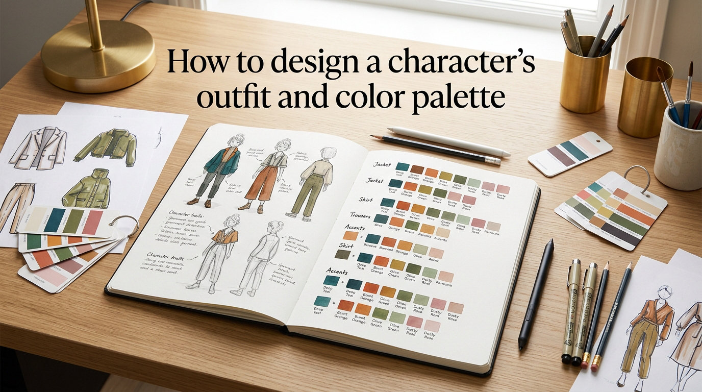
Learning how to design a character’s outfit and color palette is one of the most rewarding skills any artist, illustrator, or game designer can develop. A well-chosen outfit paired with a harmonious color scheme tells the audience who your character is before they read a single line of dialogue. This guide walks you through the entire process, from color theory fundamentals to outfit silhouette design, so you can create characters that feel instantly memorable.
Whether you are building an original character for a comic, designing a game protagonist, or just exploring character design for the first time, the principles here apply across every style and genre. By the end, you will have a clear workflow for choosing colors and designing outfits that work together as one cohesive visual statement.
Table of Contents
Why Outfit and Color Palette Matter in Character Design
A character’s outfit and color palette do far more than make them look appealing. They communicate personality, social status, era, and emotional state at a single glance. Think about how quickly you recognize characters like Mario, Spider-Man, or Sailor Moon, their color and costume choices are inseparable from their identity.
Strong outfit and color design also supports storytelling. A villain draped in dark jewel tones signals danger, while a hero in warm primaries feels approachable and trustworthy. When outfit and palette align with character personality, the audience connects emotionally without needing explicit explanation.
Designers who skip this step often end up with characters that feel generic or forgettable. Investing time in outfit and color planning saves hours of revision later and produces characters people actually remember.
Color Theory Fundamentals: Hue, Value, and Saturation
Before picking colors for your character, you need to understand three building blocks of color theory: hue, value, and saturation. These three properties define every color you see, and mastering them gives you full control over your palette.
Hue is what most people mean when they say “color.” It refers to the position on the color wheel: red, blue, green, yellow, and everything in between. Hue is the first choice you make when selecting a character’s dominant color.
Value describes how light or dark a color is. A light blue and a dark navy share the same hue but have very different values. Value is critical for readability. If your character’s outfit has similar values throughout, the design looks muddy and flat. Artists often squint at their work to check value contrast, if the silhouette reads clearly at a glance, the values are working.
Saturation (also called chroma or intensity) measures how vivid or muted a color is. A fully saturated red is bright and punchy; a desaturated red looks grayish and subtle. Most strong character designs use a mix of saturated and desaturated areas to create visual hierarchy. The character’s face and key accessories tend to carry higher saturation, while background elements stay muted.
A useful rule of thumb: if you change the value, shift the hue’s temperature slightly. This prevents your shadows from looking like a simple darkened version of the base color and adds richness to your character’s palette.
The 60-30-10 Rule for Character Design
The 60-30-10 rule is a time-tested formula for balancing colors in any visual design, and it works exceptionally well for character outfits. Here is how it breaks down:
60% dominant color. This is the foundation of your character’s look. It covers the largest area, usually the main garment, jacket, or dress. This color sets the overall mood. A character with 60% blue reads as calm or mysterious; 60% red reads as passionate or aggressive.
30% secondary color. This color supports the dominant hue and adds contrast. It often appears in pants, skirts, undershirts, or hair. The secondary color should complement or contrast the dominant color without competing with it.
10% accent color. This is the small but powerful pop of color that draws the eye. Think belt buckles, jewelry, buttons, scarves, or eye color. The accent adds personality and prevents the design from feeling monotone.
This ratio keeps your character’s palette balanced and readable. When forum artists on Reddit’s r/characterdesign recommend keeping to 3 to 5 colors maximum per outfit, the 60-30-10 rule is the framework that makes that possible.
How to Pick a Color Palette for Your Character
Choosing a color palette does not have to feel overwhelming. Follow these steps to build one from scratch:
Step 1: Define your character’s personality and role. Is your character brave, cunning, nurturing, or mysterious? Write down three to five personality traits. These traits will guide your color choices because colors carry psychological weight.
Step 2: Choose a dominant color that matches their core trait. Use the color symbolism section below as a reference. If your character is a calm, wise mentor, start with blue or teal. If they are fiery and impulsive, red or orange is a natural fit.
Step 3: Pick a secondary color for contrast. Look at the color wheel. Complementary colors (opposite on the wheel) create bold contrast, while analogous colors (adjacent on the wheel) create harmony. Choose based on whether your character feels harmonious or internally conflicted.
Step 4: Add one accent color for visual interest. This small pop should be highly saturated and appear in accessories, eye color, or small details. It draws the viewer’s eye to the character’s face or signature element.
Step 5: Test your palette with value check. Convert your colors to grayscale. If the values are too similar, the design will look flat. You want at least two distinct value steps between your lightest and darkest colors.
Step 6: Apply the 60-30-10 ratio. Map your three colors onto the character using the proportions above. Adjust until the design feels balanced.
Color Schemes Every Character Designer Should Know
Color schemes are predefined relationships between colors on the wheel. Understanding these schemes helps you build palettes that feel intentional rather than random.
Complementary. Two colors opposite each other on the color wheel, like blue and orange or red and green. This scheme creates maximum contrast and energy. Many superhero designs use complementary palettes because they are visually striking and easy to read at a distance.
Analogous. Three colors next to each other on the wheel, such as blue, blue-green, and green. Analogous palettes feel calm and unified. They work well for nature-themed characters, healers, or characters who blend into their environment.
Triadic. Three colors equally spaced on the wheel, forming a triangle. Red, yellow, and blue is the classic triadic scheme. Triadic palettes feel vibrant and playful. Many cartoon and animation characters use triadic schemes because they pop on screen without feeling chaotic.
Split-complementary. A color plus the two colors adjacent to its complement. For example, blue paired with yellow-orange and red-orange. This gives you the contrast of a complementary scheme with less visual tension. It is a favorite among character designers who want boldness without clashing.
Monochromatic. One hue in multiple values and saturations. A character in all shades of purple, from pale lavender to deep plum, looks cohesive and elegant. Monochromatic schemes work beautifully for ethereal, mysterious, or regal characters.
Try experimenting with a free color palette generator like Coolors or Adobe Color to visualize these schemes before committing to one for your character.
Designing the Outfit: Silhouette, Layering, and Accessories
Color is only half the equation. The outfit’s shape, construction, and details complete the character’s visual story. Here is how to approach outfit design alongside your color palette.
Start with silhouette. The silhouette is what your character looks like as a solid black shape. A strong silhouette is recognizable even without color or detail. Ask yourself: does this character wear flowing robes, fitted armor, baggy streetwear, or a sharp suit? The silhouette should reflect their lifestyle, profession, and personality. A knight needs broad shoulders and angular shapes; a dancer needs fluid, curved lines.
Consider the setting and time period. Where and when your character lives determines what clothing is appropriate. A fantasy character in a medieval-inspired world wears tunics, cloaks, and leather belts. A sci-fi character might wear sleek bodysuits with technological accessories. Research real-world clothing from your character’s equivalent era and region for authenticity.
Use layering to add depth. Layering refers to how garments stack: base layer, mid layer, outer layer, and accessories. Each layer is an opportunity to introduce your secondary or accent colors. A character might wear a white undershirt (base), a blue vest (secondary), and a red scarf (accent). Layering also makes the character feel three-dimensional rather than flat.
Accessories tell the backstory. Jewelry, weapons, belts, bags, patches, and scars all communicate history. A character wearing a locket might be sentimental; one with a patched jacket might be resourceful. Keep accessories in your accent color to reinforce the 60-30-10 balance.
Test functional plausibility. Even fantasy outfits should feel like they could be worn and moved in. Forum discussions on Toyhou.se and Tapas forums frequently mention the frustration of designs that look impossible to actually wear. Your character needs to sit, fight, run, and live in these clothes.
Color Symbolism and Character Personality
Colors carry cultural and psychological associations that audiences instinctively respond to. Using these associations intentionally strengthens your character’s visual communication.
Red signals passion, energy, danger, and love. Characters in red tend to be bold, aggressive, or romantically charged. Think of the Red Queen, or a passionate protagonist whose emotions run high.
Blue conveys calm, wisdom, trust, and sadness. Blue characters often serve as the rational thinker or the melancholic hero. Many mentor and healer archetypes wear blue.
Yellow and gold represent optimism, warmth, energy, and royalty. Golden accents often signal nobility or divine power in character design.
Green suggests nature, growth, envy, or poison depending on context. Forest-dwelling characters, shamans, and tricksters frequently appear in green.
Purple blends red’s energy with blue’s calm, creating an association with mystery, magic, and luxury. Sorcerers, royalty, and enigmatic figures often wear purple.
Black and white carry strong symbolic weight. Black signals power, elegance, or villainy. White suggests purity, innocence, or divinity. Using both together creates stark contrast and visual drama.
Remember that color symbolism varies across cultures. White represents mourning in some East Asian traditions, while it represents weddings in Western cultures. If your character exists in a specific cultural context, research local color associations for accuracy.
Common Mistakes to Avoid in Character Color Design
Even experienced designers fall into these traps. Recognizing them early saves significant revision time.
Using too many colors. The most common beginner mistake is adding every color that looks appealing. Stick to three to five colors maximum. More colors dilute the design and make the character hard to read visually. Reddit’s r/ArtistLounge frequently discusses this exact problem, with experienced artists consistently recommending restraint.
Ignoring value contrast. A palette that works in color might fail in grayscale. If your character’s outfit blends together when you squint, the values are too similar. Always test your palette in grayscale before finalizing.
Making every element equally saturated. When every color screams for attention, nothing stands out. Use desaturated tones for large areas and reserve high saturation for focal points like the face and key accessories.
Choosing colors randomly instead of intentionally. Picking colors because they “look cool” without considering personality, symbolism, or scheme leads to designs that feel disconnected. Every color choice should serve the character’s story.
Forgetting the background context. A character designed in isolation might clash with their environment. Consider where the character will be seen most often and ensure enough contrast with typical backgrounds.
Over-accessorizing. Too many details create visual noise. Each accessory should have a purpose, whether narrative or functional. If an accessory does not tell the viewer something about the character, remove it.
Digital Tools and Palette Generators
Several free and affordable tools can streamline your character color design workflow:
Coolors (coolors.co) generates random harmonious palettes and lets you lock colors you like while shuffling the rest. It supports every major color scheme type and exports in multiple formats.
Adobe Color (color.adobe.com) offers a full color wheel with complementary, analogous, triadic, and other scheme modes. It also has an accessibility tool that simulates how colorblind viewers see your palette.
Clip Studio Paint includes built-in color set palettes and lets you create custom palette swatches attached to specific characters. Many professional character designers use CSP’s subview palette to keep reference colors visible while painting.
Paletton (paletton.com) is a browser-based tool focused on color relationships. It shows tints, shades, and tones of your chosen scheme, which is helpful for planning value variations within a single hue.
Using a generator does not replace understanding color theory, but it accelerates the experimentation phase and helps you explore options you might not have considered.
Frequently Asked Questions
What is the 3-3-3 rule for clothing?
The 3-3-3 rule for clothing is a capsule wardrobe guideline that suggests building outfits from 3 tops, 3 bottoms, and 3 pairs of shoes that all mix and match. In character design, the principle translates to limiting your character to three main garment types that work together cohesively. This keeps the design manageable and ensures every piece serves a purpose in the overall silhouette.
What is the 70/30 rule in character design?
The 70/30 rule in character design refers to the proportion of detail to simplicity in a character’s visual appearance. Roughly 70 percent of the design should be simple, clean areas that let the eye rest, while 30 percent carries the detailed, visually interesting elements. This balance prevents the design from becoming overwhelming and guides the viewer’s attention to the most important parts of the character.
How to pick a color palette for character design?
Start by defining your character’s personality and core traits. Choose a dominant color that reflects their primary trait, then select a secondary color for contrast using a color scheme like complementary or analogous. Add one accent color for visual pop, apply the 60-30-10 ratio, and test your palette in grayscale to ensure strong value contrast. Limit yourself to 3-5 colors total for a clean, readable design.
What is the 60-30-10 rule in character design?
The 60-30-10 rule is a color balance formula where 60 percent of the character’s outfit uses a dominant color, 30 percent uses a secondary color, and 10 percent uses an accent color. The dominant color sets the mood, the secondary adds contrast, and the accent draws the eye to key details. This ratio creates visually balanced, readable character designs that feel intentional and harmonious.
Conclusion
Designing a character’s outfit and color palette comes down to understanding a few core principles and applying them with intention. Start with personality, choose colors using the 60-30-10 rule, pick a color scheme that fits the mood, design a strong silhouette, and test everything in grayscale before you commit. The combination of thoughtful color theory and purposeful outfit design is what separates a forgettable character from one that stays in the audience’s mind long after they close the book or finish the game.
Practice these techniques with your next original character, and you will see immediate improvement in how cohesive and expressive your designs feel. The tools and frameworks in this guide give you a reliable starting point every time.