
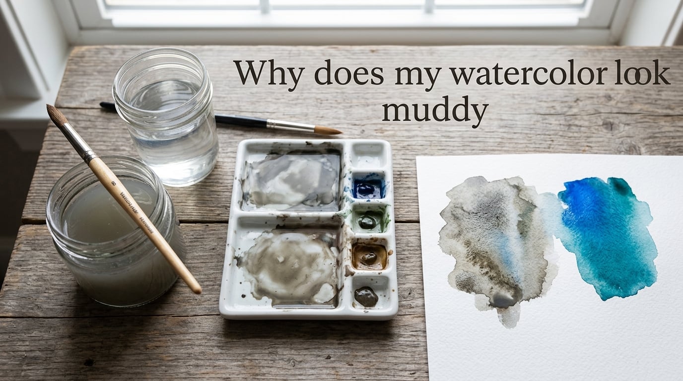
If your watercolor looks muddy, the cause is almost always one (or a combination) of these six things: mixing too many pigments at once, overworking a wet or half-dry layer, using too much water without enough pigment, working with student-grade paint, painting on cheap paper, or using dirty tools. This guide walks through each cause with a specific fix, plus a diagnostic table to match what you see on your paper to what is going wrong.
Table of Contents
Quick Answer: Why Does My Watercolor Look Muddy?
Muddy watercolor happens when pigments lose their vibrancy and shift toward dull, gray, or lifeless tones. The most common causes are mixing too many colors in one puddle, reactivating a half-dry layer, using too much water with not enough pigment, working with low-quality paint or paper, and dipping your brush into dirty water. Prevention is far easier than recovery because once a mix goes muddy, you usually cannot bring the vibrancy back.
- Mixing too many pigments — combining all three primaries (or a warm and cool of the same hue) neutralizes the color toward brown-gray.
- Overworking a layer — adding more paint to a half-dry surface lifts pigment and creates a chalky, blotchy finish.
- Dirty tools or water — one contaminated rinse tints every subsequent color in your painting.
What Does “Muddy” Actually Mean in Watercolor?
In watercolor, “muddy” means colors that have lost their vibrancy and shifted toward dull gray, brown, or chalky tones. The pigments are technically still on the paper; they have just been neutralized by mixing complementary hues, diluted too far, or smeared back into a layer that was trying to dry.
It helps to separate accidental mud from intentional neutrals. Many landscapes and portraits genuinely need soft grays, muted browns, and quiet shadow tones. When those tones come from clean pigment mixing with a clear purpose, they are useful, not muddy.
Accidental mud is different. It appears when you expected vibrancy and got a flat gray-brown instead. It usually creeps in silently during a single brushstroke rather than appearing as a deliberate mix on your palette.
Cause #1: Mixing Too Many Pigments at Once
The fastest way to make muddy watercolor is to mix three or more colors in the same puddle. Each primary pigment (red, yellow, blue) has a slight warm or cool bias, and as soon as you combine all three, they neutralize each other into a near-gray or brown. Add a fourth or fifth pigment and the puddle goes flat almost instantly.
The same problem appears even with two pigments if they sit opposite each other on the color wheel. Mixing a warm yellow with a cool purple, for example, can neutralize vibrancy the same way mixing all three primaries does.
The fix is a simple rule: mix a maximum of two pigments per puddle. If you need a third, layer it on the paper after the first two are dry. You can build surprisingly complex colors this way, and they stay luminous because each layer keeps its own identity.
Cause #2: Overworking and the Half-Dry Stage
Overworking is the single most common reason watercolor paintings end up looking dull. The pattern is familiar: a wash goes down, something is not quite right, so you “fix” it with another stroke, then another, then a tiny adjustment with the tip of the brush. By the time you stop, the surface looks chalky and the original vibrancy is gone.
The hardest moment is the half-dry stage. The surface is no longer wet, but it is not fully dry either. Touch it with a wet brush and you lift pigment instead of adding it, which creates a streaky, blotchy look that most people describe as chalky.
3 Signs You Should Put the Brush Down
- The surface has lost its shine but your finger comes away dry — that is the half-dry trap. Either rewet the entire area or leave it alone.
- You are going back to “fix” the same spot for the third time. The fix is making it worse, not better.
- The color on the paper no longer matches the color in your head. Stop, let it dry, then judge. Wet watercolor looks 20–30% darker than it will when dry.
Cause #3: Too Much Water, Not Enough Pigment
Watercolor pigment is expensive; water is free, and the imbalance shows in the painting. When you load your brush with mostly water and only a hint of color, the pigment spreads thin across the paper and dries pale and washed out. Layer a few pale washes together and you get a muddy mid-tone that has lost both the luminosity of a clean wash and the depth of a dark one.
A useful starting point is the 70/30 rule of watercolor: aim for roughly 70% pigment load to 30% water in your brush for most washes. Test on the edge of your paper first. If the stroke is so pale you have to lean in to see it, add more pigment.
Remember that watercolor lightens as it dries. A wash that looks bold and dark wet will dry 20–30% lighter. Plan for that shift rather than fighting it by adding more water later.
Cause #4: Student-Grade Paint Filled with Kaolin
Student-grade watercolor sets are tempting — they are affordable and the pans look the same as artist-grade tubes. The difference is what is inside the pan. To make a student-grade paint behave like a vivid pigment, manufacturers add fillers like kaolin (a white clay) and dextrin (a waxy binder) to stretch the pigment further. The result is paint that applies chalky, mixes dull, and never quite reaches the chroma of the same color in artist-grade form.
Common pigments that suffer most in student-grade form are the warm, opaque colors: Cadmium Yellow, Cadmium Red, Cerulean Blue, Naples Yellow, and Yellow Ochre. They start life as fairly opaque pigments, and adding filler pushes them toward mud.
You do not have to replace your whole set. A practical upgrade is to buy artist-grade versions of the three or four colors you use most — typically a transparent yellow like Quinacridone Gold, a clean red like Pyrrol Red, and a strong blue like Phthalo Blue (PB29) or Ultramarine — and keep the rest of your student set as-is.
Cause #5: Paper Quality: Wood Pulp vs Cotton
Cheap watercolor paper feels almost like regular printer paper. It buckles when wet, pills up under a brush, and dries with colors sitting on the surface instead of soaking into the fibers. Pigments that sit on the surface look chalky and lift easily — exactly the muddy look you are trying to avoid.
100% cotton paper behaves differently. The longer cotton fibers absorb water and pigment together, locking the color into the sheet. Colors stay vibrant, washes lay flat, and you can lift or glaze without destroying what is underneath.
If you are buying your first upgrade, look for paper labeled 100% cotton, cold press, 140 lb (300 gsm). Cold press has a slight texture that forgives small mistakes; 300 gsm resists buckling under most washes without stretching.
Cause #6: Dirty Palette, Dirty Brush, Dirty Water
This is the easiest cause to fix and the easiest to overlook. A single rinse of dirty water is enough to tint every color that follows. The same is true of a brush that still holds pigment from your last stroke.
The simplest habit shift is the two-jar water system. Keep one jar for rinsing dirty brushes and a second jar for clean water. Dip into the clean jar only when you are loading fresh pigment. When the rinse jar turns cloudy, swap it out.
Wipe your palette between sessions, not just at the end. Dried pigment from yesterday’s session will mix into today’s colors and dull them before you start.
Symptom-to-Cause Diagnostic Table
If you are staring at a finished painting and trying to figure out what went wrong, match what you see to the likely cause. This table is the diagnostic shortcut I wish someone had handed me in my first year of painting.
| What You See | Most Likely Cause |
|---|---|
| Chalky, dusty patches in a dry wash | Overworking / half-dry stage (you lifted pigment) |
| Flat gray-brown instead of vibrant green | You mixed all three primaries (red + blue + yellow) |
| Colors look washed out and pale | Too much water, not enough pigment |
| Streaky backruns or blooms in a wash | Dirty brush or pigment-loaded water |
| Paint pills up or sits on top of paper | Wood pulp / non-cotton paper |
| Even your best mixes look dull and lifeless | Student-grade paint with kaolin filler |
| Painting looks gray despite using “good” colors | You are judging it while it is still wet |
| Shadow areas all turn brown | You mixed complements instead of using a darker version of the base color |
Transparent vs Opaque Pigments: Why It Matters
Transparent pigments let light pass through them, bounce off the paper, and come back to your eye. That is why a clean wash of Phthalo Blue or Quinacridone Gold glows. Opaque pigments block that light, sit on the surface, and mix together into a chalky mid-tone.
As a working rule, transparent pigments mix cleanly with each other. Opaque pigments mix cleanly with each other. The trouble starts when you mix a transparent with an opaque — the opaque pigment partially covers the transparent one, and the result is muddy.
Pigments to Watch Out For
- Cadmium Yellow, Cadmium Red — opaque, warm, beautiful alone, hard in mixes.
- Naples Yellow — already contains white; adding it to anything pulls toward pastel mud.
- Cerulean Blue — famously opaque; mixes beautifully with whites but dulls vibrant colors.
- Yellow Ochre — granulating and warm, but adds visible mud to any green mix.
For clean, vibrant mixes, lean toward the transparent end of your palette: Phthalo Blue (PB29), Quinacridone Gold, Pyrrol Red, Ultramarine, and Viridian.
Value Structure: The Hidden Cause Most Beginners Miss
Sometimes a painting looks “muddy” and the colors are not actually the problem at all. What looks like mud is often a flat mid-tone with no strong darks and no clean lights. Your eye reads “no contrast” as “no vibrancy,” even when every individual color is correct.
Test this by squinting at your finished work, or by taking a black-and-white photo of it. If the grayscale image looks like one flat gray, the painting is missing value contrast. The fix is not a different pigment — it is committing to a darker dark and a lighter light somewhere in the composition.
How to Fix Muddy Watercolor: A Step-by-Step Plan
When a painting has gone muddy and you cannot recover it on the paper, the most useful response is to learn from it. The next painting will be cleaner because of what this one taught you.
- Stop and let the current layer dry completely. Touching a half-dry wash only deepens the problem.
- Identify which cause you hit. Use the diagnostic table above to match what you see to what went wrong.
- Wash your brushes and refill both water jars. A clean start removes the dirty-water variable from your next layer.
- Pre-mix your next color on the palette, not on the paper. Two pigments max, plus water, plus a test swatch on scrap paper.
- Apply the new color to a dry surface only. If the area is still damp, use a hair dryer on low to finish it, then paint.
- Judge the result when it is fully dry. Wet watercolor is misleading; give it 5–10 minutes before deciding.
- Note the cause in your sketchbook. After a few entries, you will see patterns — maybe you always mud yellows, or you overwork shadows. That pattern is your next lesson.
Build a Personal Color Chart in 3 Steps
A color chart is the single best diagnostic tool a watercolorist can own. It tells you, at a glance, which of your pigments mix cleanly and which ones drag every neighbor down with them.
- Draw a grid on a sheet of watercolor paper — a 6×6 grid is plenty. Label the rows with one pigment and the columns with another. Leave one row and one column for your pigments alone.
- Mix each pairing on the palette and paint a small swatch in the matching square. Use the same water-to-pigment ratio for each so the comparisons are honest.
- Circle the muddy mixes. Over time, you will start to recognize which pigments you personally reach for too often, and which ones combine beautifully. That knowledge is yours; no one else’s chart will match your hand.
You Will Still Create Mud Sometimes — and That Is OK
Every watercolorist, including the ones whose work you admire, makes mud sometimes. Muddy washes are not a sign you are bad at this. They are a sign you are learning where the edges are.
If you have been frustrated enough to nearly quit, that is more common than the polished Instagram posts suggest. Beginners blame themselves; experienced artists shrug, identify the cause, and start the next painting. The shift is not talent — it is having a short checklist of causes to run through when something goes wrong.
You now have that checklist. Keep it next to your palette, and give yourself the same patience you would give a friend who was learning something new.
Frequently Asked Questions
How do I fix muddy colors in painting?
Let the muddy layer dry completely, then identify the cause (overworking, too much water, mixing too many pigments, or dirty water). Wash your brushes and refill both water jars, pre-mix the next color with a maximum of two pigments, test it on scrap paper, and apply it only to a fully dry surface. Once a wash has gone muddy, you usually cannot restore vibrancy within the same painting — prevention on the next layer is faster than recovery.
How do I make my watercolor look more vibrant?
Use a higher pigment-to-water ratio in your brush (the 70/30 rule is a good starting point), limit each mix to two pigments, layer rather than blend, and switch to artist-grade versions of your three or four most-used colors. 100% cotton paper also helps — pigment absorbs into the fibers instead of sitting on the surface, which keeps washes luminous.
What are three common mistakes that people make when using watercolor?
The three most common mistakes are mixing too many pigments in one puddle (which neutralizes color toward gray-brown), overworking or reactivating a half-dry layer (which lifts pigment and creates a chalky look), and using dirty water or a dirty brush (which tints every subsequent color). All three are easy to fix once you spot them.
What is the golden rule of watercolor?
The golden rule of watercolor is that you cannot take it back. Once pigment is on the paper, removing it requires lifting — which always leaves a mark. The corollary is to work light to dark in layers, letting each layer dry before adding the next. Patience is the skill that most separates watercolor from opaque media like acrylic or oil.
Why does my watercolor painting look dull?
A dull painting usually has one of three causes: low pigment-to-water ratio (the wash is too thin), mixing three or more pigments (which neutralizes chroma), or working on non-cotton paper (which makes pigment sit on the surface). Test by photographing the work in black and white — if it looks like one flat gray, the issue is value contrast rather than color, and you need a darker dark somewhere.
Why does my watercolor look chalky?
Chalky watercolor is almost always caused by overworking — re-wetting a half-dry layer lifts pigment and leaves a dusty finish on the surface. The half-dry stage is the most dangerous moment: the surface has lost its shine but is not yet dry, and a wet brush will smear instead of blend. Wait until the layer is fully dry before going back, or commit to a hair dryer on low to finish it first.
What is the cauliflower effect in watercolor?
The cauliflower effect is the bumpy, mottled pattern that appears when pigment gathers at the edges of a wet wash as it dries. It happens when you add water or paint to an area that is already starting to dry — the new, wetter pigment pushes the existing pigment outward, and it settles in irregular rings. It can be decorative if intentional, but in a smooth wash it reads as muddy. The fix is to keep the entire wash wet until you finish the area, or wait until it is fully dry before adding more.
What is the 70/30 rule in painting?
The 70/30 rule in watercolor means roughly 70% pigment load and 30% water in your brush for most washes. It is a starting point, not a strict formula — granulating pigments and very dark passages need more pigment, while light washes need more water. Test on scrap paper before committing to the painting; if the swatch is so pale you have to lean in to see it, add more pigment.
What does rubbing alcohol do to watercolor?
Rubbing alcohol pushes wet pigment away from where it lands, creating pale, textured blooms and resist effects. It is a decorative technique, not a fix for mud — it adds interest, but it does not restore vibrancy to a wash that has already gone dull. Use it on purpose for tree foliage and snow effects; do not reach for it as a recovery move.
The Bottom Line
If your watercolor looks muddy, run through the six causes in order: too many pigments in the mix, overworking a half-dry layer, too much water with not enough pigment, student-grade paint, non-cotton paper, and dirty tools or water. Most muddy paintings come from one of these, often combined. Pick the cause, change one thing on your next painting, and watch what shifts. This is how vibrant, luminous watercolor actually gets built — one careful layer at a time.