
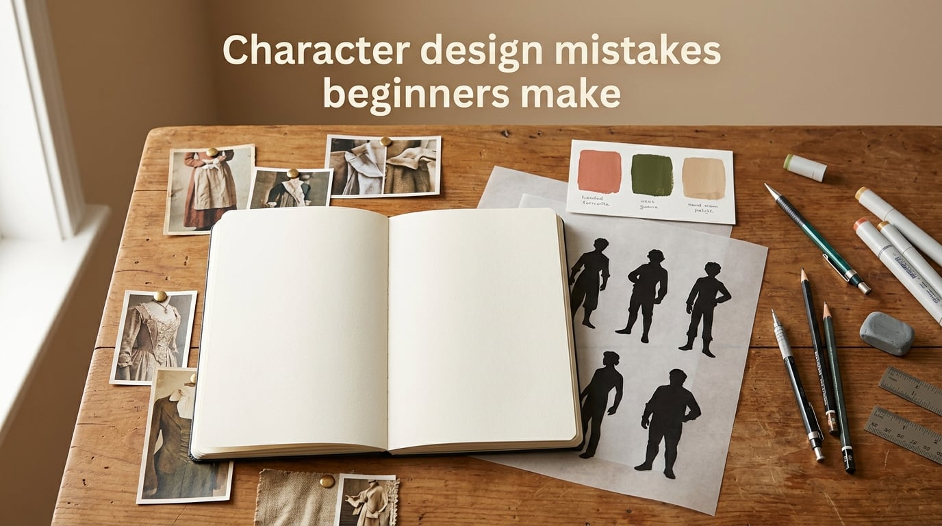
Most character design mistakes beginners make come from skipping the thinking stage and going straight to the drawing stage. I have watched dozens of new artists (and made every one of these errors myself years ago) jump into Photoshop with a vague idea and end up with a character that looks fine but feels hollow.
This guide walks through the 13 most common beginner mistakes I see in concept art, illustration, game design, and animation portfolios. For each one, I explain what it looks like, why it weakens your design, and exactly how to fix it. I have also included the 70/30 rule, a good vs bad comparison table, and a practical checklist you can use on your next character.
Table of Contents
Why Beginners Struggle With Character Design
Beginners usually struggle because they treat character design like drawing instead of like design. Drawing is about line, form, and rendering. Design is about decisions, communication, and choices that solve a problem.
Reddit’s r/learntodraw and r/ArtistLounge communities have noticed the same pattern for years: new artists obsess over rendering, anatomy details, or one signature feature and ignore the larger questions. Who is this person? What do they want? Where do they live? How do other people read them at a glance?
When those questions go unanswered, the character ends up generic. It might be technically pretty, but it has no hook. In this article I will give you a clear way to spot each common mistake and a concrete fix you can apply on your next sketch.
What Is Bad Character Design?
Bad character design is when a character fails to communicate who they are at a glance. The silhouette is muddy, the proportions look generic, the colors do not tell you anything, and the costume has no relationship to the character’s life or story.
You can usually tell a bad design by three quick tests. First, fill the character with solid black. If the resulting shape looks like a blob or a generic humanoid, the silhouette is weak. Second, squint at the design from across the room. If the colors blur into one muddy tone, the color hierarchy is missing. Third, ask a friend to guess the character’s personality after looking for five seconds. If they shrug, the design is not telling its story.
A memorable design passes all three tests. Think of Mickey Mouse, Darth Vader, or Wednesday Addams. You recognize them instantly, you know what they are about, and you can describe their personality before anyone opens their mouth.
13 Character Design Mistakes Beginners Make (With Examples)
Here are the 13 mistakes I see most often, ordered from the ones that quietly sink a design to the ones beginners usually catch on their own. Each one comes with a real example, the reason it hurts, and a fix you can apply today.
1. Weak or Unreadable Silhouette
The silhouette test is the single most useful habit a beginner can build. If you fill your character with solid black and cannot tell what they are, the design is not working yet. Many OCs (original characters) read like generic people in coats because the silhouette has no unique shape language.
Look at Sonic the Hedgehog. Even when you erase every color and line, you still see the spikes, the big shoes, and the round head. That is a strong silhouette. A weak silhouette blends into other characters in the same lineup.
How to fix it: Before you detail anything, do five thumbnail sketches that emphasize outer shape. Push one curve, exaggerate one feature, and aim for a shape that reads as this character and only this character. Then refine.
2. Skipping References and Moodboards
Beginners often treat references as cheating. They are not. They are how professional artists make informed choices. Without references, you default to generic ideas your brain already knows, which is why so many first OCs share the same hoodie, jeans, and spiky hair.
Build a moodboard on Pinterest, PureRef, or even a folder on your desktop before you start sketching. Include clothing references, color palettes, body language, environments, and one or two characters you admire. The moodboard is your decision-making shortcut later.
How to fix it: Spend 30 to 60 minutes gathering references first. Pin outfits, hairstyles, props, lighting moods, and color palettes that match the concept you have in mind. You will save hours of guessing at the sketch stage.
3. Designing Without a Backstory or Concept
A character without a backstory is just a drawing. A character with even a small backstory has built-in design choices. Where do they live? What is their job? What do they fear? Each question points you to a clothing detail, a posture, a prop.
Design Canyon and M3DS Academy both stress this point: a backstory turns random features into intentional ones. A character who grew up fishing on a cold coast wears different clothes than one raised in a desert city. The design starts to make sense.
How to fix it: Write 5 to 10 sentences about your character before you sketch. Name, age, occupation, one fear, one goal, one secret. Then pick three concrete details from that bio and put them in the design.
4. Ignoring Anatomy and Proportions
Anatomy is not about drawing every muscle. It is about knowing how the body balances, how weight sits on the feet, and how the head relates to the torso and limbs. Beginners who skip anatomy often end up with floating limbs, stiff poses, and heads that look too large or too small for the body.
You do not need a figure drawing class. You need to study basic proportions, gesture drawing, and a few construction methods (like the mannequin or the bean). Even stylized characters like those in Arcane or Steven Universe are built on real anatomy first and exaggerated after.
How to fix it: Spend two weeks doing 30-second gesture drawings from Posemy.art, Line of Action, or photo references. Then redraw your character using a loose mannequin underneath. The proportions will tighten up almost immediately.
5. Overdesigning With Too Many Details
This is the second most common character design mistake beginners make. They pile on belts, buckles, pouches, scars, tattoos, glowing eyes, armor plates, and floating particles because each idea felt cool in isolation. The result is visual noise. Nothing leads the eye.
The 70/30 rule (which I explain in detail below) is built exactly for this. Pick one feature to be the focal point and let the rest of the design support it.
How to fix it: After your sketch, remove details one by one until you cannot remove any more. Whatever survives that process is your real design. Anything you removed was decoration.
6. Weak Color Choices and No Color Hierarchy
Beginners often pick colors they personally like instead of colors that fit the character. Hot pink, neon green, and electric blue in the same design turns into a crayon box. Worse, every color screams at the same volume, so the eye has nowhere to rest.
Color hierarchy solves this. You split your palette into three roles: a dominant color (around 60 percent of the visible surface), a secondary color (around 30 percent), and one accent color (around 10 percent) that you save for the focal point. This is essentially the 70/30 rule applied to color, and it is how most professional concept art stays readable.
How to fix it: Limit your palette to four to six colors. Pick one dominant, one secondary, and one accent. Save the accent for the eyes, a logo, or one signature prop.
7. Emotionless Facial Expressions
A character with the same resting face in every sketch feels like a mannequin, not a person. Beginners often draw one neutral expression and recycle it because expressions are hard. The result is a character who never smiles, never worries, never surprises.
Expressive characters use the whole face: eyebrows, eye shape, mouth shape, head tilt, and shoulders. Even a tiny change in brow position can shift a neutral face from confident to concerned to annoyed.
How to fix it: Draw your character reacting to five emotions: joy, anger, sadness, surprise, fear. Keep them small, fast, and rough. You will start to learn which features to exaggerate and which to leave alone.
8. Stiff Poses and Body Language
A beginner character often stands facing the camera with both feet planted and arms at the sides. It is technically correct and emotionally dead. Real people shift weight, lean, gesture, and tilt their heads. So do memorable characters.
Body language carries personality before any expression appears. A slouch says tired or defeated. A cocked hip says confident. Hands in pockets say guarded. Beginners who skip body language lose half their storytelling for free.
How to fix it: Before you detail the face, block in a pose with a gesture line. Try a contrapposto stance, a slight lean, or one hand doing something. The whole drawing will feel alive even before you add any lines.
9. Designing Clothing Without Purpose
Clothing is not decoration. It is a story about who the character is, what they do, and where they live. Beginners often dress characters in whatever looks cool rather than what makes sense for the world.
Wednesday Addams wears black and white because of who she is. Darth Vader wears a helmet and cape because of what he does. A fisherman wears worn waterproofs because of where he works. Each piece of clothing carries meaning.
How to fix it: For every clothing item, ask: why does this character wear this? If you cannot answer, replace it with something that has a reason.
10. Ignoring Environment and Context
A character designed in a vacuum often looks like they were dropped into your scene from somewhere else. Beginners focus only on the figure and forget that characters belong to a world, a setting, and a story.
M3DS Academy’s mistake list specifically calls this out. The strongest characters feel like they came from somewhere. Their clothes match the climate, their props match their job, and their colors echo the environment they live in.
How to fix it: Decide where your character lives and what they do there. Reflect at least one detail from that environment in the design (a tool, a stain, a logo, a piece of jewelry, a color).
11. Forgetting the Final Medium and Production Needs
Beginners often design a beautiful character without asking how it will be used. A character meant for a 2D side-scroller needs a clear silhouette and readable colors. A character for a 3D game needs clean topology and simple shapes that will deform well. A character for a printed comic needs strong linework and shading that survives at small sizes.
Design Canyon highlights this in their list of 15 mistakes. Skipping the medium question leads to characters that look great in the artist’s portfolio but fall apart in the actual product.
How to fix it: Before you finish the design, ask: where will this character live? Animation, game, comic, illustration, 3D model. Then test your design under those conditions: shrink it down, color it flat, redraw it from the back.
12. Copying Other Artists Without Adding Your Voice
Study is essential. Imitation can teach you a lot in the short term. But if every character in your gallery reads like the same anime artist, you have not developed a voice yet. Beginners often fall into this trap because copying feels safer than inventing.
Reddit users in r/ArtistLounge often call this out. A design that depends entirely on another artist’s style is fragile. The moment you try to draw outside that style, the design falls apart.
How to fix it: Pick three artists you admire. Study their choices, not their lines. Then deliberately add one personal element to every design (a signature prop, a color habit, a shape language preference) until your own style starts to emerge.
13. Skipping Testing, Feedback, and Iteration
The single biggest beginner mistake is treating the first sketch as the final piece. Professional concept artists run a character through thumbnails, silhouettes, color tests, expression sheets, and turnaround sheets before they ever call it done. Beginners often stop at step one.
Iteration is also where feedback matters. Posting a finished character and asking does this work? is too late. Posting a thumbnail and asking which silhouette reads best? gives you useful answers.
How to fix it: Force yourself to make at least three versions of every design before you choose one. Then show those versions to peers or a community like r/ArtCrit or r/characterdesigns. Keep the versions you do not pick. They are how you learn.
The 70/30 Rule in Character Design (Explained)
The 70/30 rule in character design means that roughly 70 percent of your character’s visual identity should come from one main focal element, and the remaining 30 percent should support it without competing. This is sometimes called the focal point rule or the visual hierarchy rule.
In practice, the 70 percent is usually one signature feature: a huge sword, a dramatic hairstyle, a glowing eye, a unique silhouette, a one-of-a-kind costume piece. The 30 percent is everything else: secondary shapes, supporting colors, props, line treatment. If the 30 percent starts to compete with the 70 percent, your design feels chaotic.
Look at how this plays out in popular designs. Sora from Kingdom Hearts has the spiky hair and keyblade as his 70 percent. The outfit, shoes, and color accents are the supporting 30 percent. Remove the spiky hair and keyblade and Sora loses his identity. Remove the outfit details and he still reads as Sora.
The rule is also why overdesigned characters feel exhausting. Every detail is fighting for attention, so nothing wins. When you commit to one strong focal feature and let the rest of the design play support, the character becomes memorable.
A quick test: blur your drawing and look for the loudest shape. That is your 70 percent. If two shapes are equally loud, your design is fighting itself.
How to Avoid Character Design Mistakes: A Practical Checklist
Here is a five-step process I use with beginner artists in our community. Follow it on your next character and at least four of the 13 mistakes above will quietly disappear.
Step 1: Start With a Concept and Backstory
Write five to ten sentences about who your character is. Name, age, job, one fear, one goal, one secret. Pick three concrete details from the bio that you want the viewer to notice. These are your design anchors.
Step 2: Build a Moodboard and Reference Library
Spend 30 to 60 minutes gathering references. Pin clothing, hairstyles, props, color palettes, lighting moods, and at least one character you admire. Save them in a folder or board you can see while you sketch.
Step 3: Test Your Silhouette
Sketch five thumbnails that emphasize the outer shape. Do one with the focal feature exaggerated. Fill each with black and see which one still reads. Pick the strongest silhouette as your base.
Step 4: Apply Shape Language and Color Hierarchy
Decide whether your character is built from circles, squares, or triangles (or a mix). Choose one dominant color (about 60 percent of the surface), one secondary (around 30 percent), and one accent (around 10 percent). Save the accent for the focal point.
Step 5: Sketch, Iterate, and Get Feedback
Make at least three versions of the character. Show the thumbnails to a community, a friend, or even a sketch journal. Keep the versions you rejected. They are the fastest way to learn.
Good vs Bad Character Design: Comparison Table
This is the table I wish I had when I started. It maps each common beginner mistake to the fix that turns it around. Use it as a quick reference while you sketch.
| Common Mistake | What It Looks Like | What To Do Instead |
|---|---|---|
| Weak silhouette | Character blends into the lineup or reads as a generic blob. | Push one shape, exaggerate one feature, fill with black to test. |
| No references | Outfit, hair, and props feel random and familiar. | Build a moodboard first. Pin clothing, props, colors, mood. |
| No backstory | Pretty drawing with no personality hook. | Write a short bio, then pick three concrete details to show. |
| Ignoring anatomy | Floating limbs, awkward proportions, stiff poses. | Practice gesture drawing and use a loose mannequin under the sketch. |
| Overdesigning | Belts, buckles, scars, tattoos, armor, particles all at once. | Apply the 70/30 rule. Remove details until you cannot remove more. |
| Weak colors | Crayon-box palette with no clear focal point. | Use a 60/30/10 hierarchy with one accent saved for the focal point. |
| No expressions | One neutral face used everywhere. | Draw five emotions. Vary brow, eye, mouth, head tilt, shoulders. |
| Stiff poses | Front-facing, both feet planted, arms at sides. | Block the pose with a gesture line first. Add weight shift and lean. |
| Clothing without purpose | Outfit looks cool but says nothing about the character. | For every piece, ask why this character wears it. Replace what fails. |
| No environment fit | Character feels dropped into any scene. | Reflect one detail from the world (tool, stain, logo, color) in the design. |
| Ignoring medium | Design falls apart in animation, game, or print. | Test the design in its final use: shrink it, flat-color it, redraw the back. |
| Copying without voice | Every character feels like the same anime artist. | Study choices, not lines. Add one personal signature element each time. |
| No iteration | First sketch is treated as the final piece. | Make three versions. Get feedback on thumbnails. Keep the rejects. |
Frequently Asked Questions
What is the 70/30 rule in character design?
The 70/30 rule in character design means that roughly 70 percent of your character’s visual identity should come from one main focal feature (a signature silhouette, hairstyle, prop, or color) and the remaining 30 percent should support it without competing. This keeps the design readable and memorable instead of visually chaotic.
How can I start character design as a beginner?
Start by writing a short backstory for your character, then build a moodboard of references including clothing, props, and color palettes. Sketch five thumbnails that focus on silhouette, fill them with black to test readability, pick the strongest one, and refine with shape language, color hierarchy, and three concrete details from the backstory.
What are some common mistakes graphic designers make when designing characters?
The most common character design mistakes beginners make include weak silhouettes, skipping references, designing without a backstory, ignoring anatomy, overdesigning with too many details, weak color choices, emotionless expressions, stiff poses, clothing without purpose, ignoring the environment, and skipping iteration and feedback.
What is bad character design?
Bad character design is when a character fails to communicate who they are at a glance. The silhouette is muddy, the proportions look generic, the colors do not tell a story, and the costume has no relationship to the character’s life. The result is forgettable, hard to animate, and emotionally flat.
How do I make my character design better?
Strengthen your silhouette first, limit your palette to four to six colors with a clear 60/30/10 hierarchy, apply the 70/30 rule so one feature leads, vary expressions and body language, and make at least three versions of the design before you choose the final one. Getting feedback on thumbnails early will save hours of polishing later.
What makes a character design memorable?
Memorable designs have a strong, unique silhouette, a clear focal feature supported by the 70/30 rule, a thoughtful color hierarchy, expressions and body language that match the personality, and clothing that reflects the character’s story and environment. Think of Mickey Mouse, Darth Vader, or Wednesday Addams: each one is recognizable in a single glance.
Final Thoughts on Character Design Mistakes Beginners Make
The character design mistakes beginners make are not failures. They are signposts pointing to the skills that will level you up. Every weak silhouette teaches you shape language. Every overdesigned character teaches you the 70/30 rule. Every stiff pose teaches you gesture drawing.
Keep your old drawings. They are proof you are learning. Pick one mistake from the list above, fix it on your next character, and notice how the design gets stronger. The process compounds faster than you think.
Open your sketchbook, build a moodboard, and run the silhouette test. Your next character will already be better than your last.