
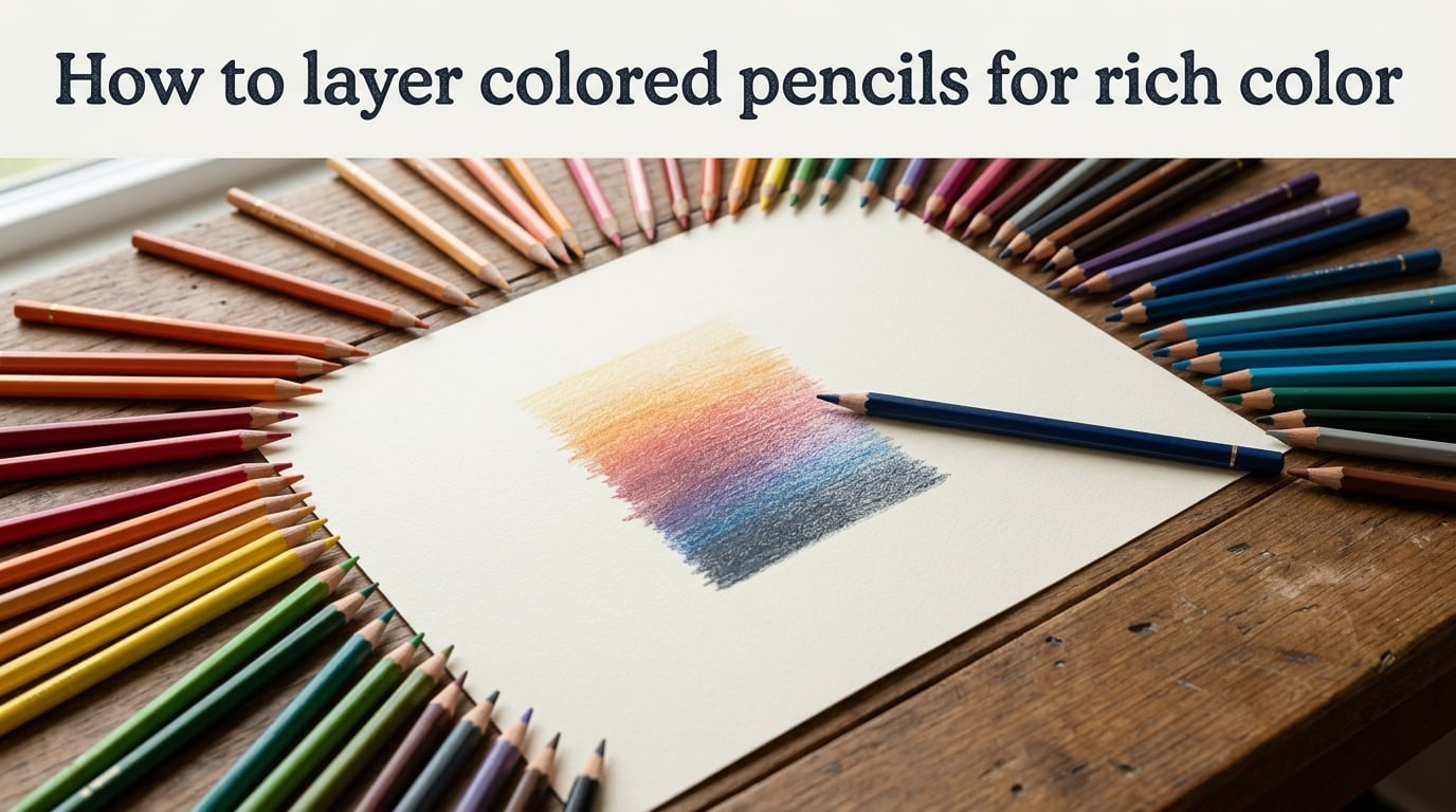
To layer colored pencils for rich color, start with a sharpened pencil and very light pressure, then build the color slowly by adding thin, transparent strokes on top of one another while leaving the paper’s tooth open. Each new layer grips onto the texture left by the last, and 4 to 8 light layers almost always produce deeper, smoother color than a single heavy pass.
I learned this the slow way. When I first picked up colored pencils, I tried to push hard and “finish” an area in one or two strokes. The result was waxy, streaky, and flat. The piece changed for me when I switched to patient, light layers and a paper with real tooth. That’s the entire secret behind rich colored pencil work, and the rest of this guide breaks down exactly how to do it.
Below, you’ll find the paper choice, pressure control, and step-by-step process I now use for every drawing, plus the mistakes that cause muddy, grainy, or streaky color (and how to fix them mid-drawing).
Table of Contents
What Is Layering in Colored Pencils?
Layering is the practice of applying many thin, transparent strokes of colored pencil one on top of another, instead of trying to reach your final color in a single heavy pass. Each layer adds a small amount of pigment, and your eye blends the stacked colors into a single, richer color when you step back.
The opposite of layering is pressing hard once and hoping for the best. That approach fills the paper’s tooth almost immediately, leaves a waxy film on top, and stops accepting more pigment. Once the tooth is full, no amount of extra color will deepen the result.
This is why layering is the foundation of realistic colored pencil art. A single heavy stroke gives flat, dull color. Layered strokes let you adjust value (how light or dark), temperature (warm or cool), and saturation (how vivid or muted) gradually, almost like tuning an instrument.
One sentence I keep coming back to, from a thread on r/ColoredPencils, is this: “Layering is the first most important skill. Many lightly applied layers will get you to dark brown skin.” That single line captures the whole mindset shift.
Why Paper Tooth Matters When You Layer Colored Pencils
Paper tooth is the tiny texture or grain you feel on the surface of drawing paper. Smooth papers have very little tooth. Textured papers have a lot. When you layer colored pencils, that tooth is what physically holds the pigment, and how much of it your paper has determines how many layers you can lay down before the surface “fills up” and refuses more color.
A smooth paper like Bristol Smooth has just enough tooth for 3 to 4 light layers before the surface starts looking waxy. A mid-tooth paper like Stonehenge gives you 5 to 7 layers with breathing room. A heavily textured paper like Pastelmat or UART sanded paper can take 8 to 12 layers because there is simply more texture to grip pigment into.
Reddit artists repeatedly call this out. Paper choice is often named as more important than pencil brand for layering success. If your layers look streaky or waxy after only a few passes, the paper is almost always the bottleneck, not the pencil.
Quick Comparison: Paper Types for Layering
- Bristol Smooth: very smooth, limited tooth, best for 3-4 light layers, fine detail work, and crisp lines.
- Bristol Vellum: a touch more tooth than smooth, a good all-rounder for portraits and illustrations.
- Stonehenge: warm-white, mid-tooth, takes 5-7 layers well, my default recommendation for beginners learning layering.
- Pastelmat: heavily textured, holds 8-12 layers, great for fur, foliage, and atmospheric skies, but pencils wear down fast on it.
- Hot pressed watercolour paper: smoother than cold pressed, takes 5-8 layers, slight grain shows through in finished work.
For your first layering experiments, Stonehenge or Bristol Vellum will give you the most forgiving surface. Save Pastelmat for when you already understand light pressure.
Pressure Control: Why Light Pressure Comes First
If you remember only one rule from this guide, make it this one: light pressure first, more layers later. Heavier pressure is reserved for the final stages, never the early ones.
Heavy pressure early is the single fastest way to ruin a layering project. It crushes the paper’s tooth flat before you’ve built any color, and once the tooth is gone, no amount of additional pigment will stick. Beginners often interpret “more color” as “press harder,” when the opposite is true. More color comes from more layers, not more force.
A pressure bar is the easiest way to feel this. On a scrap piece of paper, draw the same color in five small boxes: feather-light, light, medium, heavy, and very heavy. You’ll notice that the medium and heavy boxes look darker in the moment, but they have almost no tooth left. Try adding a second layer of the same color on top of each box. The light and feather-light boxes will accept new pigment; the heavy ones will skip and streak.
Keep these pressure principles in mind as you work:
- Keep your pencil sharp. A sharp point lays down a thin, even layer. A blunt tip pushes pigment into the tooth unevenly and creates that “grainy, speckled” look beginners complain about.
- Use the side of a sharp lead for broad, even coverage rather than the point.
- Build with light layers first, and only switch to heavier pressure in the final 1 to 2 layers (often when burnishing).
- Let your hand stay relaxed. Grip tension almost always translates into too much pressure.
How to Layer Colored Pencils in 5 Steps
This is the core process I use for almost every subject. Follow these five steps in order, and your layers will look richer and more controlled than one-stroke attempts ever do.
- Plan your color order before you touch the paper. Decide which 2 to 4 colors you will use and roughly in what sequence. Light to dark is the standard rule, and you’ll learn why in step 3.
- Lay down a thin base layer with very light pressure. Use the lightest color in your plan. Cover the entire area with a single, transparent pass. You should still see white paper through this layer.
- Add mid-tone layers, still light, working in the same direction or in small circles. Each new layer adds pigment without crushing the tooth. Two to four mid-tone layers is typical at this stage.
- Introduce darker accents and complementary shadows last. Use a darker version of your base color, or the complementary color (opposite on the color wheel) for shadows instead of black. Stay light until the very end.
- Burnish only at the very end if you want a smooth, polished surface. Burnishing is the final compression step, not a layering technique. Use a colorless blender, a light pencil, or a white pencil to push the pigment into the tooth.
For a sphere, expect to use 5 to 7 layers total. For a deep red apple or a dark fur texture, 7 to 10 layers is normal. The trick is patience. A realistic colored pencil piece often takes many sessions of layered building. That timeline is part of the medium, not a sign you’re slow.
Light-to-Dark vs Dark-to-Light: Which Order Is Correct?
The standard answer is light to dark, and that’s what you’ll use 90% of the time. Start with your lightest color, build to mid-tones, finish with darkest accents. The reason is simple: light layers on top of dark layers have no tooth left to grip, so they look chalky and refuse to blend.
There is one exception. Underpainting (sometimes called a “dark base”) is a deliberate technique where you lay down a dark layer first, then build lighter colors on top. Some artists use this for portraits and dramatic skies. If you’re a beginner, stick with light-to-dark until your layering is consistent, then experiment with underpainting later.
Optical Mixing: Building New Colors Through Layers
Optical mixing is what happens when you layer two different colors on top of each other and your eye fuses them into a third color. A blue stroke over a yellow stroke reads as green, even though there is no green pencil in the picture. This is how colored pencil artists create hundreds of subtle color variations from a small set of pencils.
The biggest advantage of optical mixing is that it lets you tune temperature and value without buying more pencils. A cool shadow on a warm orange can be built from a thin layer of blue over orange. A warmer shadow on a cool blue surface can be built from a thin layer of orange over blue. The result is far more lifelike than dropping in black.
Complementary colors (colors opposite on the color wheel) are the most powerful version of optical mixing. The classic pairs are magenta and green, cyan and orange-red, and yellow and violet-blue. Use the complementary to add depth and shadow rather than black, and your colors will stay vivid instead of dull.
A simple exercise: draw two small swatches. In the first, lay down orange and add black for the shadow. In the second, lay down orange and add a touch of blue for the shadow. The second swatch will look noticeably richer and more alive. That’s complementary shadowing in action.
Wax-Based vs Oil-Based Pencils: How They Layer Differently
The binder inside a colored pencil changes how it layers. Wax-based pencils (Prismacolor Premier, Derwent Chromaflow, Caran d’Ache Luminance) feel soft and creamy. Oil-based pencils (Faber-Castell Polychromos, Caran d’Ache Pablo, Derwent Lightfast) feel firmer and drier. Neither is “better,” but they behave differently during layering.
Wax-based pencils lay down pigment fast and fill the paper’s tooth quickly. This is great for smooth, saturated color in fewer layers, but it’s also why wax pencils go muddy faster if you overwork them. Oil-based pencils need more layers to reach deep saturation, but they hold their tooth longer and reward patient building. Beginners often blame the pencil for muddy color, when the real issue is too many wax-based layers on already-filled tooth.
If your layers are going muddy after only 3 or 4 passes, try switching to an oil-based pencil. If your layers look chalky or won’t build, try a softer wax-based pencil. Most serious artists keep both types in their kit for this reason.
Why Your Colors Go Muddy (and How to Fix Them)
Muddy color is the most common frustration beginners describe on r/ColoredPencils. The colors turn dull, grayish, or just “wrong.” Almost every muddy layer comes from one of three causes.
Cause 1: Too many pencils at once. When you grab five or six colors and mix them all in the same area, the result drifts toward neutral gray. Pick 2 to 4 colors per area and stick with them. The mix will read as one intentional color, not a gray-brown haze.
Cause 2: Pressing too hard, too early. Heavy pressure fills the tooth before the color is built. The remaining pigment sits on a wax film instead of sinking in, and any new layer smears the old one. Drop your pressure and add more light layers instead.
Cause 3: Using black for shadows. Black kills color. Reach for the complementary color of your base instead. If you need a darker shadow on red, use a touch of green. If you need a darker shadow on yellow, use a touch of violet-blue. The shadow will look richer and more natural.
How to Fix a Muddy Area Mid-Drawing
If you’ve already gone muddy, don’t panic. Lightly lift pigment with a clean kneaded eraser. The eraser grabs surface wax and softens the haze without ripping the paper. Then re-establish a thin, light base layer in your dominant color, and rebuild from there with 1 to 2 careful mid-tone layers.
If the area is severely overworked, the cleanest fix is to stop and start that section on a fresh piece of paper. Most artists throw away more rough pieces than they ever finish, and that is normal.
How Many Layers of Colored Pencil Is Enough?
This is the question Reddit asks over and over, and most blog tutorials dodge it. The honest answer is that the number depends on your paper and your color, but there is a useful working range.
Most finished colored pencil drawings use 4 to 8 layers per area. Light colors on smooth paper may only need 3 to 4. Deep, saturated colors on textured paper often need 6 to 10. More than 10 layers on the same spot is a warning sign that the tooth is full and further work will go muddy.
Visually, you’re done layering when the paper tooth is fully covered but still has a slight texture. If the area starts to look shiny, waxy, or smooth like plastic, you’ve gone too far. If you can still see white specks, you need one more light pass.
Use this rough guide:
- Highlights: 1 to 2 layers, often just a touch of color or a preserved white area.
- Mid-tones: 3 to 5 layers, your main color work.
- Shadows: 5 to 8 layers, including complementary shadow color.
- Deepest accents: 8 to 10 layers, finished with a light burnish.
Frequently Asked Questions
How do you layer colored pencils effectively?
Layer colored pencils effectively by starting with a sharp pencil and very light pressure, then building thin, transparent layers on top of one another. Plan your color order light to dark, leave the paper’s tooth open between layers, and use 4 to 8 layers per area before burnishing at the end.
How do you burnish colored pencils?
Burnishing is the final step of layering, not a layering technique itself. To burnish, use a colorless blender pencil, a white pencil, or your lightest color with firm pressure to push the pigment into the paper’s tooth. This compresses the layers into a smooth, polished surface.
How do you properly blend colored pencils?
To properly blend colored pencils, lay down your colors first as light, separate layers. Then use a colorless blender pencil or a light, dry stroke of a matching pencil to softly merge the edges. Blending moves pigment around; layering builds color. They work best together.
What is the difference between a blending pencil and a burnishing pencil?
A blending pencil moves pigment across the paper to soften transitions between colors. A burnishing pencil compresses existing layers flat into the tooth for a polished finish. Blending happens mid-drawing. Burnishing happens at the very end.
How many layers of colored pencil should you use?
Most finished drawings use 4 to 8 layers per area. Light colors on smooth paper may only need 3 to 4 layers, while deep saturated colors on textured paper often need 6 to 10. Stop when the paper tooth is covered but still has slight texture; a shiny, waxy surface means you have gone too far.
In which order should you layer colored pencils?
Layer colored pencils light to dark almost every time. Start with your lightest version of the dominant color, build up with mid-tones, and finish with the darkest accents. Use the complementary color on the color wheel for shadows instead of black.
How do you avoid muddy colors when layering colored pencils?
Avoid muddy colors by limiting yourself to 2 to 4 pencils per area, keeping pressure light until the final layers, and using complementary colors for shadows rather than black. If color goes muddy mid-drawing, lift pigment with a kneaded eraser and rebuild from a thin base layer.
What paper is best for layering colored pencils?
Stonehenge is the best paper for most beginners learning to layer because its mid-tooth surface accepts 5 to 7 light layers without filling too quickly. Bristol Vellum is a slightly smoother alternative. Pastelmat and UART sanded paper take 8 to 12 layers and are best once you have light-pressure control.
Putting It All Together
Learning how to layer colored pencils for rich color is really about three habits: light pressure, patient building, and complementary shadows. Once those three are in place, almost every other technique (burnishing, blending, optical mixing) becomes a refinement rather than a struggle.
Try this 10-minute practice exercise to lock the ideas in. On a scrap of Stonehenge or Bristol, draw a 2-inch square. Pick one color (a yellow-orange works well for beginners). Lay down a feather-light base layer covering the whole square. Add 4 more light layers of the same color, each one slightly firmer than the last. Then, in just the lower-right corner, layer in a touch of blue (the complementary). You should see a clear shift from flat yellow-orange to a richer, dimensional orange-blue, and that single square will teach you more about layering than an hour of theory.
The first few drawings will still go a bit muddy or grainy. That’s normal. Every experienced colored pencil artist has thrown away the same number of practice pieces. Keep the pressure light, keep the color count small, and let the layers do the work. Rich color is built, not pressed.