
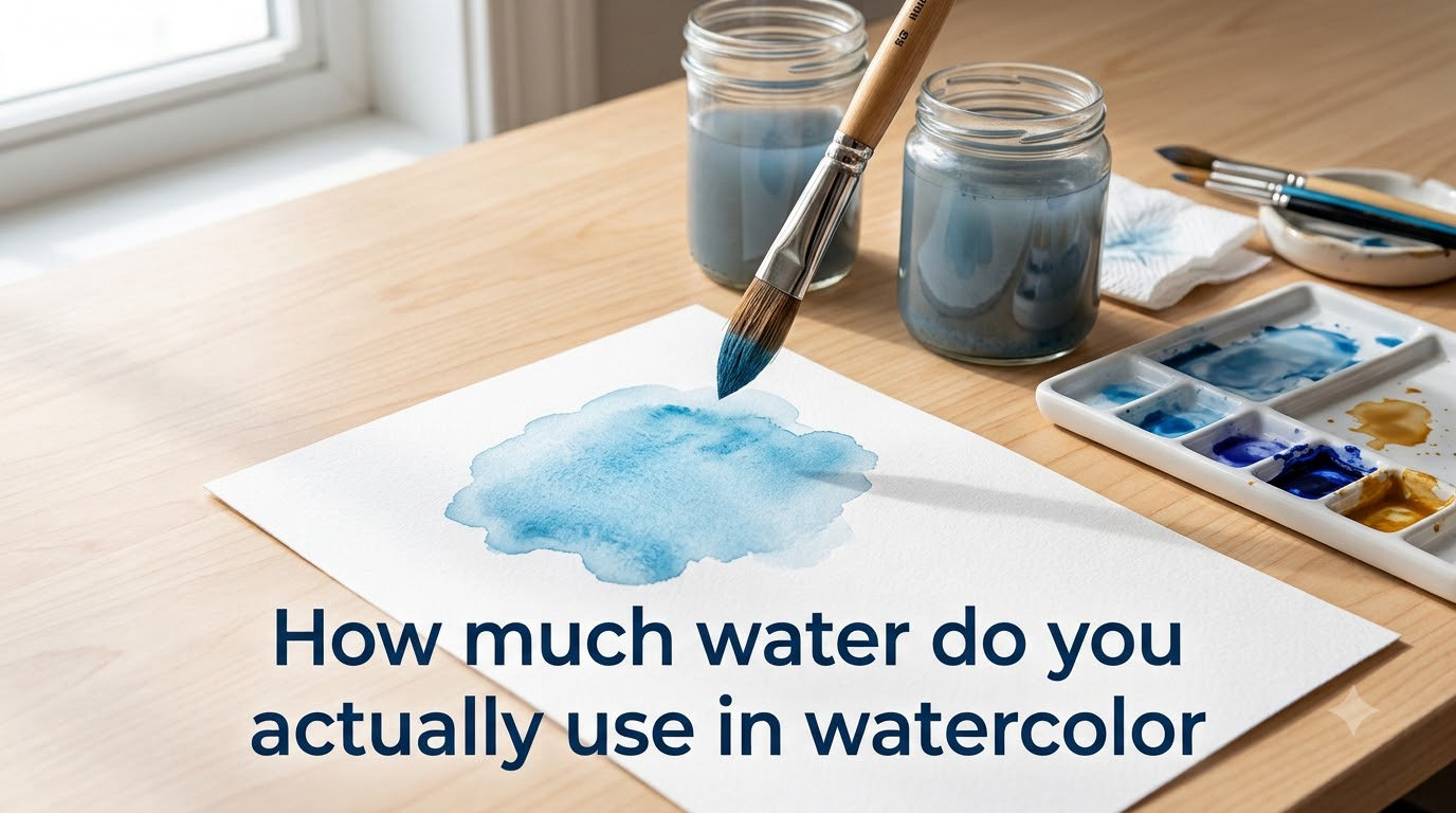
Water is the single most important tool in watercolor painting, yet most beginners have no idea how much to actually use. The short answer: more than you think. Most watercolor mixes sit somewhere between tea and milk consistency, using roughly equal parts paint and water. The ratio you choose controls everything from value to transparency to flow.
I’ve spent years teaching watercolor workshops, and the question I hear most is “how much water do you actually use in watercolor?” The answer depends on what effect you want, what paper you’re on, and which stage of the painting you’re in. This guide breaks it all down so you can mix with confidence.
Table of Contents
The Golden Rule: More Water Than You Think
If you take one thing away from this article, let it be this: watercolor needs more water than most beginners expect. A common frustration on Reddit’s r/watercolor101 is painters who add water drop by drop and end up with streaky, patchy marks. The fix is almost always “add more water.”
Watercolor paint is dry pigment suspended in a gum arabic binder. It only becomes paint when you add water. Unlike acrylics or oils, water has no white pigment to lighten colors — water IS your only tool for controlling value and transparency.
A good starting point for general-purpose painting is a roughly 1:1 ratio of paint to water. But the real skill is learning to adjust that ratio on the fly. Some layers need thin, watery washes. Others need thick, concentrated pigment. Learning to see which consistency you need — and mixing it reliably — is the foundation of watercolor mastery.
The Tea-to-Butter Consistency Framework
The most practical way to think about water-to-paint ratio is the consistency framework popularized by Joseph Zbukvic. He describes four levels, each named after a familiar liquid. I use this framework in every painting session, and it’s the clearest mental model I’ve found.
Tea consistency is mostly water with a hint of pigment. It’s thin, flows freely, and dries very light. This is your wash and sky layer — use it for your first pass over large areas. Think roughly 1 part paint to 4 or 5 parts water.
Milk consistency is the workhorse of watercolor. It’s balanced — you can see the color clearly, but it still flows smoothly off the brush. This is where most of your painting happens. Approximate ratio: 1 part paint to 2 parts water.
Cream consistency is thicker, with visible pigment concentration. It holds its shape on the paper and doesn’t flow as freely. Use it for mid-tones, building layers, and wet-on-dry glazing. Ratio: about 2 parts paint to 1 part water.
Butter consistency is nearly undiluted pigment. It’s thick, opaque (for watercolor), and holds hard edges. Reserve it for your darkest darks, fine details, and final accents. Ratio: mostly paint with just enough water to make it brushable.
Here’s how I think about it in practice: start your painting with tea or milk consistency for the background and large shapes. Build up to cream for mid-tones. Save butter for the last 10% — the details and shadows that make the painting pop.
When to Use Each Consistency
Knowing the four levels is one thing. Knowing when to reach for each is where the real skill lives. Here’s how I match consistency to painting stage:
Base layers and skies: Tea consistency. You want the paint to spread evenly across damp paper, creating soft, luminous washes. A wet-on-wet technique with tea-consistency paint gives you those ethereal sky blends that watercolor is famous for.
Mid-tones and building form: Milk consistency. This is your main working mix for the bulk of the painting. It’s versatile enough to blend into wet areas or hold its shape on dry paper. Most of your painting time happens at this level.
Details and shadows: Cream consistency. When you need the paint to stay where you put it without bleeding, cream gives you control. It’s ideal for glazing — layering thin coats of color over dried layers to build depth.
Darks and fine lines: Butter consistency. Your darkest values and sharpest details come from thick, concentrated pigment. A round brush loaded with butter-consistency paint can lay down crisp lines for branches, eyelashes, or architectural details.
One tip that helped me: mix one shade darker than you think you need. The drying shift (more on that below) will lighten everything by roughly 20-30% once the water evaporates.
Troubleshooting: Signs You Have the Water Ratio Wrong
Most beginner frustration comes from an incorrect water ratio. Here’s how to diagnose what’s happening and fix it:
Too Much Water
Puddles and pooling: If your paint forms puddles that sit on top of the paper, you’ve overloaded the brush. Tilt the paper slightly or wick excess water off with a thirsty brush (a dry brush touched to the puddle edge).
Blooms and backruns: Those cauliflower-shaped marks that appear when a wet area pushes into a drying one? That’s excess water migrating. Wait for the surface to lose its shine before adding a nearby wash, or work on the whole area at once.
Hard edges around washes: When a puddle dries, the pigment concentrates at the edge, creating a harsh ring. To prevent this, soften edges with a clean, damp brush while the wash is still wet, or work on damp paper.
Too Little Water
Streaky, patchy application: If your brush drags across the paper leaving uneven, dry-looking strokes, there’s not enough water in the mix. Add water gradually until the paint flows smoothly without resistance.
Jagged brush strokes: A dry brush catches on the paper texture, creating scratchy marks. Reload your brush with more water. If it happens mid-stroke, your brush ran dry — dip back into the palette before continuing.
Dull, chalky appearance: Paint applied too thickly dries matte and lifeless. Watercolor’s beauty comes from transparency. If you can’t see the paper through your paint, thin the mix with more water.
The Quick Fix
When in doubt, test your mix on a scrap of the same paper before committing it to your painting. Look for the “shimmer” — a slight glossy sheen on the paper surface indicates the right amount of moisture. If it’s matte and dragging, add water. If it’s puddling and pooling, wick some off.
What Changes How Much Water You Need
Your water ratio isn’t just about the paint — the surface, tools, and pigment type all play a role.
Paper Type
Cotton paper absorbs water slowly and holds it longer, giving you more working time. You can use wetter mixes without the paper buckling or the paint drying too fast. 100% cotton papers like Arches or Fabriano Artistico are forgiving for beginners learning water control.
Cellulose paper absorbs water faster and dries quicker. Your window for blending is shorter, and the paper can pill if you scrub too much. With cellulose, you’ll need to work faster and use slightly less water to avoid buckling.
Cold press vs rough vs hot press: Cold press (the most popular) holds water in its textured surface. Rough paper catches even more, requiring slightly wetter mixes. Hot press is smooth and lets water bead up, so you’ll need to work with less water or pre-wet the surface.
Brush Size and Type
A large mop brush holds far more water than a size 4 round. When switching from a big brush to a detail brush, you’ll need to adjust your mix — a smaller brush dries out faster and may need a slightly wetter consistency to maintain flow.
Water-tank brushes (the kind with a reservoir in the handle) deliver a steady stream of water. They can be useful for plein air painting, but many artists find they oversaturate the mix. I prefer traditional brushes where I have direct control over water pickup.
Pan vs Tube Paint
Pan paints need to be activated before use. Swirl a damp brush on the pan surface for 10-15 seconds until you see pigment loading onto the bristles. You’ll use more water upfront to rehydrate the dry paint. Some artists spray their pans with water a few minutes before painting to pre-soften them.
Tube paints come pre-mixed with moisture. Squeeze a small amount onto your palette and add water from there. Tubes give you more control over the starting consistency because the pigment is already activated.
Pigment Strength
Not all pigments behave the same. Strong, staining pigments like phthalo blue or quinacridone rose are intensely concentrated — you need very little paint relative to water. Earth tones like raw umber or yellow ochre are gentler and may need a higher pigment-to-water ratio to achieve the same intensity.
The Drying Shift: Why Your Painting Looks Lighter Than Expected
One of the most disorienting beginner experiences is watching your vibrant wet painting dry 20-30% lighter. This is called the drying shift, and it’s completely normal.
When water evaporates from your mix, the pigment particles settle into the paper fibers in a thinner layer than what you saw when the surface was wet. The paper’s white shows through more, and the color appears lighter and more transparent.
The practical implication: always mix one value step darker than your target. If you want a mid-tone sky, mix it at cream consistency, not milk. If you want a rich shadow, go butter, not cream.
You can check your value by tilting the painting and looking at the wet surface from an angle. If the wet paint looks like your target value, it will dry lighter. Some artists test on scrap paper, let it dry for 30 seconds, and check the result before committing to the full painting.
This is also why the “tea-to-butter” framework matters for water planning. If you know your tea-consistency wash will dry 25% lighter, you’ll use it for very light values only. Milk becomes your mid-tone. Cream handles your darker mid-tones. Butter delivers the darks that hold up after drying.
The Two-Cups-of-Water Habit
Most experienced watercolorists use two cups of water: one for rinsing dirty brushes (the “dirty” cup) and one for clean water used in mixes (the “clean” cup). This habit prevents muddy colors — the number one complaint among beginners.
When you rinse a brush loaded with blue paint in your water cup, that water turns blue. If you then use that same water to mix a yellow wash, you get green instead of clean yellow. The two-cup system keeps your clean water pristine.
Some artists color-code their cups: a warm side (reds, oranges, yellows) and a cool side (blues, greens, purples). This prevents warm-cool contamination in the palette. It’s an extra step, but it’s worth it — muddy mixes from dirty water are the most common cause of dull, lifeless paintings.
Refill your clean water cup whenever it starts to look cloudy. In a two-hour painting session, I typically refill 3-4 times. Keep a full pitcher nearby so you’re never tempted to use dirty water because the clean cup ran out.
Frequently Asked Questions
What is the golden rule of watercolor?
The golden rule is to use more water than you think you need. Most watercolor painting happens at milk consistency, roughly equal parts paint and water. Beginners almost always use too little water, which causes streaky, patchy results.
What happens if I use too much water in watercolor?
Too much water causes puddles, blooms (cauliflower-shaped marks where wet paint pushes into drying areas), and hard edges around dried washes. The paint becomes too transparent and loses pigment intensity. Fix it by wicking excess water with a thirsty brush or tilting the paper to drain puddles.
How do I make my watercolor paint more vibrant?
Use less water in your mix. Vibrant colors come from higher pigment concentration — cream or butter consistency rather than tea. Also use 100% cotton paper, which holds pigment better than cellulose, and avoid over-mixing on the palette, which can muddy your colors.
What is the ideal ratio of water to paint when painting with watercolor?
There is no single ideal ratio because it depends on the effect you want. Tea consistency (1:5 paint to water) works for light washes. Milk (1:2) is the general-purpose workhorse. Cream (2:1) handles mid-tones and glazing. Butter (mostly paint) delivers darks and details. Start with milk and adjust from there.
Why does my watercolor look streaky?
Streaky watercolor is almost always caused by too little water in the mix. The brush drags across the paper texture, leaving uneven marks. Add more water until the paint flows smoothly, and reload your brush before it runs dry mid-stroke. Using cotton paper also helps because it absorbs more evenly than cellulose.
What are three common mistakes beginners make with watercolor?
First, using too little water, which causes streaky, patchy marks. Second, using dirty rinse water, which muddies every mix. Third, not accounting for the drying shift — wet paint looks 20-30% darker than it will dry, so beginners end up with paintings that look washed out.
Conclusion
Understanding how much water to use in watercolor is the foundation of every technique you’ll ever learn. Start with the tea-to-butter framework, test your mixes on scrap paper, and keep two cups of clean water on hand. The more you practice, the more intuitive your water control becomes — and that’s when watercolor starts feeling less like a struggle and more like magic.