
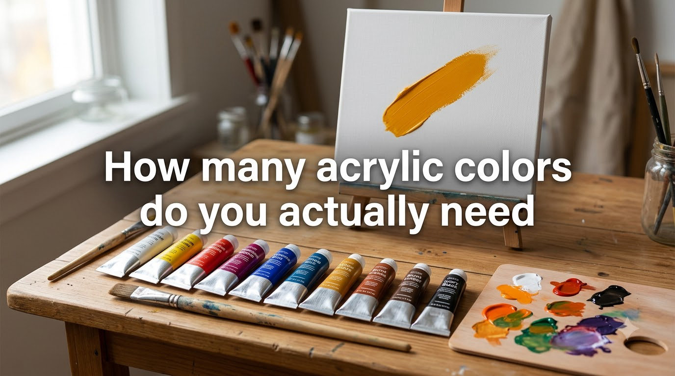
You need just 5 to 7 acrylic paint colors to mix nearly any color you want, and starting with a smaller palette actually makes you a better painter. After working through hundreds of beginner questions on Reddit and seeing the same frustration surface again and again, our team keeps landing on the same conclusion: most new acrylic painters buy too many colors, then spend years unlearning bad mixing habits.
If you have ever stared at a wall of paint tubes in an art store and felt overwhelmed, this guide is for you. We will walk through exactly how many acrylic colors you actually need, which specific tubes to put in your basket, and why a limited palette will outperform a 64-color starter kit every time.
Table of Contents
The Short Answer: 5 to 7 Colors Is All You Need
For most acrylic painters, especially beginners, 5 to 7 colors is the practical answer. That core palette typically looks like this:
- Titanium white
- Warm yellow (such as cadmium yellow medium or yellow oxide)
- Cool yellow (such as lemon yellow or cadmium yellow light)
- Warm red (such as cadmium red medium)
- Cool red (such as quinacridone magenta or alizarin crimson)
- Warm blue (such as ultramarine blue)
- Cool blue (such as phthalo blue)
With those seven tubes plus white, you can mix vibrant oranges, rich purples, deep greens, soft peaches, atmospheric grays, and convincing skin tones. Add burnt umber as an eighth color and you can knock out near-black mixtures without ever touching a black tube.
You might be wondering: what about the 12-color or 24-color sets sold everywhere online? Those prepackaged palettes are built for convenience, not learning. They will not teach you color theory, and they will leave you with muddy mixes when you try to combine similar colors that are not designed to play well together.
Your Core Acrylic Palette Explained
Let us break down why each of these colors earns a spot in your starter kit.
Titanium White
White is the workhorse of acrylic painting. You will use more white than any other color because it lightens values, softens mixtures, and creates the highlights that bring paintings to life. Titanium white has strong tinting strength and a slightly cool cast, which makes it ideal for mixing sky tones and cool grays.
Warm Yellow
A warm yellow like cadmium yellow medium or yellow oxide brings sunshine, autumn leaves, and golden hour light. Yellow oxide also doubles as an earth tone, which means it pulls double duty in landscape and portrait work.
Cool Yellow
Lemon yellow or cadmium yellow light is your cool counterpart. Mixing it with cool blue gives you clean, electric greens for foliage. Mixing it with cool red produces sunny pinks and warm corals. Without a cool yellow, your greens will lean muddy and your highlights will feel flat.
Warm Red
Cadmium red medium is the classic warm red. It mixes with your warm yellow to make bright orange, with your cool blue to make rich violets, and with white to make glowing skin tones. Warm reds also anchor shadow areas in portraits and still lifes.
Cool Red
Quinacridone magenta or alizarin crimson handles the cool side. These reds lean toward purple, making them perfect for shadows, distant landscapes, and rosy skin undertones. A cool red also mixes the most believable purples when combined with ultramarine blue.
Warm Blue
Ultramarine blue is the quintessential warm blue, despite the confusing name. It leans toward violet, mixes gorgeous purples, and creates the darkest darks when combined with burnt umber. It is also one of the most useful blues for painting skies and shadows.
Cool Blue
Phthalo blue (sometimes called Winsor blue or monastral blue) sits on the green side of the color wheel. Mixing it with lemon yellow creates clean, intense greens. Mixing it with white produces luminous turquoise water and cool atmospheric tones.
Burnt Umber (Optional Eighth Color)
Burnt umber is the secret weapon of countless experienced painters. Mix it with ultramarine blue and you get a deep, rich near-black that beats anything out of a tube. Mix it with white and you create warm grays for portrait shadows. Add it to any mixture to instantly ground the color and reduce chroma.
Understanding Color Bias: Why Warm and Cool Primaries Matter
Color bias is the tendency of any color to lean warm or cool, even within the same family. Two yellows might both look yellow at first glance, but one pulls toward orange and the other toward green. That subtle difference is what separates clean color mixing from muddy color mixing.
This is the concept Will Kemp and Michael Wilcox have spent years teaching, and it is the single biggest unlock for beginners struggling with their palettes.
Masstone vs Undertone
Every acrylic paint has two personalities. The masstone is the color you see when the paint is applied thick and undiluted. The undertone is the color revealed when you spread the paint thin, mix it with white, or layer it as a glaze.
A yellow with a green masstone and a yellow undertone is a cool yellow. A yellow with an orange masstone and a yellow undertone is a warm yellow. These two versions of each primary are not redundant. They are tools for different jobs, and having both is what lets you mix the entire spectrum.
Why One Primary Is Never Enough
A pure theoretical primary red, blue, or yellow does not actually exist in real paint tubes. Every manufactured paint has a bias, which means every color you mix with a single set of primaries will lean one direction or the other. If you only own one red, you can never make a clean purple because your red is already pulling away from blue.
Owning warm and cool versions of each primary gives you access to both sides of every secondary. A warm yellow plus a cool blue makes vibrant green. A cool yellow plus a warm red makes hot pink. That kind of range is impossible with a single primary set.
Quick Reference: Warm vs Cool Pairs
- Warm yellow: cadmium yellow medium, yellow oxide, Naples yellow
- Cool yellow: lemon yellow, cadmium yellow light, Hansa yellow light
- Warm red: cadmium red medium, cadmium red light, vermilion
- Cool red: quinacridone magenta, alizarin crimson permanent, carmine
- Warm blue: ultramarine blue, cobalt blue, French ultramarine
- Cool blue: phthalo blue, cerulean blue, manganese blue
Progressive Palette Guide: 3, 5, 7, and 10+ Colors
How many acrylic colors you need depends on where you are in your painting journey. Here is how palette size scales with skill and ambition.
Three Colors: The Minimalist Approach
The legendary Swedish painter Anders Zorn built a career using just four colors: yellow ochre, cadmium red, ivory black, and titanium white. The three-color version of that idea is often called the Zorn palette or the limited palette exercise. Pick one warm yellow, one warm red, one warm blue, plus white and you can complete entire paintings.
Three colors is a great starting exercise because it forces you to mix every color from scratch. It also exposes your weaknesses. If your shadows look muddy, it is not because you have the wrong tube. It is because you have not learned how warm primaries behave in mixtures.
Five Colors: The Beginner Sweet Spot
Five colors is where most beginners should land. Add burnt umber to the three-color setup and you suddenly have access to believable skin tones, organic earth colors, and convincing darks. This is the setup Will Kemp recommends for painters who want to learn color theory without getting tangled up in tube inventory.
Seven Colors: The Confident Painter
Once you can mix confidently with five colors, add the cool counterparts. Swap your single yellow for warm plus cool, your single red for warm plus cool, and your single blue for warm plus cool. That brings you to the full seven-color palette described earlier in this guide.
Seven colors opens up mixing possibilities you could not reach before. Now you can make both vibrant and muted versions of every secondary, which means your paintings will have more depth, more atmosphere, and more believable light.
Ten or More Colors: Specialized Palettes
Advanced painters often build palettes around a specific subject. Portrait painters reach for earth tones like burnt sienna and raw umber, plus a flesh-friendly red like cadmium red light. Landscape painters add sap green and chromium oxide green for foliage. Still life painters lean on paynes gray and neutral grays to quiet down backgrounds.
Once you reach ten or twelve tubes, you are no longer building a foundation. You are curating a specialty kit. At that stage, every color should earn its place. If a tube has not been squeezed in two months, it is probably time to swap it for something more useful.
Common Beginner Mistakes to Avoid
After reading hundreds of Reddit threads and forum discussions, our team noticed the same handful of mistakes showing up again and again. Here is what to skip on your first trip to the art store.
Buying a 64-Color Beginner Kit
The huge prepackaged sets feel like a bargain, but they are usually loaded with similar versions of the same color plus cheap fillers like fluorescent pink and metallic gold. Many beginner painters report opening a 64-color set, feeling excited, then realizing they still cannot mix a convincing green.
One Reddit user put it perfectly: they retired their 64-color beginner kit and started over with seven tubes, and that is when their painting actually improved.
Skipping the Cool Primary
Beginners often buy one yellow, one red, and one blue, then wonder why their mixes look dull. Without warm and cool versions of each primary, you can only push your mixtures in one direction. Always buy at least one cool and one warm version of each primary.
Buying Black Instead of Mixing It
A tube of black is convenient, but it kills the dimensionality of your shadows. Black out of the tube tends to flatten color. A mix of ultramarine blue plus burnt umber gives you a richer, more chromatic near-black, and that is what experienced painters reach for instead.
Confusing Student Grade With Artist Grade
Student grade paint contains more filler and more binder, which means weaker tinting strength and less vibrant mixes. Artist grade paint costs more per tube, but you use far less of it because the pigment load is higher. For learning color theory, artist grade is worth the upgrade once you know which ones you want.
Buying Too Many Convenience Mixes
Pre-mixed greens, purples, and skin tones save time, but they flatten your learning curve. If you have not mixed a green yourself, you do not yet understand the relationship between blue bias and yellow bias. Skip the convenience colors until you can mix them from scratch.
Ignoring Lightfastness Ratings
Some pigments fade dramatically over time, which means a painting that looks fresh today could look washed out in five years. Look for paint with a lightfastness rating of ASTM I or II, especially for the colors that dominate your composition. Lightfastness ratings matter if you ever plan to sell or exhibit your work.
Frequently Asked Questions
What is the 3 color rule in art?
The 3 color rule in art refers to a limited palette approach where painters work from just three primary colors plus white. The classic version uses one warm yellow, one warm red, and one warm blue, plus titanium white. Famous painters like Anders Zorn built entire careers on this approach. The benefit is that every color in the painting comes from a mixing decision rather than a tube, which teaches color theory faster than any other exercise.
What are the 5 basic acrylic colors?
The 5 basic acrylic colors for beginners are titanium white, a warm yellow (such as yellow oxide or cadmium yellow medium), a warm red (such as cadmium red medium), a warm blue (such as ultramarine blue), and burnt umber. These five tubes let you mix an enormous range of colors including skin tones, earth colors, near-blacks, and most neutrals. As your mixing skills grow, you can add the cool versions of each primary to expand your range further.
What are common mistakes in acrylic painting?
Common mistakes in acrylic painting include buying too many colors too soon, skipping warm and cool versions of each primary, relying on black straight from the tube instead of mixing it, choosing student grade paint and expecting artist grade results, and ignoring color bias when mixing. Another frequent mistake is using too much water or medium, which weakens the paint film and causes poor adhesion. Start with five to seven colors, learn their biases, and let your tube collection grow only when your skills demand it.
What does adding baking soda to acrylic paint do?
Adding baking soda to acrylic paint creates a textured, matte, almost stone-like finish by disrupting the smooth flow of the paint film. It is a popular technique for mixed media and impasto effects. Be aware that adding baking soda changes the binding properties of the paint, which can reduce adhesion and durability over time. Use this technique for experimental pieces rather than archival artwork.
Conclusion
You actually need just 5 to 7 acrylic colors to mix nearly every color you will ever want. Start with titanium white plus warm and cool versions of yellow, red, and blue. Add burnt umber if you want an eighth tube. Build from there as your painting style demands.
How many acrylic colors do you actually need is a question every painter answers for themselves, but the lesson is the same either way. Mixing skills always outperform tube count. Seven well-understood colors will take you further than sixty four tubes you have never really used.