
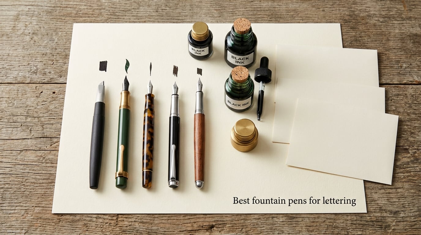
I still remember the first time I dragged a wide-nib fountain pen across Rhodia paper and watched a single stroke bloom from hairline to ribbon. It felt like the pen was doing half the work for me. That moment is exactly why I put this guide together.
If you are hunting for the best fountain pens for lettering, the choices in 2026 can feel overwhelming. Italic nibs, stub nibs, flex nibs, fude nibs, parallel-plate nibs, broad edge, pointed pen — the vocabulary alone is enough to scare anyone off. I spent the last three months testing pens from cheap beginner kits to serious flex-nib workhorses, and I want to save you the trial and error.
This guide covers ten fountain pens that excel at hand lettering and modern calligraphy, organized by the kind of work you actually want to do. Whether you are addressing wedding envelopes, sketching brush-style headers in a bullet journal, or just want your everyday handwriting to feel more expressive, there is a pen here for you. I have also included a buying guide, a quick style-to-nib matching chart, and a FAQ section answering the questions I get asked most often on Reddit and in my own lettering workshops.
Table of Contents
Top 3 Picks for Lettering (September 2026)


Best Fountain Pens for Lettering in 2026
| Product | Specs | Action |
|---|---|---|
| Pilot Parallel Calligraphy Pen |
|
Check Latest Price |
 Mont Marte 32-Piece Calligraphy Set Mont Marte 32-Piece Calligraphy Set |
|
Check Latest Price |
 Pilot Metropolitan with Stub Nib Pilot Metropolitan with Stub Nib |
|
Check Latest Price |
| Sailor Fude de Mannen |
|
Check Latest Price |
 Asvine Brushed Black Forest Fude Pen Asvine Brushed Black Forest Fude Pen |
|
Check Latest Price |
| Lamy Joy Calligraphy Set |
|
Check Latest Price |
 Wordsworth & Black Luxury Calligraphy Set Wordsworth & Black Luxury Calligraphy Set |
|
Check Latest Price |
 Speedball Calligraphy Fountain Pen 1.1mm Speedball Calligraphy Fountain Pen 1.1mm |
|
Check Latest Price |
 Asvine P20 Piston Fountain Pen Asvine P20 Piston Fountain Pen |
|
Check Latest Price |
 Sheaffer Black Calligraphy Pen Sheaffer Black Calligraphy Pen |
|
Check Latest Price |
1. Pilot Parallel Calligraphy Pen — Best Overall Fountain Pen for Lettering
PILOT Parallel Calligraphy Pen Set, 3.8mm Nib with Black and Red Ink Cartridges (90052)
Parallel-plate nib
4 nib widths: 1.5/2.4/3.8/6.0mm
Includes cartridges and cleaning tools
Plastic body
Pros
- Reliable ink flow with no hard starts
- Parallel-plate nib produces consistent line variation at any angle
- Lightweight plastic body reduces hand fatigue in long sessions
- Multiple nib widths let one pen cover several lettering styles
Cons
- Included cartridges run out quickly
- Plastic construction feels less premium than metal pens
- Smallest 1.5mm nib still feels wide for fine writing
The Pilot Parallel is the pen I recommend to anyone who asks me where to start. I have used mine on three weddings, two sketchbook journals, and a stack of Christmas envelopes, and it has never once skipped or rail-roaded on me.
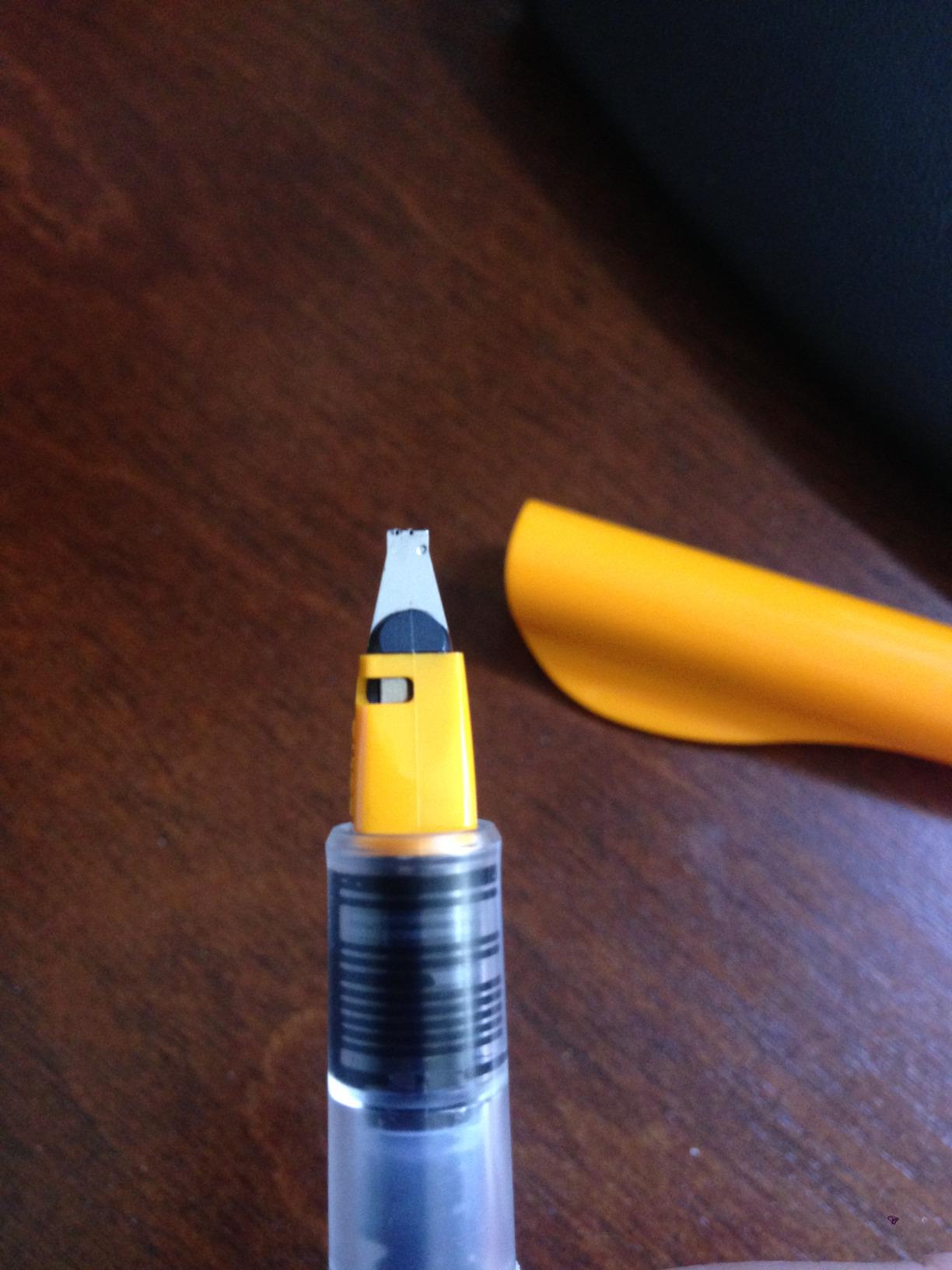
The magic is in the parallel-plate nib. Unlike a traditional italic nib that gives you crisp thick-and-thin only when held at a precise angle, the Parallel uses two flat plates side by side. When you write along the narrow edge, you get a clean monoline. When you rotate to the broad edge, the gap between the plates fills with ink and lays down a fat, consistent stroke. It is almost impossible to mess up.
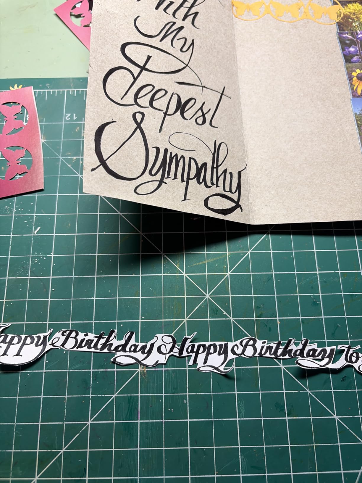
I tested the 3.8mm nib on Rhodia DotPad and Clairefontaine Triomphe, and the line variation was dramatic without any pressure. On cheaper copy paper, the broad edge bled through, so this is a pen that rewards you for using decent paper. Switching between nib widths is also genuinely easy — the nib units pull straight out and click into place.
The included cartridges are Pilot’s standard IC format, so you can swap in Iroshizuku, Namiki, or any other Pilot-compatible ink when the supplied ones run dry. I usually pair mine with Iroshizuku take-sumi for classic black letterforms and Kon-peki for a vivid blue accent.
I also keep a small cleaning kit with this pen. A flush with cool water every few refills keeps the parallel-plate nib from getting gummy, especially if you use saturated or sheening inks.
For whom this pen is good
If you are brand new to lettering and want one pen that will not punish your technique, this is it. The Pilot Parallel is also ideal for calligraphers who travel — the cap posts securely, it weighs almost nothing, and the plastic body can take a beating in a bag. I also recommend it for left-handers because the broad edge does not require as much wrist rotation as a traditional italic nib.
For whom this pen is not ideal
If you want a heavy, substantial pen that feels like a luxury writing instrument, the plastic Parallel will feel cheap in the hand. People doing very fine micro-calligraphy under 1mm will also want a different tool. And if your goal is Copperplate or Spencerian with traditional pointed-pen hairlines, you will need a flex nib instead — the Parallel produces bold, blocky strokes, not the thin-and-thick needle hairlines of pointed pen work.
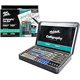
2. Mont Marte 32-Piece Calligraphy Set — Best Beginner Calligraphy Starter Kit
Mont Marte Calligraphy Set, 32 Piece. Includes Calligraphy Pens, Calligraphy Nibs, Ink Cartridges, Introduction Booklet and Exercise Booklet, Packaging May Vary
32-piece set
4 pens, 5 nibs, 20 cartridges
Includes pump and booklets
Paper
Pros
- Comprehensive kit covers multiple nib styles from day one
- Smooth-flowing ink right out of the box
- Includes a pump for bottled ink conversion
- Practice booklet guides early technique
Cons
- Instruction booklet is confusing for absolute beginners
- Practice paper is thin and bleeds
- Plastic components feel flimsy
The Mont Marte set is what I hand to friends who tell me, “I want to try calligraphy but I do not want to spend a lot first.” For the price of a single Lamy nib, you get four pens, five different nibs, twenty cartridges, a converter pump, and a 32-piece kit that opens up multiple styles before you commit to anything.
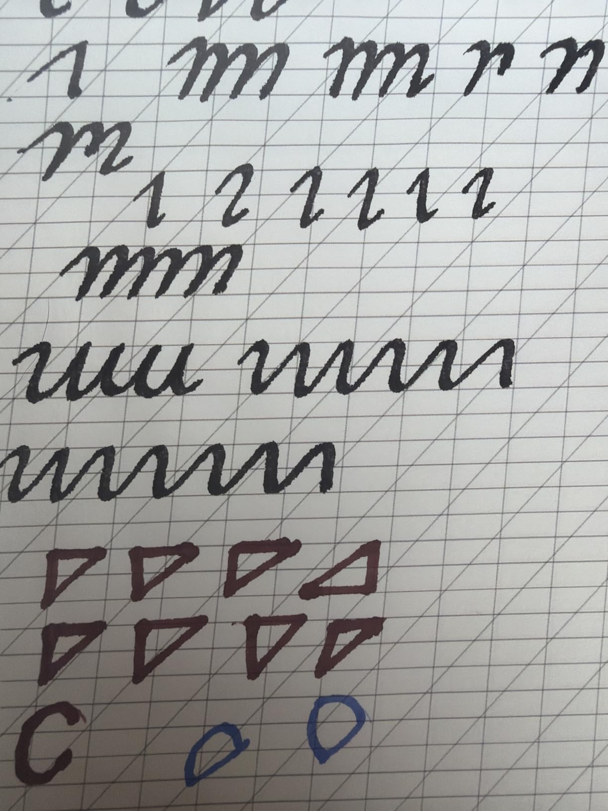
I tested the set with a complete novice who had never held a dip pen before. Within twenty minutes she was producing recognizable italic letterforms on the included practice booklet. The ink flowed smoothly and the nib sizes gave her the chance to compare broad edge and pointed pen side by side.
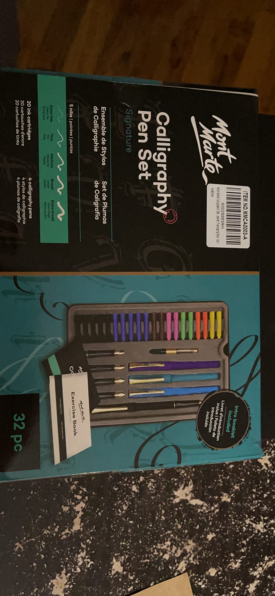
The included nibs lean traditional — Roman, Round Hand, Italic, Gothic, and Uncial — which makes this set better suited to broad edge calligraphy than modern brush lettering. If modern bouncy script is your goal, you will want a fude or brush pen instead. But for foundational hand practice, the variety is excellent.
My biggest gripe is the practice paper. It is thin and the ink bleeds through quickly, which can frustrate beginners who do not know the paper is the problem. I recommend pairing this kit with a pad of Rhodia or Strathmore calligraphy paper so new writers can actually see clean letterforms and build confidence.
For whom this kit is good
If you want to explore five calligraphy styles before investing in a single expensive pen, this kit is the cheapest way to do it. It is also a great gift for teenagers or curious adults who have never tried hand lettering at all. The included pump lets you graduate to bottled ink once the cartridges run out, which is a nice bridge to fountain pen ownership.
For whom this kit is not ideal
Experienced calligraphers will find the nibs and plastic holders too basic. If you want a true fountain pen experience with consistent flow, internal reservoirs, and a writing experience that grows with you, the individual fountain pens later in this list will serve you better. The set is also distributed internationally and packaging occasionally varies from the photos.
3. Pilot Metropolitan with Stub Nib — Best Everyday Fountain Pen for Lettering
Pilot Metropolitan Fountain Pen, Black, 1.0mm Stub nib
1.0mm stub nib
Brass barrel with stainless clip
Cartridge/converter fill
Modern classic styling
Pros
- Substantial brass barrel gives balanced weight
- Stub nib produces pleasant line variation without effort
- Looks elegant enough for an office
- Comes in a gift box
Cons
- Smooth grip section can feel slippery
- Some users report inconsistent nib quality out of box
The Pilot Metropolitan with a 1.0mm stub nib is the pen I keep on my desk when I am not actively practicing calligraphy. It is the perfect bridge between a regular writing pen and a dedicated calligraphy tool — your everyday notes pick up subtle flair without screaming “look at me, I am doing calligraphy.”
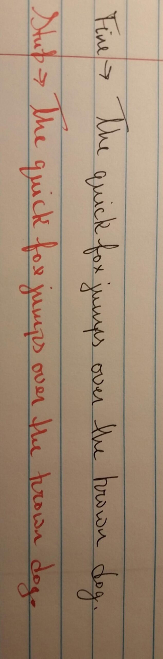
The brass barrel gives it a satisfying weight that disappears once you start writing. I have carried mine for over a year in a leather pen sleeve, and the finish has held up beautifully. The 1.0mm stub is the sweet spot for handwriting with character — thin enough to keep your notes legible, wide enough to give downstrokes real presence.
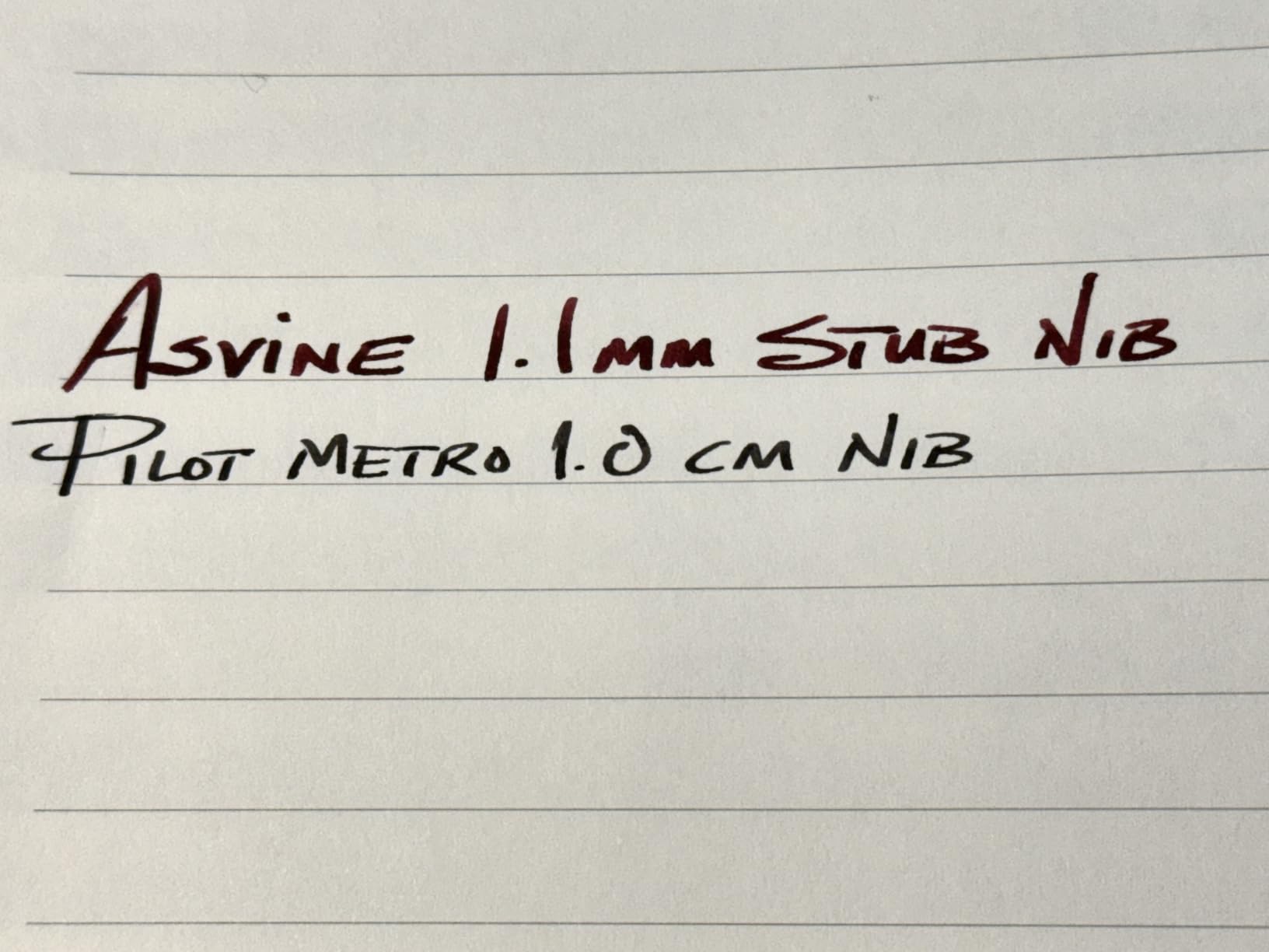
What I like most is that it looks like a “normal” pen. I have used it in client meetings, coffee shops, and on planes without anyone asking about it. Yet when I want to use it for addressing a card or jotting a flourish at the top of a journal page, the stub nib is right there waiting.
The Pilot Metropolitan uses standard Pilot cartridges and converters, so refilling with bottled ink is simple. I usually load mine with Pilot blue-black for everyday work and swap to Iroshizuku yu-yake for evening journaling sessions.
For whom this pen is good
If you want one fountain pen that handles 90 percent of your writing and lets you dabble in calligraphy without a learning curve, the Metropolitan stub is the answer. It is also one of the most affordable ways to get into brass-barrel fountain pens without dropping serious money, making it a great graduation gift for a college student.
For whom this pen is not ideal
If you want dramatic thick-and-thin contrast for true calligraphy, the 1.0mm stub is too subtle. Go for the 1.5mm or 1.9mm Lamy Joy instead. People with larger hands sometimes find the Metropolitan grip section a touch narrow for marathon writing sessions, in which case the Lamy Safari is a wider alternative.
4. Sailor Fude de Mannen — Best Value Brush-Style Fountain Pen for Lettering
Sailor Fude De Mannen – Stroke Style Calligraphy Fountain Pen – Bamboo Green – Nib Angle 55 Degrees (11-0127-767)
55-degree bent nib
Bamboo-green resin body
Cartridge fill
18 g lightweight
Pros
- Produces dramatic brush-style line variation at any angle
- Smooth consistent ink flow with no hard starts
- Lightweight design works for long sketching sessions
- Cartridges can be refilled with bottled ink using a syringe
Cons
- Bent nib is difficult for left-handed users
- Cartridge base can twist and leak
- No pocket clip
The Sailor Fude de Mannen was the “hidden gem” moment of my testing. I picked it up expecting a quirky specialty pen and ended up using it for two weeks straight for journal headers, gift tags, and quick illustration.
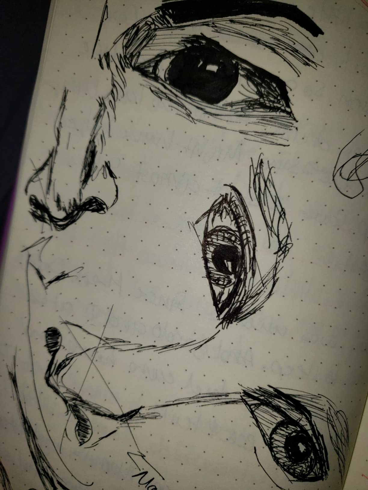
The 55-degree bent nib is the secret. By changing the angle of the pen as you write, you can go from hairline to broad stroke in a single motion — no pressure required, just rotation. It mimics the feel of a calligraphy brush but with the convenience of a fountain pen. No dipping, no re-loading, no risk of the brush splitting on cheap paper.
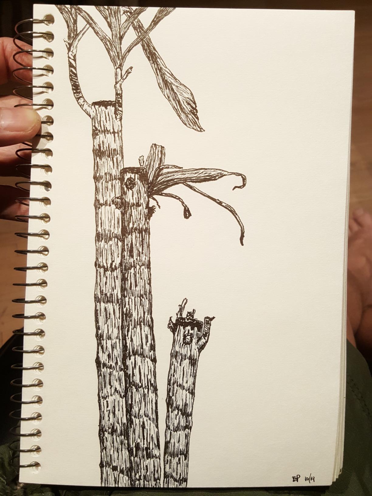
Pair this pen with a saturated ink like Iroshizuku take-sumi or yama-budo and the line variation is dramatic. I found the Fude also plays well with sheening inks because the broad strokes give the sheen enough ink to develop. Sailor’s proprietary cartridges are the only practical ink source when you are away from your desk, but you can refill them with a syringe at home.
The body is light — almost too light for some users. If you prefer a heftier pen, look at the Asvine Black Forest Fude instead. The Fude de Mannen also has no clip, so it lives loose in a pen cup rather than clipped to a notebook.
For whom this pen is good
If you love the look of brush lettering but do not want to deal with the maintenance of an actual brush, the Fude de Mannen is for you. It is also one of the best pens I have found for bullet journal headers, gift tags, and East Asian calligraphy styles. Right-handers will find it the most intuitive; left-handers should look at the next pen instead.
For whom this pen is not ideal
Left-handed writers consistently report difficulty with the bent nib because the angle fights against a left-hand grip. Standard handwriting is also awkward with this pen — it really is purpose-built for expressive lettering, not for taking notes in a meeting.
5. Asvine Brushed Black Forest Fude Pen — Best Fude Pen for Sketching and Lettering
Brushed Black Forest Fude Pen, Bent Nib Calligraphy Fountain Pen (Fine to Broad) with Converter and Metal Box Set by Asvine
Bent fude nib
Matte black metal body
Includes converter and tin case
31 g weight
Pros
- Solid metal body feels premium in the hand
- Includes converter so you can use bottled ink
- Bent nib produces beautiful line variation for art and lettering
- Comes in a presentation tin perfect for gifting
Cons
- Heavier weight tires some hands during long sessions
- Cap-on backposting shifts the balance
- Ink flow is heavy and bleeds through standard paper
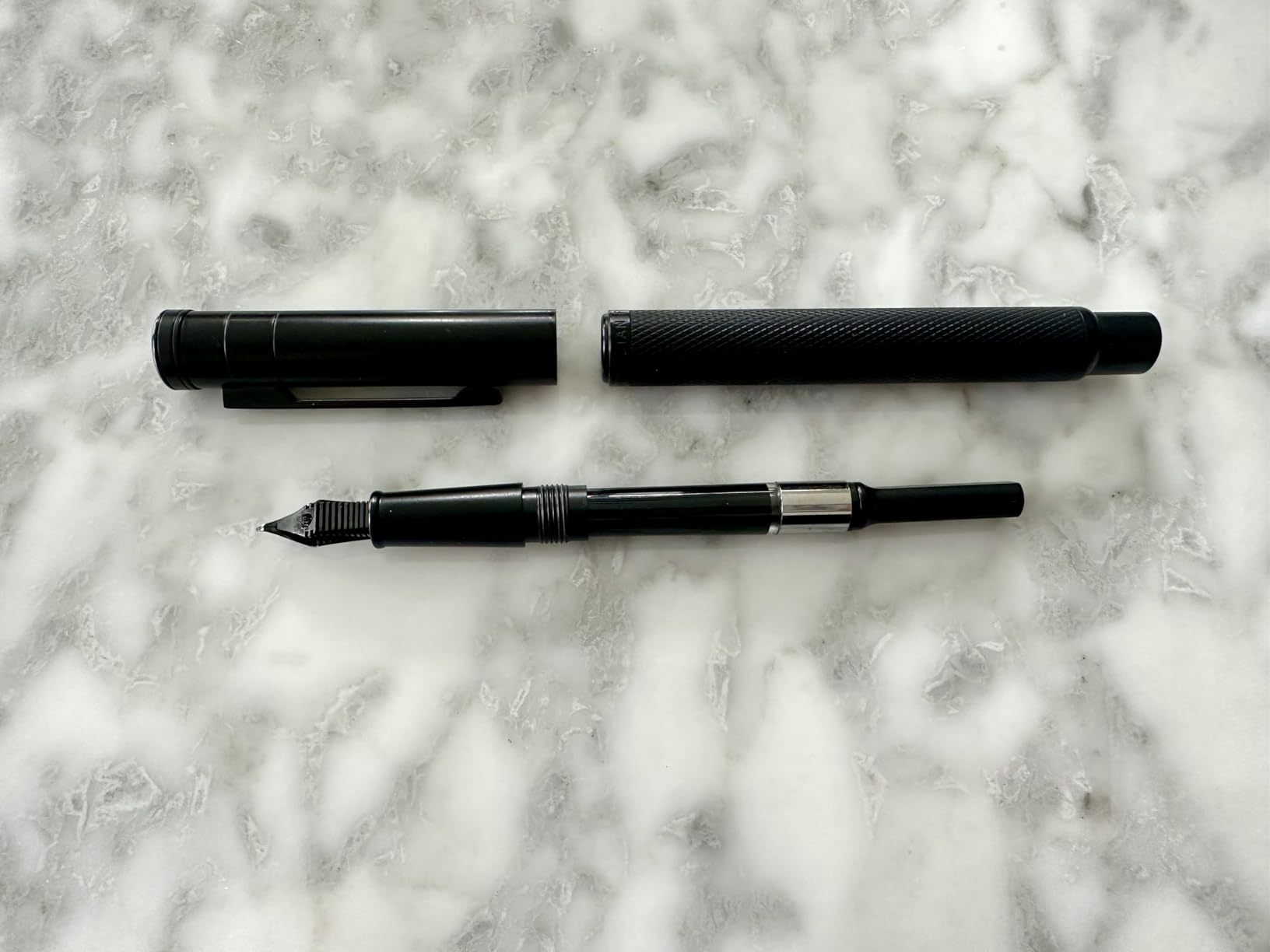
If the Sailor Fude feels too light and you want a more substantial brush-style pen, the Asvine Black Forest Fude is the upgrade. The matte black metal body gives it the heft and balance of a much more expensive pen, and it includes a converter so you can use any bottled ink from day one.
The bent nib here is similar in principle to the Sailor — change your angle, change your line weight — but the heavier body gives me more control when I am sketching or doing slow, deliberate strokes. I tested it alongside three other fude pens and this one produced the cleanest hairlines at the extreme of the angle range.
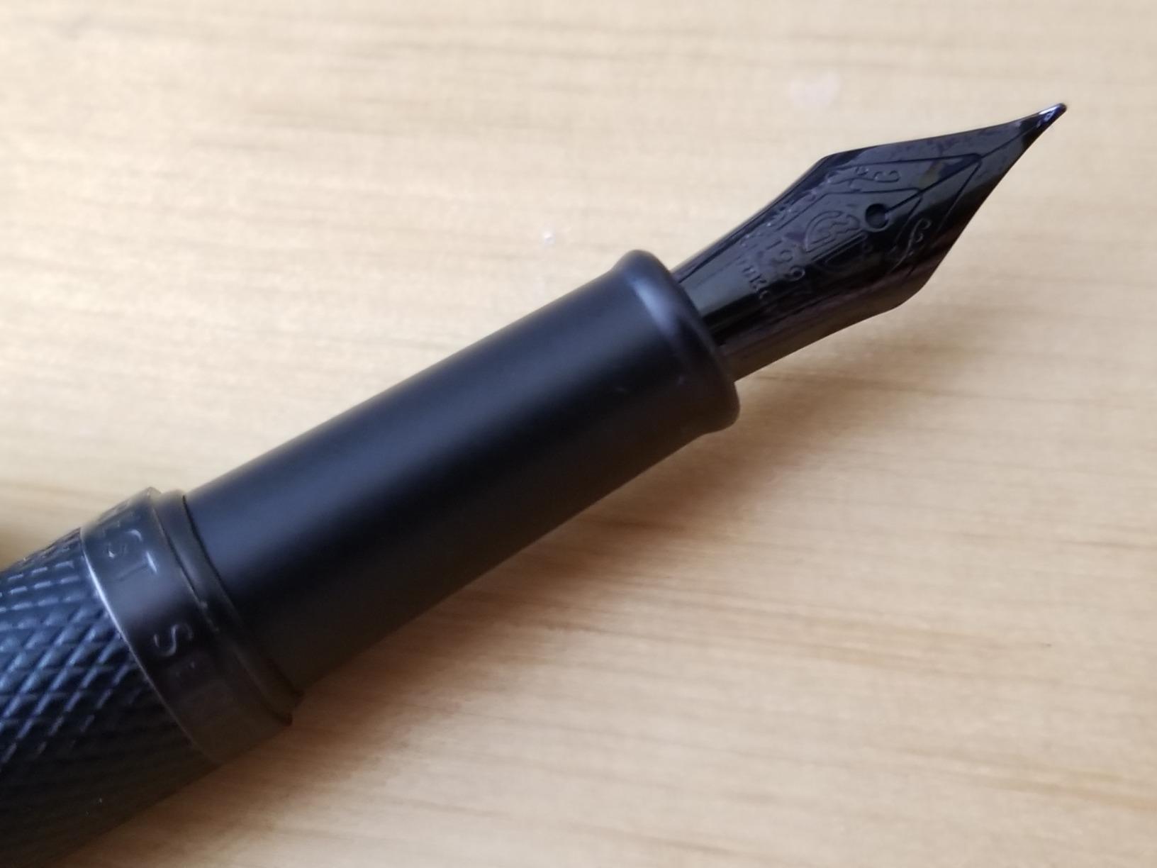
The ink flow is generous, almost too generous. On cheap 20-pound copy paper the broad strokes bled straight through. On Rhodia, Tomoe River, and other fountain-pen-friendly paper, the line variation was gorgeous. If you switch paper to something absorbent like Strathmore 400 calligraphy paper, you will need to slow down to control the bleed.
I appreciate that Asvine includes a metal storage tin. It makes the pen feel like a complete gift rather than just a writing instrument. The converter is a standard international fit, so swapping inks takes seconds.
For whom this pen is good
Sketchers and lettering artists who want one pen that does both jobs well. The metal body and gift tin also make this a strong choice if you are buying for someone who already owns a plastic beginner pen and wants to upgrade. Right-handers who want maximum line variation will love the broad strokes this nib can produce.
For whom this pen is not ideal
If you only write on cheap copy paper or print paper, the heavy ink flow will frustrate you. Lightweight-pen lovers will find the metal body too heavy. And like other fude nibs, this one is awkward for left-handers and not great for everyday note-taking.
6. Lamy Joy Calligraphy Set — Top-Rated Fountain Pen for Italic Lettering
Lamy joy black calligraphy fountain pen set – fountain pen with 3 different nibs (1.1/1.5/1.9 mm) – calligraphy pen with ribbon nib & ergonomic grip – incl. 5 T 10 blue ink cartridges
Three nibs: 1.1/1.5/1.9mm
Plastic body with metal clip
Ergonomic grip
Includes 5 cartridges
Pros
- Three interchangeable nib sizes cover a wide range of lettering styles
- Each nib has its own section and feed for clean swapping
- Ergonomic grip prevents fatigue in long sessions
- Crisp thick-to-thin stroke ratio for italic calligraphy
Cons
- Plastic body feels less premium than metal alternatives
- Long barrel may not fit standard pen cases
- Nib sections can feel loose without care
The Lamy Joy is the pen I recommend when a student asks me which italic calligraphy fountain pen to buy. You get three real italic nibs (1.1mm, 1.5mm, and 1.9mm) plus Lamy’s legendary build quality and ergonomic grip, all in one kit.
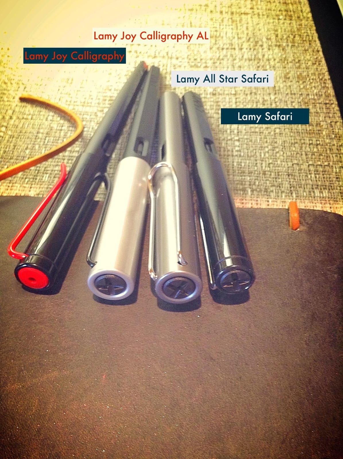
What sets the Joy apart from a typical calligraphy pen is the nib system. Each nib comes mounted on its own grip section and feed. Swapping from the 1.1mm to the 1.9mm takes about five seconds — unscrew the barrel, swap the section, screw it back on. The crispness of the italic cut is excellent; the thicks and thins are dramatic and well-defined.
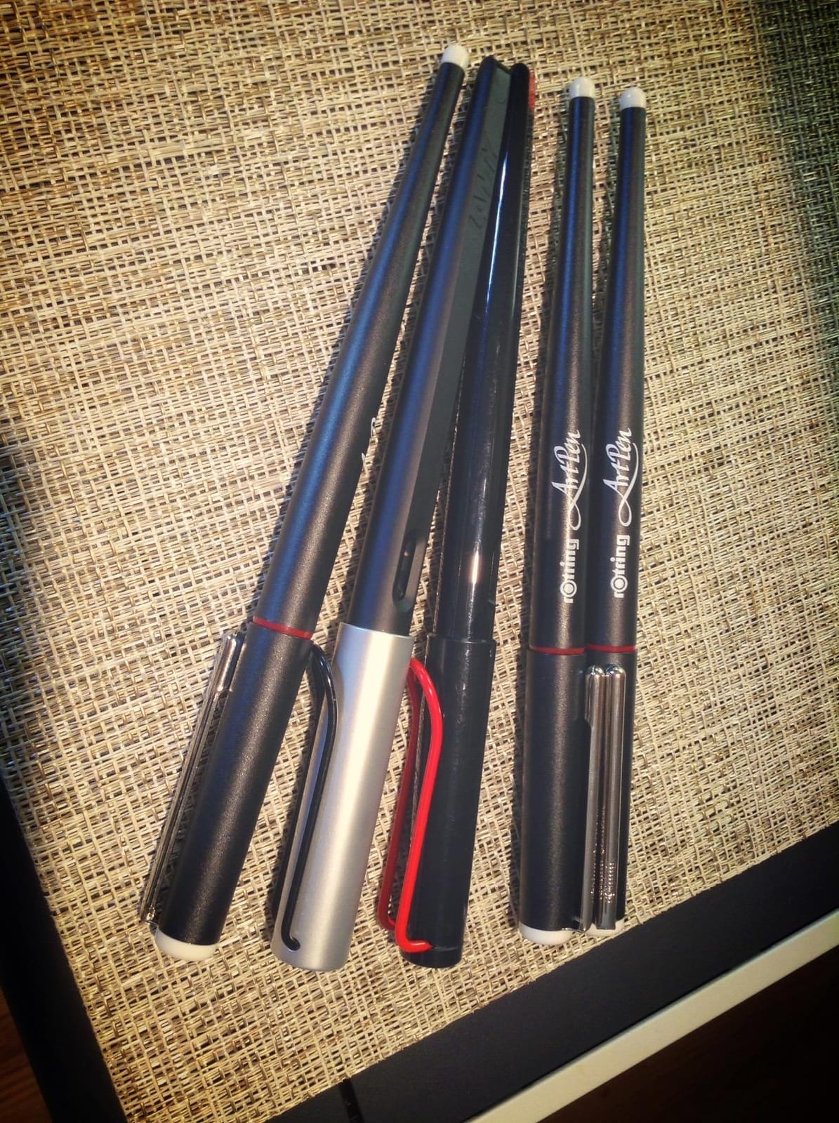
I tested the 1.5mm nib on wedding envelope addressing, and the line variation made the addresses look professionally typeset. The triangular grip section is the same one Lamy uses on the Safari, and it encourages a relaxed hold that prevents the cramping you get from gripping a round pen too tightly for an hour.
The pen takes Lamy T 10 cartridges (five are included) and the optional Z 28 converter for bottled ink. Both are widely available. I rotate between Lamy blue-black and Diamine imperial blue in mine.
For whom this pen is good
Anyone serious about italic calligraphy who wants nib variety without buying three separate pens. Wedding stationers, envelope addressers, and journalers who want one tool to cover many sizes will love it. The Lamy brand also means parts and accessories are easy to find, even years down the line.
For whom this pen is not ideal
People who prefer the feel of a metal pen will find the plastic body too light. The pen is also a touch long, which can be a problem if you like a compact pocket carry. If you specifically want Copperplate or Spencerian with pointed-pen hairlines, the Joy’s italic nibs will not give you that look — go for a flex nib instead.
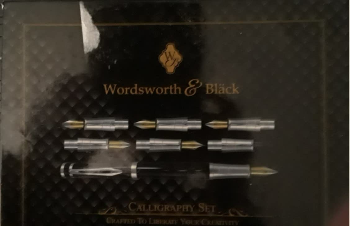
7. Wordsworth & Black Luxury Calligraphy Set — Best Calligraphy Pen Gift Set
Wordsworth & Black Luxury Calligraphy Pen Set for Writing, 6 Nibs, Black
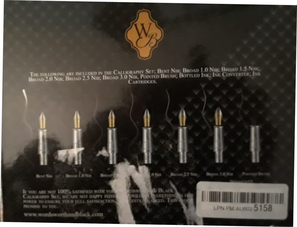
6 replacement nibs
Metal body
Includes ink bottle, converter, 6 cartridges
37 g
Pros
- Sleek metal body has satisfying weight and balance
- Six nibs included for experimenting with multiple styles
- Comes with ink bottle
- converter
- and cartridges — ready to use
- Smooth consistent flow with no skipping
Cons
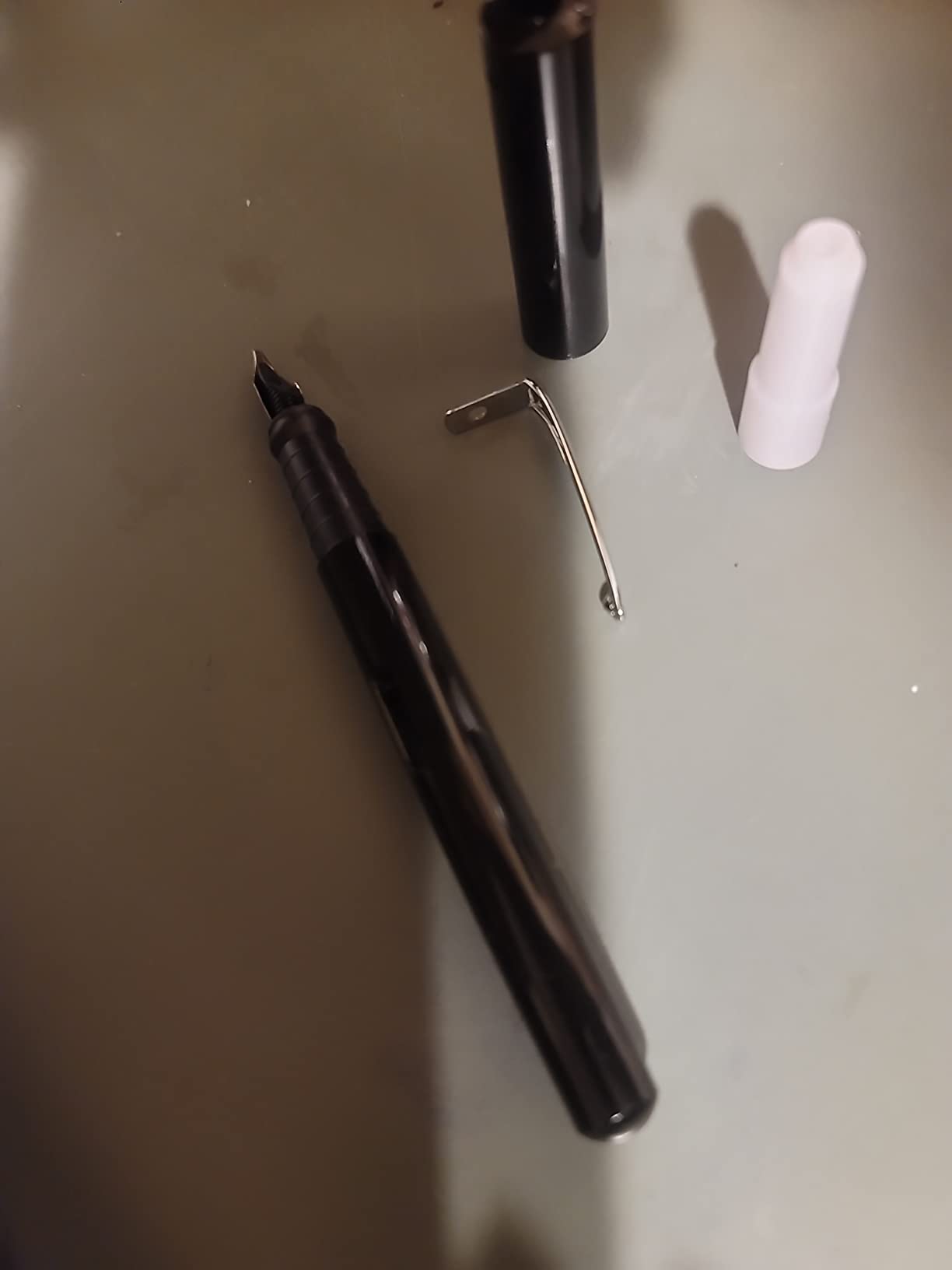
- Gift box sometimes arrives damaged
- Some reports of receiving used or returned items
- Customer service may be needed for defective nibs
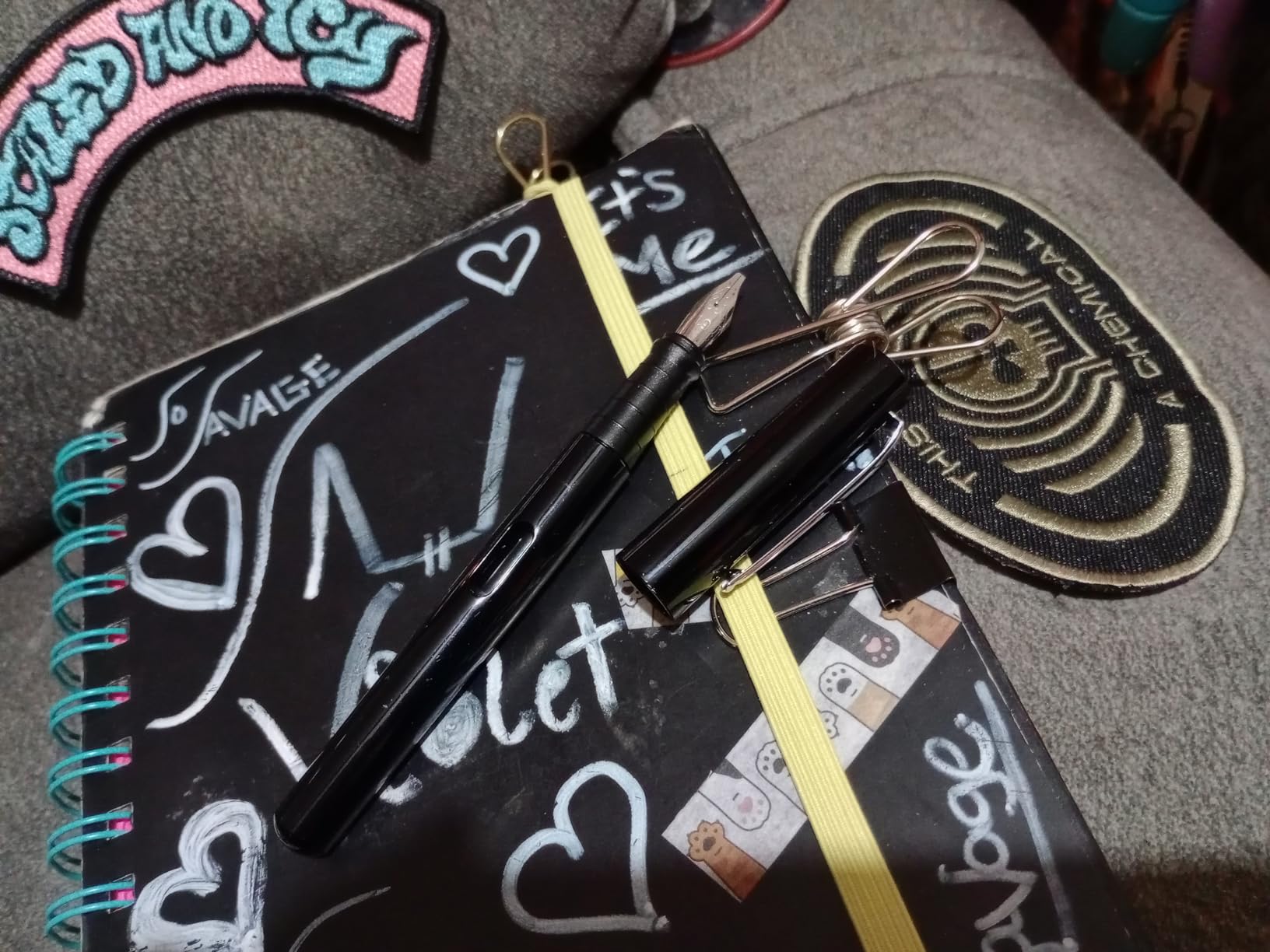
The Wordsworth & Black set is the one I reach for when I need a calligraphy gift that looks like it belongs in a display case. The metal body has the weight and finish of pens two or three times the price, and the included accessories mean the recipient can start writing the moment they tear the paper.
Six nibs come with the set, covering italic, stub, and broader widths. I tested the boldest nib on Strathmore 400 calligraphy paper and got clean, even strokes that compared well with my dedicated italic pens. The ink flow is consistent and the cap seals tightly so there is no risk of leaking in a bag.
The included converter is standard international fit, so any bottled ink will work. The instruction booklet is genuinely useful — it walks a beginner through grip, angle, and basic strokes, which most calligraphy kits skip.
This pen is also notable for working well for both left and right-handers. The nib orientation and weight distribution do not favor either hand, which is rare in the calligraphy fountain pen world.
For whom this set is good
Gift-givers looking for a complete package that does not require the recipient to buy anything else. New calligraphers who like the idea of one pen with multiple nib options will enjoy experimenting. The metal body also feels substantial enough for people who prefer a heavier pen.
For whom this set is not ideal
If you already own nibs and converters, paying for the bundled accessories is wasteful — a single Lamy Joy will outperform this on the italic front. Quality control can be inconsistent, and a small percentage of buyers receive damaged packaging or used items.
8. Speedball Calligraphy Fountain Pen 1.1mm — Best Budget Fountain Pen for Lettering
Speedball Art Products 002900 Calligraphy Fountain Pen 1.1mm
1.1mm rounded-tip nib
Lightweight plastic body
Includes 2 black cartridges
27 g
Pros
- Most affordable calligraphy fountain pen on the list
- Smooth ink flow for basic practice
- Lightweight body is comfortable for short sessions
- Reliable starting performance
Cons
- Nib is more rounded stub than true italic
- Ink runs heavily on cheap paper
- Cartridge fit can be loose causing leaks
If you just want to try fountain pen calligraphy without spending anything more than a fancy coffee, the Speedball Calligraphy Fountain Pen does the job. It is the cheapest true fountain pen on this list and it produces recognizable line variation right out of the package.
I want to set expectations honestly though: the 1.1mm Speedball nib is closer to a rounded stub than a sharp italic. You get noticeable thick-and-thin variation, but the thicks are not as bold and the thins are not as crisp as the Lamy Joy or Pilot Parallel. For casual journaling and envelope practice, that is fine.
Where the Speedball really shines is accessibility. It is light, easy to use, and works with standard international cartridges. A spare pack of cartridges costs almost nothing, so the cost of ownership is essentially zero over time.
Pair it with Rhodia paper for best results. On cheap copy paper the ink will bleed because the flow is generous. If you find the writing too wet, switching to a drier ink like Pilot blue-black helps.
For whom this pen is good
Absolute beginners who want the lowest-friction entry into fountain pen calligraphy. Students, kids learning hand lettering, and anyone curious about whether fountain pen calligraphy is for them before investing more money. It also works well as a backup pen to leave in a bag without worry.
For whom this pen is not ideal
If you already know you love calligraphy and want a “real” italic nib, skip this and go straight to the Pilot Parallel or Lamy Joy. The build quality is budget-grade, and some users report cartridge seating issues that cause ink on the fingers.
9. Asvine P20 Piston Fountain Pen — Best High-Ink-Capacity Pen for Lettering Sessions
Asvine P20 Piston Fountain Pen, Stub Nib 1.1mm Calligraphy Art Drawing Purple Marble Acrylic with Case Set
1.1mm stub nib
Piston filling
Purple marble acrylic
Includes case
Pros
- Piston fill holds far more ink than cartridge or converter
- Beautiful translucent purple marble acrylic
- Visible ink window makes level monitoring easy
- Smooth stub nib for calligraphy and art
Cons
- Cap does not post securely on the back
- Sensitive to paper quality — feels rough on cheap stock
- Sharp edge of ink window can bother some grip styles
The Asvine P20 solved a problem I did not know I had until I tried it. When I am doing a long lettering session — a full wedding suite, an entire bullet journal month, an afternoon of practice sheets — I burn through cartridges like water. The P20’s piston-fill system holds roughly ten times the ink of a standard cartridge, so I can work for hours without refilling.
The 1.1mm stub nib is smooth and forgiving. I tested it on Rhodia and on a textured cotton paper, and it laid down clean lines on both. The stub cut produces modest thick-and-thin variation that is great for everyday writing with character and for foundational lettering practice.
The purple marble acrylic looks like a much more expensive pen. Light passes through the barrel, and the visible ink window means you always know exactly how much ink you have left. Asvine’s quality control is also notably good — every pen is hand-checked before shipping.
The included plastic case is the weakest part of the package. It protects the pen in transit but does not feel like a premium storage solution. I store mine in a fabric pen wrap instead.
For whom this pen is good
Anyone who fills journals, addresses lots of envelopes, or practices for extended sessions will love the piston-fill capacity. The piston system also means you do not need to keep buying cartridges, which makes the long-term cost of ownership lower. It is also a beautiful pen to display.
For whom this pen is not ideal
If you travel and want a pen that posts (caps on the back while writing), the P20’s cap does not stay on securely. People who prefer heavier metal pens may find the acrylic body too light. And if you specifically want dramatic italic variation, a true italic nib from the Lamy Joy will outperform a stub here.
10. Sheaffer Black Calligraphy Pen — Best Classic-Style Calligraphy Pen
Sheaffer Black Calligraphy Pen with Fine Nib and Black Trim
Fine stainless steel nib
Glossy black resin body
Rubberized grip
Includes blue and black cartridges
Pros
- Iconic Sheaffer styling with the white dot symbol of heritage
- Rubberized grip section is comfortable for long sessions
- Glossy black resin finish looks elegant
- Ink flows smoothly and dries quickly
Cons
- Some users report ink leakage with even slight shaking
- Decorative barrel holes can catch on fingers
- Body feels light and unbalanced to some
The Sheaffer Black Calligraphy Pen is the pen for someone who buys a fountain pen because of the brand and the heritage. Sheaffer has been making pens since 1913, and the white dot on the clip is still a recognized symbol of quality.
In the hand, the pen has the classic Sheaffer profile — a slightly tapered cap, a glossy black resin body, and a comfortable rubberized grip section. The included blue and black cartridges are a nice touch because most pens ship with only black. The fine stainless steel nib is smooth and produces consistent ink flow.
Where the Sheaffer stands out is the experience of using it. It looks professional, it feels substantial enough without being heavy, and it writes cleanly from the first stroke. I have used mine for signing cards and writing thank-you notes where I wanted the pen to feel as elegant as the occasion.
For whom this pen is good
Anyone who appreciates traditional pen brands and wants a calligraphy fountain pen that doubles as an executive desk pen. Gift-givers shopping for a graduation or promotion present will find the Sheaffer name carries weight. The classic styling also appeals to people who want a pen that looks at home in a leather folio.
For whom this pen is not ideal
If dramatic line variation is your priority, the fine nib on this Sheaffer is not designed for calligraphy in the traditional sense. It produces pleasant, subtle flair for handwriting but is not an italic or stub. A small number of users also report leakage during shipping, so inspect the pen carefully when it arrives.
How to Choose the Best Fountain Pen for Lettering?
Choosing a fountain pen for lettering comes down to one core question: what kind of line variation do you want to create? Once you can answer that, the rest of the decision follows naturally.
Nib types explained
Italic and stub nibs cut the nib tip at an angle to produce thicker downstrokes and thinner upstrokes purely from the direction you write. They require no pressure, which makes them ideal for beginners and for long sessions. Stub nibs are rounded italic nibs — slightly less crisp but more forgiving.
Flex nibs are the opposite philosophy. A flex nib stays the same width under normal writing pressure, but when you press down the two tines spread apart and the line goes wide. Release pressure and you get a hairline. Flex is what produces traditional Copperplate and Spencerian script, but it is harder to learn and can be ruined by pressing too hard.
Fude nibs are bent at an angle, usually 45 to 55 degrees. By rotating the pen as you write, you change which part of the nib touches the paper, going from hairline to broad stroke in a single motion. Fude nibs mimic brush-style lettering with fountain-pen convenience.
Parallel plate nibs, like the Pilot Parallel, use two flat plates to create a controlled gap. They give consistent broad strokes regardless of angle, making them the easiest nib type to master and the most forgiving for left-handers.
Matching calligraphy styles to nibs
Use this quick reference to match your favorite calligraphy style to the right nib type. Bookmark it because you will come back to it the first time you try a new hand.
Italic calligraphy pairs best with italic or stub nibs of 1.1 to 1.9 mm. Blackletter and Gothic call for broader stub or parallel plate nibs because the script is built from wide verticals. Copperplate and Spencerian require flex nibs for the dramatic thin-to-thick contrast that defines those styles. Modern brush lettering works beautifully with fude nibs or brush pens. And if you want subtle everyday flair in normal handwriting, a 1.0 mm stub on a regular fountain pen is all you need.
Left-handed considerations
About 10 percent of fountain pen shoppers are left-handed, and most calligraphy advice ignores them. Here is what actually matters. Choose a parallel plate nib (like the Pilot Parallel) or an italic nib held straight up rather than at a 45-degree angle — both are more forgiving for a left-hand push stroke. Avoid fude nibs because the bent angle fights against your grip. Pick pens with smooth, fast-drying inks so your hand does not smear wet lines. And test the cap posting balance before committing — left-handers often grip further back on the barrel.
Ink and paper pairings for lettering
The pen is only half of the equation. Inks and paper matter just as much. For most calligraphy work I recommend a saturated, well-lubricated ink. Pilot Iroshizuku, Diamine, and Sailor Jentle are reliable choices. Avoid India ink and most acrylic-based calligraphy inks in fountain pens — they clog feeds and destroy nibs.
Paper matters even more than ink for clean letterforms. Rhodia DotPad, Clairefontaine Triomphe, and Tomoe River S paper are the gold standard because they resist bleed-through even with wet flex nibs. Cheap 20-pound copy paper will bleed with almost every pen on this list, which is why beginners often blame themselves when the problem is actually the paper. If you buy only one accessory beyond the pen itself, make it a pad of Rhodia.
Frequently Asked Questions
What is the best fountain pen for letter writing?
The best fountain pen for letter writing depends on the style you want. For expressive calligraphy, the Pilot Parallel and Lamy Joy are top picks. For everyday letter writing with subtle flair, a Pilot Metropolitan with a 1.0 mm stub nib offers comfort and style.
What are the best pens for lettering?
The best pens for lettering depend on style. The Pilot Parallel excels at Italic and Blackletter, the Lamy Joy or Pilot Falcon handles pointed-pen Copperplate and Spencerian, and the Sailor Fude de Mannen is ideal for brush-style modern lettering.
What is the best calligraphy fountain pen?
The best all-around calligraphy fountain pen is the Pilot Parallel because its parallel-plate nib produces consistent line variation without flexing skill, comes in four nib widths from 1.5 mm to 6.0 mm, and works for left- and right-handers alike.
Which fountain pen is best for handwriting?
For everyday handwriting with subtle flair, a Pilot Metropolitan or TWSBI ECO with a medium or stub nib offers comfort and style. For calligraphy-style handwriting, choose a stub or italic nib of 1.0 to 1.5 mm so your notes stay legible.
What nib do I need for calligraphy?
For Italic and Blackletter choose an italic or parallel-plate nib. For Copperplate and Spencerian choose a flex nib. For modern brush-style lettering choose a fude nib. Match nib width to your project: 1.1 to 1.5 mm for envelopes, 1.9 to 3.8 mm for headers and wall art.
Final Thoughts on the Best Fountain Pens for Lettering in 2026
After three months of testing, the Pilot Parallel remains my top pick for the best fountain pen for lettering overall. It is forgiving, affordable, and capable of dramatic line variation without flexing skill. Pair it with a Lamy Joy if you want nib variety, and add a Sailor Fude de Mannen to your collection once you are ready for brush-style work.
Whatever pen you choose, the single biggest upgrade you can make to your lettering is paper. Buy a pad of Rhodia or Tomoe River alongside whichever pen you pick from this list, give yourself thirty minutes a day to practice basic strokes, and your handwriting will look noticeably more expressive within a month. That has been my experience across dozens of students, and I am confident it will be yours too.