
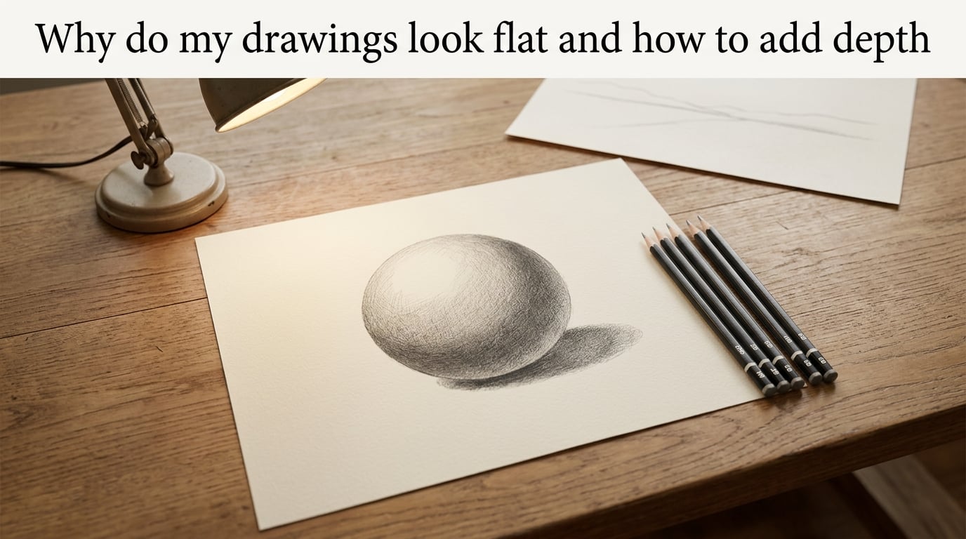
If your drawings keep looking two-dimensional no matter how much detail you add, the problem usually isn’t effort. It’s missing depth cues. Drawings look flat when one or more of these signals is weak or absent: your value range is compressed so everything is the same grey, your light source is inconsistent or missing, you’ve drawn outlines instead of constructing forms, there’s no overlapping between objects, you’ve skipped atmospheric perspective, you have no horizon line, or scale and texture don’t change with distance.
I’ve coached beginner artists through this exact problem for years, and the same handful of causes shows up again and again. The good news: depth is a stack of learnable cues, and once you start layering them, your work transforms from flat to fully dimensional. In this guide I’ll walk you through the 7 reasons drawings look flat, the 8 techniques that fix them, the five-zone value system that powers most realistic shading, and a sphere exercise you can do tonight.
Table of Contents
The 7 Reasons Your Drawings Look Flat
Before you add a single technique, you need to know which problem is actually flattening your drawing. Most beginners jump straight to “shade more,” but shading is only one of several cues. Use this diagnostic list like a checklist. Read each item, look at your most recent drawing, and notice which cues are missing.
1. Compressed value range. Your darkest dark is not dark enough, and your lightest light is not light enough, so the whole image sits in a narrow band of grey. Tonal compression is the single most common cause of flatness, and it happens when artists shade with only one or two pencils.
2. Single shadow value. You shaded the shadow side as one flat dark zone instead of separating it into core shadow, reflected light, and a transition through the mid-tone. When the entire shadow side is the same value, the form collapses into a silhouette.
3. Missing or inconsistent light source. The highlights and shadows on different objects don’t agree, so your eye can’t read a coherent light direction. Without a single consistent light, nothing feels anchored in space.
4. Drawing outlines instead of forms. You traced the contour of your subject and filled it with shading, but you never constructed the underlying 3D shapes. Outlines describe where something ends. Forms describe what it is made of. The shift from outline-thinking to form-thinking is the most important conceptual leap in drawing.
5. No overlapping between objects. Every shape sits in its own plane, with nothing partially blocking anything else. Without overlap, your eye has no way to know which object is in front.
6. No atmospheric perspective. Your foreground and background are drawn at the same contrast, saturation, and detail level. In real life, distant objects appear lighter, cooler, and softer because of the air between you and them.
7. Missing horizon line and scale variation. You never marked where the viewer’s eye level sits, and every object in the scene is roughly the same size. Without a horizon, perspective has nothing to anchor to. Without size variation, distance has no cue.
Run through your last drawing and count how many of those seven are present. Three or more missing cues is enough to flatten even a beautifully detailed piece. The techniques below target each cue directly.
How to Add Depth to Your Drawings: 8 Techniques That Work
Now that you’ve diagnosed the problem, here are the eight depth techniques I return to again and again. Treat these as a toolbox, not a checklist. You rarely use all eight at full strength in one drawing. Pick the cues your specific subject needs.
1. Use Perspective to Anchor the Scene
Perspective is the most famous depth cue and the one beginners fear the most. It’s actually simpler than it looks once you separate the pieces.
Horizon line. The horizon line is the viewer’s eye level. If you’re drawing a person standing on the ground, the horizon usually crosses their chest or waist. In a landscape, it’s where the sky meets the land. Draw it as a faint horizontal line first, and build the whole scene relative to it.
Vanishing point. Any set of parallel lines that recede from the viewer converges to a single vanishing point on the horizon. Train tracks, road edges, building tops, fence posts: all of them obey this rule.
One-point perspective. Use one vanishing point when the viewer faces a flat surface head-on: a road, a hallway, a room interior. All receding lines converge to that single point on the horizon.
Two-point perspective. Use two vanishing points when you’re looking at the corner of a building or a box from an angle. Each set of parallel lines converges to its own point, both on the horizon.
Three-point perspective. Add a third vanishing point above or below the scene when the viewer is looking sharply up at a tall building or down from a height. The third point creates dramatic foreshortening.
You don’t need to master all three before drawing anything. One-point perspective alone will solve a huge percentage of flatness in landscape and interior scenes.
2. Expand Your Value Range
Value is how light or dark a tone is. Contrast is the difference between adjacent values. Depth on paper depends almost entirely on having a wide enough range between your lightest light and your darkest dark. If your darkest tone on the page is a medium grey, the whole drawing will read as medium grey.
Test yourself: on a scrap piece of paper, try to draw a value scale from pure white (untouched paper) to the deepest black your pencil can produce. Most beginners stall at medium-dark grey because they don’t push the pencil hard enough or use soft enough graphite.
The fix is partly about tools (use 4B and 6B pencils for your deepest darks) and partly about confidence (commit to making the darkest areas genuinely dark). A drawing with five clearly separated values will look more dimensional than one with twenty values that all hover in the middle.
3. Apply the Five-Zone Value System
The five-zone value system is the most reliable framework for shading a single form. I’ll cover it in detail in its own section below, but introduce the idea here: every rounded object has five distinct tonal zones. If you can see and render those five zones, the form will read as three-dimensional even without any other cues.
4. Use the 70/30 Rule for Composition
The 70/30 rule is one of those quiet concepts that separates amateur work from professional work, and almost no beginner drawing article covers it. Here’s the principle: in any scene, your primary subject should occupy roughly 70 percent of the visual weight or area, and secondary elements should occupy the remaining 30 percent.
When the ratio flips, the drawing feels cluttered or unfocused. When it lands at 70/30, the eye knows immediately where to land and the rest of the scene supports rather than competes.
In practice this means being deliberate about negative space. If you’re drawing a portrait, give the face 70 percent of the attention and the background 30 percent. If you’re drawing a still life, let one object dominate. The 70/30 rule doesn’t add physical depth, but it adds perceptual depth by creating clear visual hierarchy.
5. Overlap Objects to Establish Planes
Overlap is the simplest depth cue and the easiest to add. When one object partially covers another, the covering object is in front. Stack your subjects so each one overlaps the next, and your brain instantly reads three planes.
In a still life, place the apple so its edge crosses in front of the cloth behind it. In a landscape, let the nearer trees overlap the distant ones. In a character illustration, let the foreground arm cross in front of the torso. You can add overlap at almost any stage of a drawing and instantly gain a plane.
6. Use Atmospheric Perspective for Distance
Atmospheric perspective (also called aerial perspective) is what makes distant mountains look pale blue and hazy. As objects recede from the viewer, the air between you and them scatters light and reduces contrast, saturation, and detail.
Apply three simple shifts to anything in the background:
- Push values lighter (darks become mid-tones).
- Cool the color temperature (warm hues shift toward blue-grey).
- Soften edges and reduce fine detail.
You don’t have to render miles of landscape to use this. Even in a single interior scene, the back wall should be slightly lighter, slightly cooler, and slightly less detailed than the foreground. Atmospheric perspective is one of the strongest signals for separating planes.
7. Layer Foreground, Middle Ground, and Background
Most flat drawings are flat because they have no planes. They read as one continuous surface because every element is drawn with the same level of attention and contrast. The fix is to commit to three planes: a foreground, a middle ground, and a background.
The foreground gets the most contrast, the warmest colors, the sharpest edges, and the most detail. The middle ground sits a step back in all of those. The background becomes lighter, cooler, softer, and simpler. This is the same principle as atmospheric perspective, but applied to the whole composition at once.
When I look at a beginner’s drawing and ask “which plane is closest?”, the answer is often unclear. If you can’t answer that question looking at your own work, the planes haven’t been separated yet.
8. Establish a Consistent Light Source and Cast Shadows
A consistent light source ties the whole drawing together. Pick one direction (upper-left is a classic) and let every highlight, every core shadow, and every cast shadow obey that direction.
Cast shadows are especially powerful because they ground objects on a surface. A floating sphere with no cast shadow looks like it’s hovering in space. The same sphere with a soft shadow stretching across the table feels like it’s resting on the table.
For a coherent light setup, you’ll need the cast shadow on the ground, the form shadow on the object itself (the five zones), and a clear brightest highlight. All three must agree about where the light is coming from.
The Five-Zone Value System: A Sphere for Shading
The five-zone value system is the most reliable framework I know for turning a flat outline into a solid, three-dimensional form. Every rounded object, from an apple to a skull to a thigh muscle, can be broken into these same five tonal zones. Once you can see them on a sphere, you can see them on anything.
Zone 1: The Highlight
The brightest spot on the form, where the light hits most directly. Leave the paper untouched, or lift tone with a kneaded eraser to reveal white. The highlight is what tells the eye “this is where the light is coming from.”
Zone 2: The Lit Area
The general surface that faces the light source. It’s brighter than the mid-tone but not as bright as the highlight. For a sphere lit from the upper left, this is most of the upper-right portion.
Zone 3: The Mid-Tone
The neutral tone that sits between light and shadow. This is the “true” local color of the object before lighting modifies it. On a sphere, it wraps around the middle as a transition band.
Zone 4: The Core Shadow
The darkest part of the form itself, on the side turned away from the light. This is the part most beginners shade, and most beginners shade it as one flat tone. The core shadow actually has internal structure: it gets darker as it curves away from the light and lighter again as it approaches the reflected light.
Zone 5: The Reflected Light
The bounce light that comes up from the surface the object rests on. A ball on a wooden table catches warm light from the wood on its underside. This is what keeps the shadow side from going completely black and is the zone most beginners skip entirely.
If you can render all five zones on a sphere, you can render any rounded form. If you can render all five on a sphere under a single consistent light, the form will look more three-dimensional than any outline drawing you’ve made to date.
Pencil Grades and Which Zones They Match
Your pencil grade controls how dark you can go and how smooth the transition reads. A rough guide for value mapping:
- HB or H: mid-tones, lit areas, light hatching. Hard, leaves crisp lines, hard to push dark.
- 2B: the workhorse pencil. Lit areas to mid-tones, soft transitions, comfortable to use for hours.
- 4B: core shadows and most cast shadows. Soft, blends easily, darkens with pressure.
- 6B and softer: the deepest darks. Use sparingly for the very darkest accents: pupils, deepest fold shadows, the corner of a cast shadow.
If you only have one pencil, you’ll never reach the deepest zone. If you have HB, 2B, and 6B, you can render all five zones.
Practice Exercise and Quick Fixes for Common Mistakes
Theory without practice stays theory. Here’s the exercise I assign to every student whose shading looks flat. Spend an hour on it and you’ll see the difference.
The Sphere Exercise, Step by Step
Step 1. Lightly draw a circle. Don’t obsess over perfect roundness; a slightly imperfect circle actually shades more interestingly.
Step 2. Mark a horizon line somewhere off to the side and decide on a light direction. Upper-left is the easiest for a right-handed artist.
Step 3. Identify all five zones on the sphere before you start shading. Look at a real ball under a single lamp if you can. Where exactly is the highlight? Where does the core shadow begin?
Step 4. Block in the mid-tone first with a 2B. Use small circular strokes or smooth blending. Don’t chase the dark zones yet.
Step 5. Use a 4B to deepen the core shadow. Let the core shadow have internal value: darker where it curves away from light, lighter where it nears the reflected light.
Step 6. Lift the highlight with a kneaded eraser if you’ve shaded over it. Pull a soft reflected light into the bottom edge of the shadow side.
Step 7. Add a cast shadow stretching in the opposite direction of the light. The cast shadow should be darkest right at the object’s base and softer as it stretches away.
Do this exercise five times in a row, changing the light direction each time. By the fifth sphere, the five zones will be visible to you on any subject you look at.
Common Mistakes and How to Fix Them
Muddy shading. Your shadow side looks like one uniform dark blob. Fix: separate core shadow from reflected light, and make sure your mid-tone actually transitions.
Lost highlight. You shaded over the brightest spot early and can’t get the white back. Fix: shade around the highlight first, then lift it with a kneaded eraser at the end. Don’t try to “leave” the highlight by accident; reserve it deliberately.
Inconsistent light across multiple objects. Each object is lit from a different direction. Fix: pick one light source for the whole drawing and stick to it. Sketch a small sun-and-arrow diagram in the corner if you need a reference.
Tonal compression. Everything is the same medium grey. Fix: push your darkest darks harder (use a softer pencil, more pressure) and protect your lightest lights. Aim for at least five clearly separated values.
Outline thinking. The drawing looks like a coloring book page with shading inside the lines. Fix: smudge out the contour line at the edges where the form turns, and let value changes describe the shape instead of a line.
Adding detail to rescue weak construction. You’ve drawn beautiful eyes and fingers on a head with no underlying form. Fix: scrape back the surface with an eraser or start over with construction lines. No amount of detail rescues bad structure.
Hard Edges vs Soft Edges
Edges are another depth cue beginners miss. Hard edges (crisp transitions where two values meet) bring objects forward. Soft edges (gradual transitions) let objects recede.
In a still life, the front of the apple has a hard edge against the dark background. The back of the apple has a soft edge as it curves away. In a landscape, foreground trees have crisp, detailed edges. Distant mountains have soft, hazy edges.
Use this. Vary your edges deliberately, and you’ll add another plane of depth without touching perspective or values.
Recovering From an Overworked Drawing
If a drawing has gone muddy, don’t scrap it immediately. Try lifting tone with a kneaded eraser first: press it firmly into the darkest areas and lift. The drawing will look five values lighter and you can re-establish darks with a fresh, soft pencil.
If it’s truly beyond saving, lay tracing paper over it and redraw the clean version on top. You’ll learn more from redrawing than from starting over.
Frequently Asked Questions
Why do my drawings always look flat?
Drawings look flat when one or more depth cues is missing or weak. The most common causes are a compressed value range (everything the same grey), a single shadow value with no reflected light, an inconsistent light source, drawing outlines instead of constructed forms, missing overlap between objects, no atmospheric perspective, and no horizon line or scale variation to anchor perspective.
How do I add depth to my drawing?
Add depth by stacking several of these cues: expand your value range, apply the five-zone value system, pick one consistent light source with clear cast shadows, overlap objects to establish planes, use atmospheric perspective to push the background back, separate foreground from middle ground and background, anchor the scene with a horizon line and vanishing points, and shade forms instead of outlines.
What is the 70/30 rule in drawing?
The 70/30 rule says your primary subject should occupy roughly 70 percent of the visual weight in a drawing, while secondary elements occupy the remaining 30 percent. It creates clear visual hierarchy so the eye knows immediately where to land. The rule works across portraits, still lifes, and landscapes: one dominant subject supported by quieter surrounding elements.
Why does my shading look flat?
Shading looks flat for a few common reasons: you only used one or two pencil grades so the value range is too narrow, you shaded the shadow side as one uniform dark tone instead of separating core shadow and reflected light, the light source is inconsistent across the drawing, or you shaded inside outlines instead of constructing the underlying form first. Fix each by widening your value range, splitting the shadow into zones, locking in a single light, and rebuilding the form in 3D before shading.
What are common mistakes to avoid when drawing?
The most common mistakes that flatten drawings are: drawing outlines instead of constructing forms, jumping to detail before solving big shapes, using only one or two pencils so values stay compressed, shading the shadow side as one flat tone, picking a new light direction for every object, losing the highlight by shading over it early, ignoring overlap between objects, skipping atmospheric perspective in the background, and adding more detail to a drawing with weak underlying construction.
How do I know which pencil grade to use for shading?
Match the pencil grade to the value zone you need. HB or H pencils work for mid-tones and lit areas with crisp lines. A 2B is the workhorse for soft transitions and most lit areas. A 4B handles core shadows and most cast shadows. A 6B or softer is for the very deepest darks: pupils, deep folds, and the darkest edge of a cast shadow. A small kit of HB, 2B, 4B, and 6B covers the entire five-zone value system.
Bringing It All Together: From Flat Drawings to Real Depth
Drawing that looks three-dimensional isn’t a single skill. It’s a stack of depth cues working together. Run through your last drawing and count which of the seven flatness causes are present. Pick the one or two cues your drawing is missing, then add them deliberately using the techniques in this guide. Your work will start looking dimensional long before you master every technique on the list.
If I had to pick one place to start, it would be the five-zone value system on a sphere, with a single consistent light source and a clean cast shadow. That single exercise teaches value range, light direction, edge variation, and form-thinking in one sitting. Once that clicks, every other depth cue becomes easier to see and apply. Keep drawing, keep diagnosing, and the flat look will fade.