
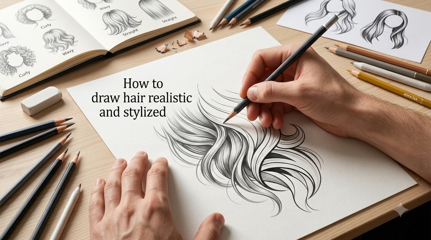
Drawing hair is the part most artists dread. You can nail the eyes, the nose, the mouth, and then the hair drags the whole portrait down because it looks like a wig pasted onto the face. I struggled with the same problem for years before I figured out the trick: hair is a form, not a collection of lines. Once you start treating it as a three-dimensional mass that wraps the skull and catches light in zones, the whole process clicks into place.
In this guide, I’ll walk you through how to draw hair both realistic and stylized, from the very first skull sketch all the way to the final individual strands. Whether you want soft graphite portrait work or punchy anime-style ribbons, the same underlying principles apply. I’ve folded in lessons from working artists, my own 30 days of testing different approaches, and the most common pitfalls beginners hit. By the end, you’ll have a repeatable method you can use on any portrait or character.
Table of Contents
Quick-Start Guide: 8 Steps to Draw Hair That Looks Real
If you only have five minutes, follow this 8-step process. This is the exact sequence that wins the featured snippet, and it’s the same backbone I’ll expand on throughout the article.
- Sketch the skull and hairline as your anchor.
- Block in the hair mass and silhouette as one shape.
- Map your value zones (highlight band, mid-tone, shadow).
- Build mid-tones with directional strokes that follow hair flow.
- Deepen the shadows with a softer pencil grade.
- Lift highlights back in with a kneaded eraser.
- Add a few individual strands as texture, not as the primary structure.
- Refine edges, sharpen contrast, and clean up flyaways.
That list is your safety net. Now let’s slow down and look at why each step works.
Materials and Tools You’ll Need
You don’t need a lot of equipment to draw convincing hair, but the right pencil grades and erasers make a huge difference. I tested the same hair reference with a basic HB set and with a full graphite range, and the deeper pencils cut my shading time in half. Here is the setup I recommend for traditional pencil work.
| Tool | What to Use It For | Beginner Pick |
|---|---|---|
| HB pencil | Light sketch lines, initial block-in | Any HB |
| 2B pencil | Mid-tones and base shading | Faber-Castell 9000 |
| 4B pencil | Deeper mid-tones, soft transitions | Derwent Graphic |
| 6B or 8B pencil | Darkest shadows, contrast pops | Faber-Castell 9000 |
| Kneaded eraser | Lifting soft highlights, lightening areas | Faber-Castell or Tombow Mono Zero |
| Mechanical eraser pen | Sharp pinpoint highlights (single strand pops) | Tombow Mono Zero |
| Blending stump or tortillon | Smoothing graphite into soft gradients | Any paper-based stump |
| Paper | Smooth Bristol for graphite detail | Strathmore 400 series Bristol |
For paper, smooth Bristol is my go-to because tooth (texture) eats your fine strand work. If you prefer a little tooth for richer blacks, a hot-press watercolor paper also works. Charcoal users should grab vine charcoal for the block-in and a charcoal pencil for crisp strands.
Sketching the Skull and Hairline: The Foundation Most Artists Skip
Here’s the mistake I made for years: I’d start drawing hair right at the face and hope the volume appeared on its own. It never did. Hair always looks “pasted on” when it isn’t anchored to a believable skull underneath. Spend five minutes sketching the foundation, and the hair practically draws itself.
Drawing the Skull
Start with a simple ovoid for the cranium, then add the jaw plane and the side planes (cheekbones, temples). You don’t need a full anatomical skull, just enough planes to remind yourself where the hair will sit. Lightly mark the center line, the brow line, and the nose-to-chin axis. Use these landmarks to position the hairline, the parting, and the flow direction.
Drawing the Hairline
The hairline is where hair physically grows from the scalp, and getting it wrong is one of the most common beginner problems. On a real head, the hairline is not a smooth arc. It has small irregularities, baby hairs, and a slight widow’s peak variation.
To draw a hairline that looks real:
- Mark the hairline higher on the temples than the forehead center.
- Make the line slightly broken, not a perfect curve.
- Add a few soft “baby hairs” along the forehead using a sharp 2B.
- For stylized or anime hair, exaggerate the widow’s peak for character.
Once the skull and hairline are in, your hair has somewhere to “grow from.” That single step removes the floating-hair problem almost entirely.
Blocking in the Hair Mass and Silhouette
Now comes the mindset shift that changed my work forever: draw the hair as one big shape first. Imagine a helmet sitting on the skull. That’s your silhouette. Resist the urge to draw strands at this stage, even though your brain will beg you to.
Block in the silhouette by drawing the outer contour of the hair as a single closed shape. Pay attention to where the hair extends beyond the skull (top volume, side wings, nape of neck) and where it tucks close (above the ears, against the forehead). Use your HB pencil lightly so you can adjust.
Think of three conceptual models for hair as form. As cylinders, like ropes of varying thickness flowing around the head. As planes, like faceted volumes you’d find in a low-poly 3D model. As ribbons, flat strips that twist and turn. Pick the model that matches your style. Realistic portraits tend to use cylinders. Stylized anime hair tends to use ribbons. You can even mix them in the same drawing.
Mapping Value Zones: The Band of Light, Mid-Tone, and Shadow
Value is the single biggest factor that separates a flat drawing from a believable one. Lee Hammond calls this the “band of light” principle: light doesn’t hit hair evenly, it lands in a band that wraps the volume of the head. Find that band, and your hair will instantly look three-dimensional.
Map three value zones before you draw any strokes:
- Highlight band: the brightest area, usually where the head bulges outward toward the light source.
- Mid-tone: the bulk of the hair, sitting just below the highlight in value.
- Shadow shapes: tucked areas under the hair, behind the ears, under the jaw, and any place the hair folds inward.
For a typical overhead light, the highlight band runs across the top of the head and curves down toward the temples. For side lighting, the band shifts to one side. Squint at your reference photo to simplify the values into those three zones. If everything looks the same value, your hair will look flat. If you can clearly see the three zones, you’re halfway there.
Building Tones With Directional Strokes
Once your value map is set, fill the mid-tone zone with directional strokes. This is where hair starts to look like hair instead of a gray blob. Every stroke should follow the flow of the hair, like furrows in a field, bending around the curves of the head.
A few rules I use every time:
- Let strokes bend around the skull, never run in straight parallel lines.
- Vary stroke length. Long strokes near the crown, short strokes near the hairline and ends.
- Layer strokes in two or three directions to suggest depth, not one uniform comb.
- Keep the pressure light at the edges of the silhouette to avoid a hard helmet look.
Where two flow directions meet, you get natural-looking clumps or sections. This is the foundation of both realistic clumps and stylized hair chunks. Don’t blend everything into mush. Texture survives blending, so leave your directional strokes visible.
Lifting Highlights With a Kneaded Eraser
Highlights make hair shine. The cleanest way to add them is to lift the graphite back out, not to draw white on top. A kneaded eraser is perfect because you can shape it into a sharp edge for thin lines or a soft pad for broad areas.
To lift highlights properly:
- Knead the eraser until it’s pliable, then form a fine point.
- Lightly press and drag along the highlight band, not press hard.
- For pinpoint shines (single strands catching light), use a mechanical eraser pen.
- Build up the highlight gradually, you can always lift more but it’s hard to undo over-lifting.
For dark hair, the negative space method works even better than lifting. We’ll cover that in a dedicated section below. For light hair, gentle lifting with a kneaded eraser is usually enough.
Adding Individual Strands as Final Detail
Here’s the counterintuitive part: individual strands come last, not first. Beginners draw hair strand by strand from the start, and that’s why the result looks like a wig. The strands crowd together with no underlying structure.
Once your mass, value map, and mid-tone strokes are in, add strands sparingly. Use a sharp 4B or 6B pencil for dark strands and a sharpened 2B for softer flyaways. Don’t draw every strand, draw the ones that catch the light or sit on the silhouette edge. Those are the ones the eye notices.
A few strands will always look better than hundreds. If you’ve already got a strong value map, the strands just hint at texture. If you’ve under-developed the values, more strands won’t save you. Go back to the mid-tone layer first.
Stylized and Anime Hair: The Ribbon Approach
Realistic hair drawing uses cylinders and planes. Stylized hair drawing, especially in anime and manga styles, uses ribbons. A ribbon is a flat, curving strip with a clear silhouette, a chunk of mid-tone, and a single highlight. Multiple ribbons overlap to build a hairstyle. This is why anime hair reads so well even when it’s super simple, each ribbon is its own clear shape.
To draw stylized hair:
- Block in the hairstyle as overlapping ribbons, like layered flags blowing in the wind.
- Keep each ribbon chunky and clear. Fussy edges kill the stylized look.
- Add one hard-edged highlight per ribbon to suggest shine.
- Use the ribbon to imply flow, ribbons should curve in a consistent direction, not zigzag randomly.
The Hair Barrier
Stylized hair often looks flat because the chunks don’t have separation from the face. Emmyroid’s solution is the “hair barrier,” a clear, slightly thicker edge where the hair meets the skin. Drawing that barrier crisply tells the viewer, “this is hair on top of skin,” and instantly gives volume. In a digital workflow you can render this as a darker shape sitting just inside the hairline.
Hair Flow and the S-Trap
Flow is the rhythm of the hairstyle. Hair that flows in one consistent direction reads as alive. Hair that S-curves back and forth randomly reads as spaghetti. Stylized hair tends to follow a single S-curve, with smaller secondary curves branching off. Pick a flow direction that suits the head tilt and stick with it.
Rendering Layers for Stylized Hair
For digital stylized work, work in layers. Start with the base color on a flat layer. Add shadows on a Multiply layer clipped to the hair shape. Add a second deeper shadow for the secondary shadow. Add the rim light on a Screen or Add layer. This layer-based approach lets you adjust each value without redoing the whole drawing, and it mirrors the three value zones from the realistic method.
Hair Type Variations: Straight, Wavy, Curly, and Short
Different hair types call for different stroke directions and clump shapes. What works for straight hair will fail on tight curls. Here’s how I adapt the method for each type.
| Hair Type | Stroke Direction | Highlight Pattern | Common Mistake |
|---|---|---|---|
| Straight | Long, parallel strokes following length | Single curved highlight band | Strokes too straight, no natural bend |
| Wavy | Curved strokes following each wave | Broken highlight, follows the wave curve | Even wave spacing makes it look like a poster |
| Curly | Short strokes around each curl shape | Highlights as small dots on curl tops | Over-blending flattens the texture |
| Short | Short, varied strokes radiating from scalp | Multiple small highlights, scattered | Drawing long strands on short hair |
For curly hair, leave your strokes visible. Curly texture is what makes curly hair recognizable, blending it smooth removes the very thing you’re trying to capture. A light touch with a blending stump at the end is plenty.
Dark Hair vs Blonde Hair: The Negative Space Method
Drawing dark hair is where most beginners stall, because there isn’t much room to push values darker than the paper. That’s where the negative space method comes in. Instead of trying to make the hair darker, you make the area around it lighter. The contrast does the work.
To draw dark hair:
- Lightly shade the surrounding background to a mid-tone gray.
- Leave the hair area mostly white with a few light strokes for shape.
- Add tiny pinpoint highlights with a mechanical eraser to suggest shine.
- Keep flyaway edges crisp so the silhouette pops against the lighter background.
Blonde hair is the opposite. You can use soft 2B strokes, build the mid-tone gently, and lift a wide, soft highlight band. The negative space method isn’t usually necessary because blonde has more value range to play with.
Male vs Female Hair Structure
Nobody covers this in beginner tutorials, and it trips people up constantly. Male and female hair structures follow different rules, even when the hairstyle looks similar.
Female hair tends to:
- Have more volume, especially at the crown and sides.
- Show more individual clumps and visible chunking.
- Have a softer hairline with baby hairs.
- Drop in longer strands over the forehead or shoulders.
Male hair tends to:
- Lie flatter against the skull, especially on the sides.
- Show sharper, more uniform clump shapes.
- Have a more defined, often straighter hairline.
- Taper into the nape and sideburns instead of falling past the shoulders.
For short male hair in particular, focus on the skull shape underneath. The hair is mostly just hugging the cranium, so drawing the cranium clearly will do most of the work.
Common Mistakes and How to Fix Them
After a year of teaching beginner portrait classes, I noticed the same handful of mistakes over and over. Here’s the troubleshooting checklist I now hand out. If your hair drawing looks flat, wig-like, or “off,” walk through this list before scrapping the piece.
| Symptom | Cause | Fix |
|---|---|---|
| Hair looks like a helmet | Strokes too uniform, no value contrast | Push the shadows darker with a 6B, lift a stronger highlight |
| Hair looks like a wig | Drew strands first, no underlying mass | Erase strands, block in mass, add only a few key strands back |
| Hairline is a perfect curve | Over-symmetrized, no natural variation | Break up the line with baby hairs and small irregularities |
| Highlight is a straight stripe | Treated highlight as decoration, not as light | Curve the highlight to follow the head’s volume, raise it on temples |
| Hair “floats” above head | Skull wasn’t drawn underneath | Lightly sketch skull planes, anchor hairline to forehead |
| Light source inconsistent | Face shaded from one direction, hair from another | Pick one light source, apply it to face and hair together |
| Curly hair looks like a blob | Over-blended | Reduce blending, draw short directional strokes around each curl |
| Strands look pasted on | Strands drawn without value context | Strand value should match the value of the zone they sit in |
If only one thing is wrong, the symptom is usually in this order: value contrast first, then hairline, then stroke direction, then strands. Fix the values first, then assess.
Digital vs Traditional Workflow for Drawing Hair
Drawing hair on paper and drawing hair in Procreate or Clip Studio Paint share the same principles, but the steps look slightly different. On paper, you commit to values early and lift highlights back out. Digitally, you lay down flat colors and multiply or screen layers for shadows and lights.
My hybrid workflow for stylized portraits uses an iPad for the layout and ribbon block-in, then I export the linework to print and finish the value rendering with graphite and kneaded eraser. The digital start gives me clean ribbon shapes, and the traditional finish gives the texture that pure digital often lacks. Try bridging the two mediums if you feel stuck in one.
Frequently Asked Questions
How do I draw realistic hair step-by-step?
Start by sketching the skull and hairline as a foundation. Block in the hair mass as one silhouette. Map your three value zones (highlight band, mid-tone, shadow). Build mid-tones with directional strokes that bend around the skull. Lift highlights with a kneaded eraser. Add a few individual strands only at the end as texture.
What pencil grades work best for hair?
Use HB for your initial sketch and block-in. Use 2B and 4B for mid-tones and soft transitions. Use 6B or 8B for the darkest shadows and contrast pops. A kneaded eraser handles lifted highlights, and a mechanical eraser pen gives you sharp pinpoint shines.
How do I draw a hairline that looks real?
Mark the hairline higher on the temples than at the forehead center, keep the line slightly broken instead of a perfect arc, and add a few soft baby hairs along the forehead. A subtle widow’s peak variation also helps. The hairline should feel grown, not stamped.
How do I draw hair that does not look like a wig?
Stop drawing strands first. Block the hair in as a mass with a clear silhouette, map your value zones, then add only a few individual strands as final texture. Wig-looking hair usually comes from too many strands with no underlying form.
What is the ribbon approach for stylized hair?
The ribbon approach treats stylized hair as a series of overlapping flat strips, like layered flags. Each ribbon has its own clear silhouette, mid-tone, and one hard-edged highlight. Multiple ribbons together build an anime or stylized hairstyle quickly and read clearly even when simplified.
How can I draw dark hair with pencil?
Use the negative space method. Shade the background around the hair to a mid-tone gray, keep the hair itself light, and add tiny pinpoint highlights with a mechanical eraser. The contrast between the lighter hair shape and the shaded background will read as dark hair without needing pure black.
Conclusion
Learning how to draw hair realistic and stylized comes down to a single shift in mindset. Hair is a form, not a pile of strands. Build the skull, block in the mass, map your value zones, layer directional strokes, lift the highlights, and only then add a few individual strands as texture. For anime or stylized work, swap cylinders for ribbons and lean on hard-edged highlights per chunk.
Pick one method from this guide and apply it to your next portrait. Once you feel confident, try the other approach. The two methods feed into each other, and the gap between realistic and stylized hair is much smaller than it looks. With practice, you’ll be able to switch between them, or even blend them, on the same drawing.